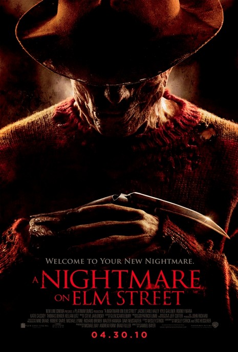
Synopsis: Freddy Krueger returns in A Nightmare on Elm Street, in the re-imagined work of the 1984 horror classic directed by Wes Craven. A group of teenagers are all being stalked by Freddy Krueger, a horribly disfigured killer who hunts them in their dreams. As long as they stay awake, they can protect one another but when they sleep, there is no escape. The teens whose dreams are terrorized by Freddy Krueger must help each other to survive by staying awake. Mise-En-SceneLighting: Low key lighting is used to create mystery and set a moody atmosphere, however the use of high key lighting of Freddy Krueger's iconic blade weapon makes it stand out as it will be a very good marketing tool for the remake of the film.
NVC: Freddy's face is hidden due to the shadow from his fedora but you are still able to make out a smirch on his face, as well as the horrific scaring he has on his face. His hand position is used to create the idea that he is waiting for you which will make the audience feel intimidated. Costume: the costume used is the same as in the original movie with Freddy sporting his iconic fedora, red and green stripped sweater and his bladed hand weapon, the sweater has lots of rips in it to make him look even more intimidating. Setting: You can not see any of the setting as the main focus of this poster is on Freddy Krueger for he is the main selling point which the poster is relying on as it is using iconography. Props: The only prop used in this poster is Freddy's iconic bladed glove weapon the use of the light shinning off it makes it stand out to the audience as it connotes death in the film. Camera: The shot is framed in a mid shot this is because they are using the iconic costume of Freddy Kruegar to signify that it is a horror movie as well as showing it is a remake of the original, this shot is used to place the iconic weapon in the centre of frame so the audiences eyes are caught by it. Colour: The colours used are red, green , brown and black. These are all dull colours which signify this will be a dark horror movie. the red signify's the hatred that Freddy has for the teens in the film. Green is used to connote life in the film but as there is very little of it in the poster, the brown is used to create the mystery in the film as it hides Freddy's face. The black connotes death death and due to the vast amount of it in the poster it becomes clear there will be lots of murders in the film. Typography: The use of sans serif font shows that this movie will have a modern twist on it making it differ from the original making it hopefully stand out as its own icon film and not just a remake Mood & Styling: The mood in this poster gives off a mysterious mood because of the low visibility. Specific Conventions: The use of horror icons such as Freddy Kruegar is a very specific convention for selling the movie, as it is a remake it has to stick to the original to some degree so it cant stray to far from the conventions used in the original.
0 Comments
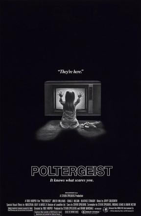
Synopsis: Steve Freeling is the main protagonist, he lives with his wife Diane and their three children, Dana, Robbie and Carol Anne in Southern California. It starts with just a few odd occurrences, such as broken dishes and furniture moving around by itself. However, a tree comes alive and takes Robbie through his bedroom window, as well as Carol Anne being abducted by ghosts. Realizing that something evil is haunting his house, Steve calls in a team of parapsychologists to investigate, hoping to get his daughter back, so he can leave the house before it's too late. Mise-En-SceneLighting: Low key lighting is used in the poster to connote an idea of isolation and darkness, it makes the high key lighting coming from the TV stand out as it engulfs the little girl signifying she is going to be a very important part of the plot.
NVC: The NVC is Carol Anne Freeling, she is staring at the TV with her hands pressed up against it signifying the connection she has with the ghost in it. Costume: the little girl is wearing a white dress this connotes the innocence and purity of the young child. Setting: The poster is set in what appears to be a living room but it is hard to tell as the only light is coming from the TV making the rest of the poster black and dark creating an isolated setting. Props: The TV is used to signify death in the poster as the ghost is communicating with Carol Anne Freeling through it, the bunny lying on the floor connotes the little girls innocence as she has discarded it for evil and death in the form of the TV. Camera: A 1 person long shot is used in the poster as it captures all of the girl and the TV this shot is used as you can see the details of the scene, as the little girl has her back facing the audience it creates a sense of mystery as to what she might be thinking. Colour: The colours used in the poster are grey, white and black. The black connotes death and the vast amount of it in the poster shows that death is the most powerful force in the movie. the whit is used to represent innocence and life as it is in Carol Anne Freeling's dress it shows she is the innocence of the movie, finally grey is used in this poster to represent the fall to evil and death as Carol Anne communicates and is taken by the spirits. Typography: Sans serif fonts are used for the masthead to show the film has a modern twist while serif fonts are used for the quote 'They're here' showing that the old traditional family values will be relevant in the plot. Mood & Styling: The use of the young girl seats a mood of fear for the audience as young children represent innocence to the audience can connect on an emotional level to the poster as they are fearful for the little girl. Specific Conventions: The tag line 'It knows what scares you' is a very normal convention as the masthead will catch your gaze and will be immediately followed by the tag line which will create an emotional pleasure for the audience as ell as an intellectual puzzle as they try to figure out what scares them which will worry them as they now believe the movie will contain this making them more likely to go see the movie.
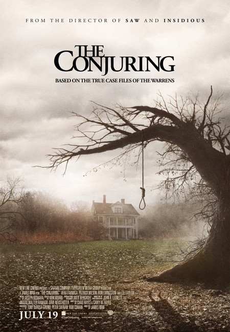
Synopsis: In 1971, the Perron family move into a farmhouse in Rhode Island. The family finds a hidden basement with a locked entrance. Soon they are haunted by ghosts, Carolyn meets the famous paranormal investigators Lorraine and Ed Warren. They visit the house and Lorraine and Ed feel that the house is possessed. Further investigation shows that a witch has sacrificed her baby to Satan and has possessed other mothers that lived in the farmhouse to kill their children. Lorraine and Ed must collect evidences to convince the Church it is necessary an exorcism to save The Perron family from evil. Mise-En-SceneLighting: Low key lighting is used to build up the idea of mystery and create and ominous atmosphere in the poster as this makes the farm house seem isolated, with a small part of high key lighting behind the house to make it stand out in the poster.
NVC: The NVC is the shadow in the bottom right hand corner of a shadow of a women hanging, we can see no details of the women which makes it interesting to the audience wanting to figure out who and what she is. Costume: The women is wearing a dress but that is the only detail to be seen as it is a shadow of the women. Setting: The poster is set in farmland with the use of the old creepy farmhouse being the only structure seen makes it a very isolated place as well as the fog connoting there will be lots of isolating and mystery in the film Props: The loos in the foreground which builds tension as the audience is interested in figuring out who was hanged and why creating an intellectual puzzle. Camera: The poster is and establishing shot of the old farmhouse with the tree and loos in the foreground, the significance of this shot is so we can see wear the story is set, the focus on the loos makes it an item of importance as it can be seen as icon for the horror genre for it is only really horror movies in which people are hanged establishing it as a horror movie poster. Colour: the colours used in the poster are black, grey, green and yellow. the black is used to show the fear that the antagonist will be putting into the antagonists. The grey represents the uncertainty of the Perron family as nothing is as black or white as they once believed before they started getting haunted. Green connotes life in the film as it is the only vibrant colour in the poster fighting through all the other dull colours to stand strong its binary-opposite is the yellow as it is the fallen leaves from the dead tree with the loos hanging from the branch making is represent death in the movie making the battle between life and death a key plot point to the story with is a very normal convention for a horror movie. Typography: the font used throughout the poster is New Times Roman this is a traditional font showing the story will stick to its routs of being based on a true story the title 'The Conjuring' is in black to represent death a the plot involves a family being haunted. Mood & Styling: The lighting in the poster sets a very dark atmosphere which is iconic for horror trailers, it also creates a depressing mood which allows the views to emphasis with the characters. Specific Conventions: The use of the line 'From the directors of SAW and INSIDIOUS' it is using a very common convention for publicity as fans of those films will now be more likely to see this one as it is by the same director the large masthead as the movies name is also very common as it stands out the audience and is memorably so they will not miss or forget the name of the movie. By placing the realise date on the poster in white is stands out and by not making it the biggest text on the poster it doesn't steal attention from the other details which is a comon convention. |
AuthorWrite something about yourself. No need to be fancy, just an overview. ArchivesCategories |
 RSS Feed
