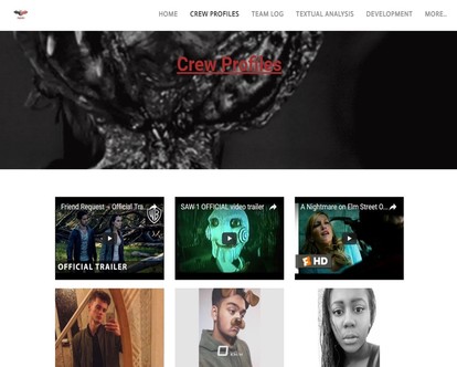
HOW EFFECTIVE IS THE COMBINATION OF YOUR MAIN PRODUCT AND ANCILLARY TEXTS? - done
EXAMPLES
|
|
Examples of Synergy & Ideas of Media Convergence
In order to further the profit of a film, the producers must be able to covert their media product onto a number of platforms as revenue has become lower in an era of piracy and become more internet aware. Therefore films must be able to make a franchise to further publicise their product and bring in profit.
LOGO

This is the logo for our production company Bat studios. It features red and black which are conventional horror colours. The use of the word 'BAT' in the wings on our logo helps to keep it unique and hard to imitate. The main purpose of logos is to avoid copyright infringement on products.
Brand Identity
Branding is important in a film in order for there to be continuity through the products to perhaps turn the media text into a franchise which would include sequels and merchandise. House style is important in establishing a recognisable typography and colours to identify a brand in the mass market therefore making the audience more likely to buy products and therefore increase return profits for the merchandise. It also affects how the audience views the company.
Examples
|
|
|
Our Product
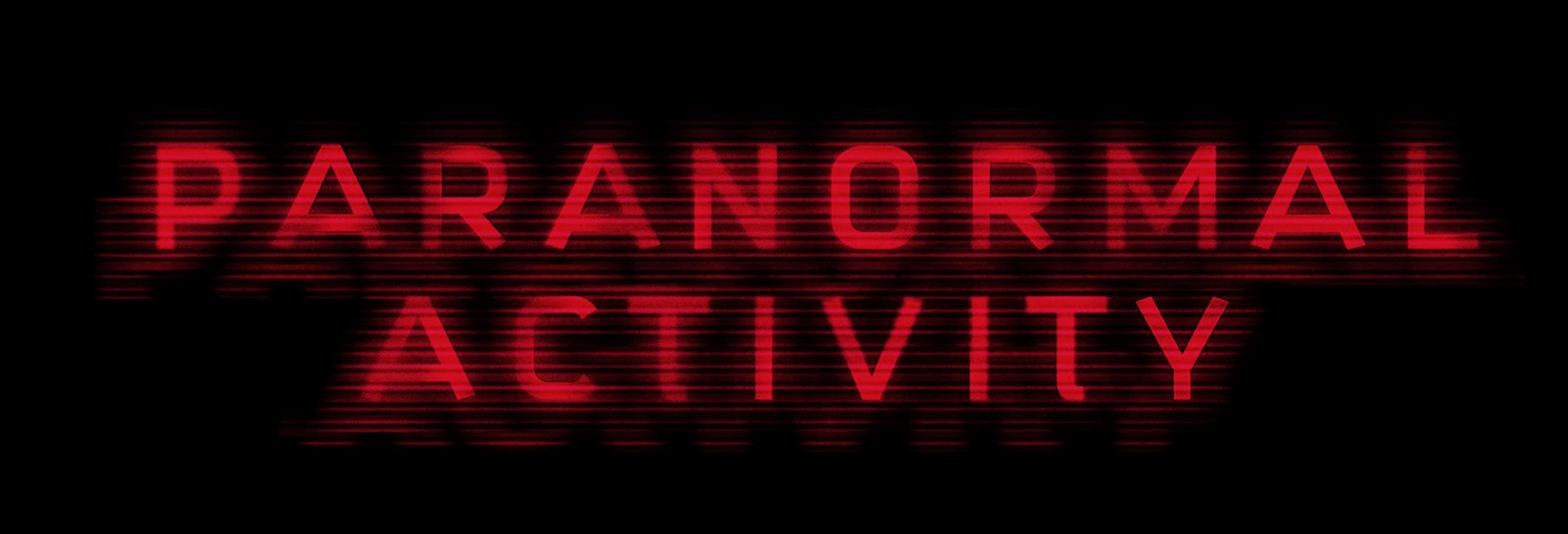
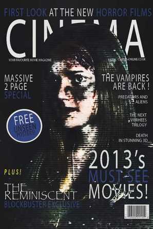
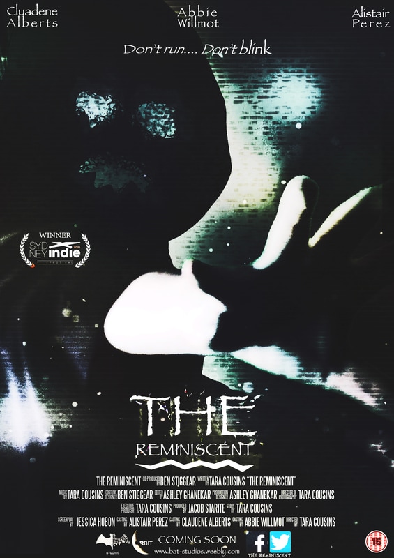
'The Reminiscent' is the title of our film and is repeated in all our products with the same font, colour and effects. This is in order to have continuity between our products by keeping the same house style. Although we challenged genre conventions which typically uses red, blue or black for text colours, we chose white as it stands out well and contrasts against the dark background on our poster. It is also easily transferable for different media platforms. This continuity helps audiences to recognise our product when transporting around. Thid is also evident in examples such as 'Paranormal Activity' and 'Final Destination'.

Example
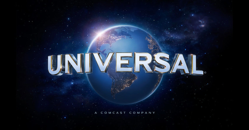
Brand identity is just as important for production companies as it is for film franchises, for example, Universal is a production company established in 1912 and yet it is a still recogniseable today. This is an example of successful branding.
Our Product
Bat Studios and its subsidiaries:
A media conglomerate is a company that owns multiple companies that are involved in mass media enterprises, for example this would be television, radio, publishing, motion pictures, the internet and theme parks. The largest media conglomerates currently in America are The Walt Disney Company, 21st Century Fox,CBS Corporation,etc.
BAT Studios has shown their understanding of branding against other media conglomerates, as we have decided to convert our production company into a subsidiary of a large media corporation, this is taking the inspiration from the multiple media corporations.
|
BAT Studios Interactive Entertainment :
BAT Studios interactive Entertainment is an industry focused on the creation of various video games. They would create games by using the inspiration from the films produced by BAT Studios, meaning the interactive entertainment sector would be working with the film industry to produce products, increasing profit. The logo uses brand identity as it has used the same shape of the main logo but now includes the words Interactive Entertainment. |
|
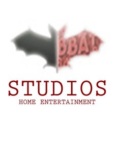
BAT Studios Home Entertainment:
BAT Studios Home Entertainment this is a pre-recorded organisation in charge of the distribution of all the BAT Studios films on all of the different media platforms such a DVD, Blu-Ray etc. This logo uses brand identity as it has used the same shape of the main logo but now includes the words Home Entertainment in order to keep with the house style of the main BAT Studios logo, but at the same time promotes the home entertainment. |
|
|
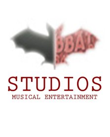
BAT Studios Musical Entertainment:
Bat Studios Musical Entertainment is a music company with the purpose of composing and recording records and singles with artist and composers, this would include all of the music featured in BAT Studios films as the artist have contracts with the same company, this is important for promoting the films produced by BAT Studios as popular artist being featured would appeal to an audience that may of originally not been interested in the film. |
|
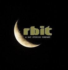
Orbit Distribution:
Orbit Distribution operates as a division of BAT Studios, the company was brought out by the media conglomerate BAT Studios. The function of Orbit Distributions is to distribute films world wide as it is a major distributor. This is highly important for BAT Studios as it means they no longer have to make deals with distributes in individual companies, allowing for easier deals for the film to be distributed in multiple countries world wide. |
XBOX Game
|
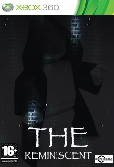
This is a Xbox Game case which focuses on a more seasoned and maturer group of onlookers, however the age rating of the motion picture is 15. Likewise the diversion case on the privilege just has a picture of the amusement and the title, which implies that amusement case intro pages ought not have an over the top measure of content. In conclusion the new Xbox case cover format is utilized with respect to another framework has been added to Xbox where 360 amusements can be played on the Xbox One through Backwards similarity. The diversion case likewise takes after the position traditions with the rating and studio being on the base, however the title is additionally close to the base.
|
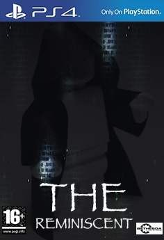
PS4 GAME CASE
|
|
This is the PS4 game case which has the same layout as the Xbox case, however its on the PS4 help the franchise gain more revenue.
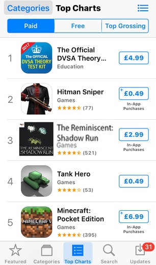
The Reminiscent app
|
Above is the image of the app for The Reminiscent movie's game "The Reminiscent: Shadow Run" in the Apple store. In the Apple store the game is free in order to draw in a large audience for the game which advertises all of BAT Studios products and the Reminiscent movie itself, however the game itself has "In-App Purchases" this means that the majority of players will then buy content in the game such as extra lives, power ups and character customization. the apple store is pre-installed on all Apple I phones, as Apple sold 74.83m smartphones worldwide last year it is the leading company in its sales of mobile phones, making it the most suitable choice for the app to first come out on.
|
Itunes page
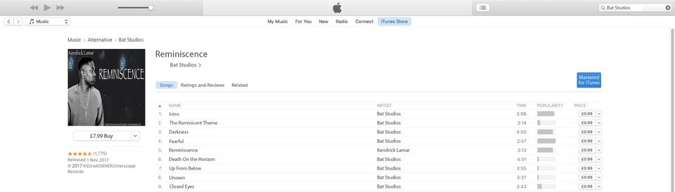
Above is a picture of our motion picture soundtrack available in iTunes. Due to the drop in the sale of physical copies of CD'S in stores it has meant that online retailers and digital media stores like iTunes are the main source of the majority of purchased music. With over 800 million accounts iTunes is the prime place to market the soundtrack from our film. The page features the album art from the soundtracks single, as well as the single itself and the other songs included in the actual movie. while the majority of the younger audience will illegally download this content their is still a proportion of the audience typical the older audience at around 20+ will purchase the soundtrack making this profitable.
Billboard
|
|
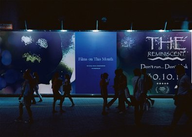
Above is a picture of our film being advertised on a billboard while the majority of the audience will be hearing about and viewing advertisements for our movie online it is still important to have physical advertisements in the forma of billboards to give the vital information, in order to get as many people to go and see the film. This poster design is different to our final film poster however it still follows the house style by using the same typography for the film title, tagline and release date, it also uses the same colour scheme of black, blue, white and yellow, it does feature the same dominant image as it is a strong image that will catch the audiences attention.
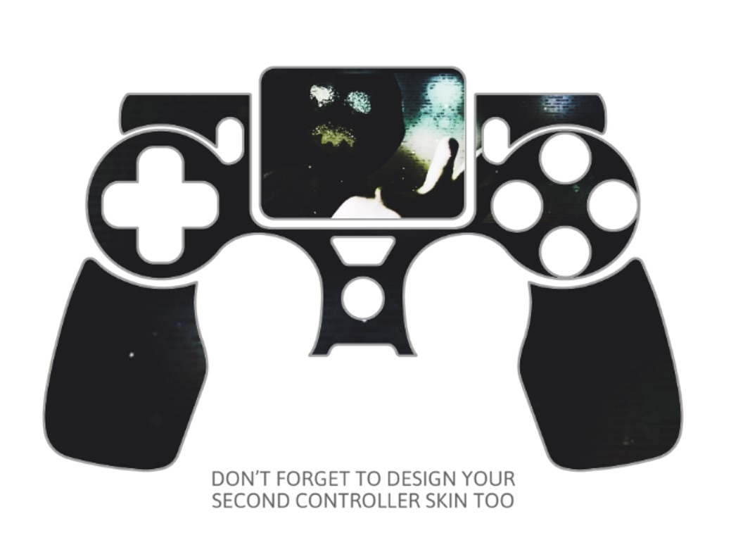
PlayStation 4 Skins
|
|
PlayStation is a game console which has topped the charts of all Games consoles ever released with the PlayStation 2, which has sold just under 155 million units after its release in 2000. In this age, the most common consoles to have are the PlayStation 4, Xbox 1 and Wii U. The PlayStation 4 still dominates this modern list, having sold 53.4 million units as of January 2016. Therefore our company has chosen to release personalised PlayStation console and controller skins which is a rising trend in modern society. It features the antagonist who features on the poster of the movie, meaning it would be easily recognisable and labelled in a merchandise store.
Album Cover

|
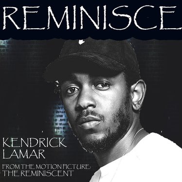
|
Above are two pictures of albums based around our film, ‘The Reminiscent’. The one on the left is represented of our film, ‘The Reminiscent’, as most feature films will release a soundtrack. These soundtracks include scores, compositions and songs which are heard throughout the film. Singles are often released by famous musicians which focus on the theme of our film. A few examples of famous franchises with successful singles include, 8 Mile (2002) and Karate Kid (2010). On the right is a single from the soundtrack called, ‘Reminisce’ by Kendrick Lamar. The colours used follow the theme and house style of our magazine and poster. They also both use the same typography.
Youtube
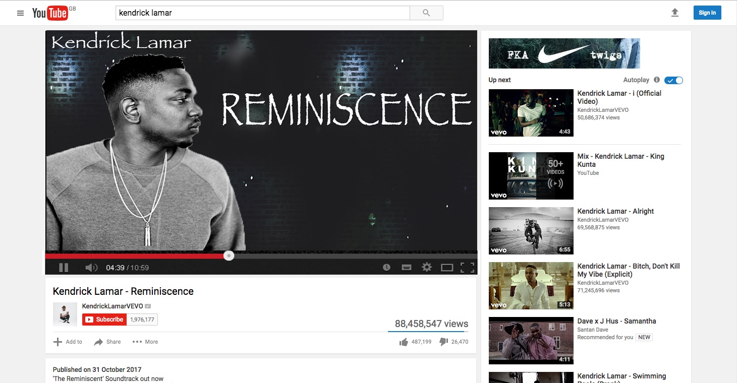
Above is a picture of a single released by Kendrick Lamar on his official YouTube VEVO page, ‘KendrickLamarVEVO’. The reason it’s released on his Youtube Page and not our own is in order publicise the film further and bring in a wider and established audience. When looking at the statistics of this video published on Kendrick’s VEVO, they surpass that of our own which would result in a higher number of views on our on videos and possibly subscribers to our channel. Although this is just an audio video containing no scenes from our movie, it entices audiences to explore our YouTube page and the film itself.
Wikipedia
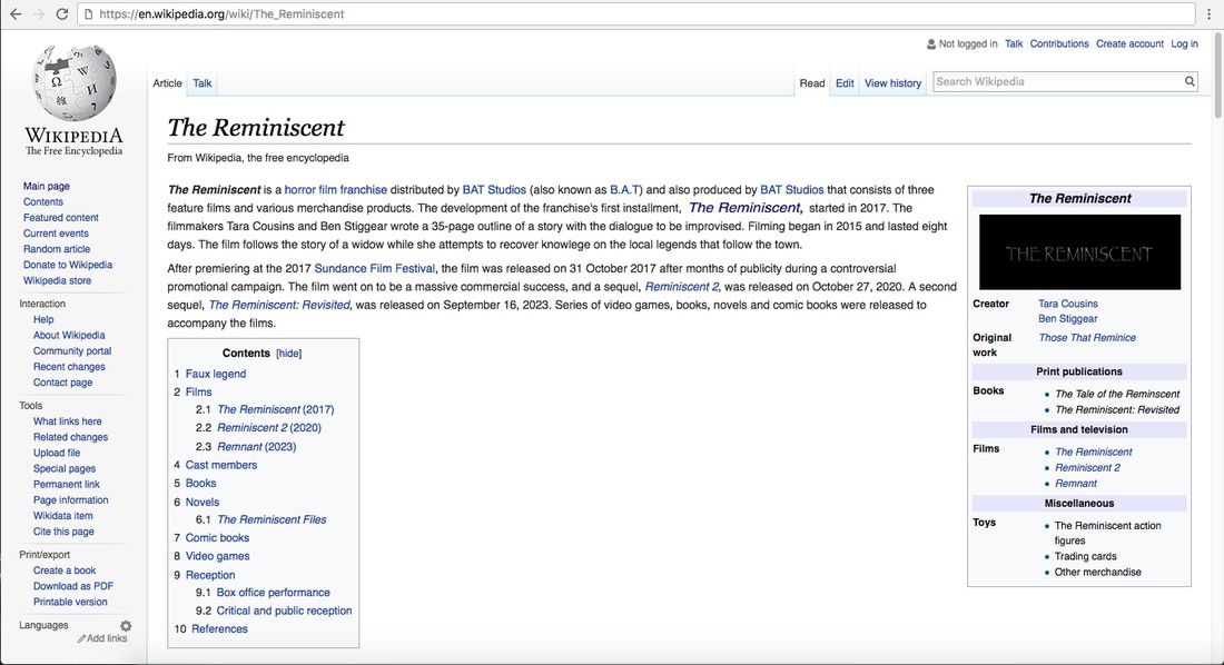
Here we have presented our film on the popular information website, Wikipedia which serves as a free online encyclopaedia which has held its position as the 6th most visited website for many years. It has just under 1.5 million pages linked to it and an estimated read pool of over a billion as of January 2017. The information presented about the film on our wiki page regards director, studio, film logo, sequels, and backstory.
HMV

|
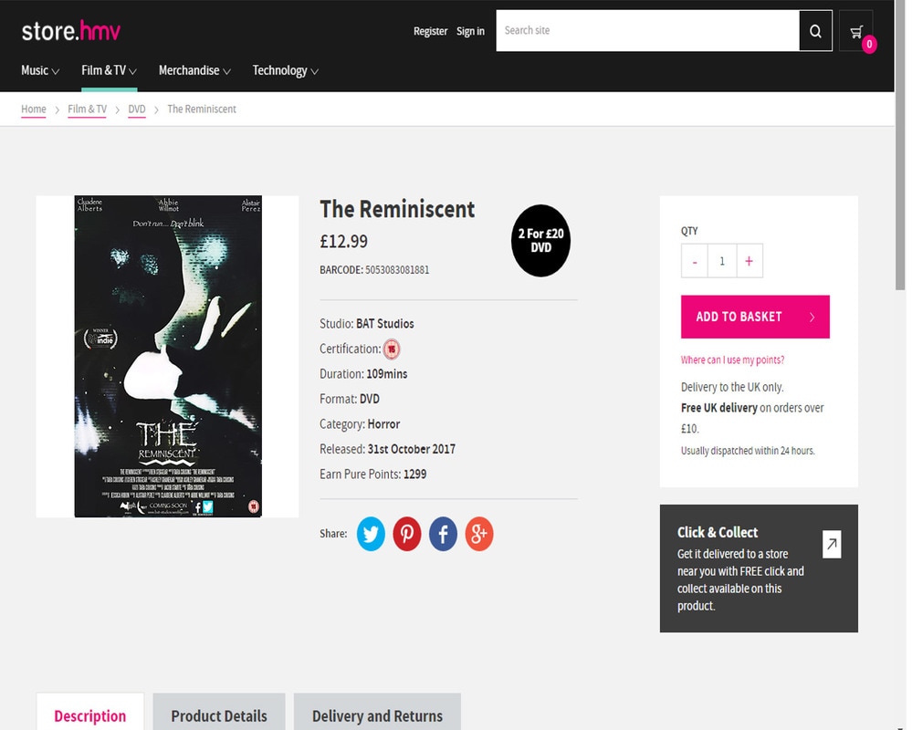
|
HMV is a British entertainment retailing company. Advertised on their website is a DVD copy of our film with information including genre and age certification. It takes 12-16 weeks for films to be released on DVD and Blu-ray after a theatrical release. The DVD cover features the movie poster whereas the Soundtrack features the same image from the poster however has been enlarged so that the antagonist is the main focus. This continuity helps to keep an established audience who would be able to recognise the key conventions.
Google Play App

Above is the image for the Google play version of ‘The Reminiscent’ movie’s game, ‘The Reminiscent: Shadow Run’. Although it differs from the Apple Store’s version, as its on two different platforms and will be experienced by different users the brand changed. However, the house style which is seen in the poster and magazine is continued throughout as it contains the text used in these campaigns ‘Papyrus’ and also the background colours of black, blue and green. Although Apple is more of a substantial and successful platform that android, as it sold 74.83m smartphones worldwide last year, in order to involve a wider range of audience it is brought out on both platforms.
Thorpe Park Ride
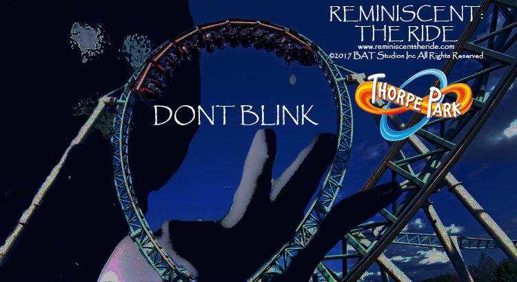
Above is a poster advertising the release of a roller coaster based on our film, The Reminiscent. It is going to be displayed in Thorpe Park, a highly successful theme park in the UK. This promotional poster features the same font and tagline in our original poster and magazine and the same house style with the use of the colors. The unique antagonistic position from our movie poster has also been posted with the amusement ride.
Success Of a Real Media Text

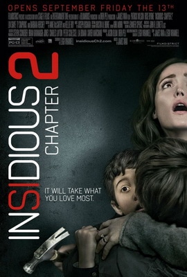
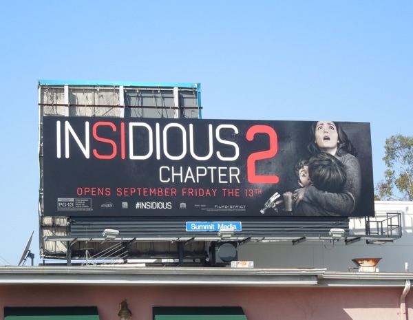
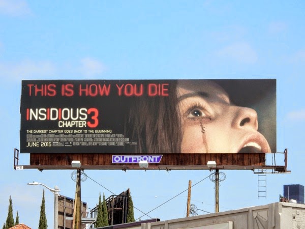
A good example of a horror franchise which has been successful and is the same genre as ours is Insidious. They have used Synergy and CMC well in order to create more merchandise and more films for their audience which in turn, turns into profit. Insidious is a franchise produced by Blumhouse Productions and distributed by Film District. There are four films in the Insidious franchise, (2 sequels and 1 prequel) with one to be released later in 2017. The 3 released filmes have collectively grossed $382 million, and was labelled the most profitable film of 2011.

|
|

|
|
|
|
|
In 2016, Insidious is everywhere. With a teaser hinting at a fourth movie, the buzz has been re-ignited around the world and with the new paths in which technology has gone down, the insidious franchise has used the opportunity to broaden its influence to bring in an audience and profit. Their innovative and unique antagonist style makes for a brand that is easy to replicate and display which measures the brands overall success. The use of the red and white house style that is portrayed throughout the Insidious series until the final film in the franchise, Insidious 3, makes for a swift marketability with this franchise, therefore proving to be a great success for the franchise would could indeed be increased if more films were brought out.
|
|
What is very rare these days is for a franchise to be successful and profitable enough to be able to create a ride or physical interactive experience in order to bring in profit. For example, this can be see with Saw: The Ride. As seen in the picture, the antagonist of the specific film campaign which the interactive experience is a part of is seen outside in order to bring in fans and a horror audience who would bring more attention to their campaign by taking pictures and videos with the antagonist and posting in on social media sites such as Facebook and Instagram. The poster containing the protagonists, house style and colours of the film campaign are on the side a sign of continuity to publicise their brand.
|
|
It is even rarer for horror film franchises to bring out video games, the most notorious ones being Resident Evil and Saw. However, the insidious franchise have brought out an interactive and person experience on VR – virtual reality. The modern version of this – HTC VR – was brought out in 2016 and provided a way to publicise the fourth film in the insidious series, featuring an iconic figure in the film series, Elise. The actress, Lin Shaye won Fright Meter Awards’: Best Supporting Actress Award in 2011. Therefore bringing her back as a character in this modern way of interacting with audience shows the audience engagement as the audience will recognise her well even though she is not a main character. The colours used are similar to the ones on the posters and billboards, This interactive VR experience is also available on social platforms such as Facebook, which requires the user to move their phone around in 360 degrees to see their surroundings.
|
|
Continuity is important throughout campaigning and Insidious have definitely adhered well to the use of continuity with different media platforms. On the blu ray cover of Indious, it reflects the same image of the poster for that film. The colours and house style are the same and the house is still visible on the cover. The only difference between the two is that the eyes of the child are (purposefully) scratched out, which creates a sinister and scary effect on the audience who, if perhaps haven’t seen the film, would wonder what is wrong with the child. This small difference between the poster for the film and the DVD cover provides for further campaigning and publicity for the franchise. Overall on blu ray and DVD, the insidious franchise made over $27 million.
|

|
|
|
|
The film franchise has again chose to portray the protagonists when backing the billboard posters which would be on display to millions. They used these two examples of billboards to market the release of Insidious and Insidious 2. It continues the house style of the posters including the white and red text colours, same font and colours and the same picture of the protagonists. The continuity throughout this marketing campaign for the insidious franchise helped Insidious 2 to smash a profit on their budget of $5 million by racking in $162 million at box office.
|
|
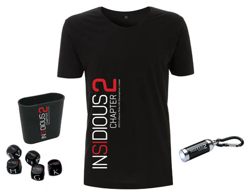
T-shirts, mugs, and decorative pens all help the franchise with further publicity and bringing in profit. Just link the bringing out games and rides it furthers the identity of the brand and brings in a more active audience and fans who would be interested in buying an insidious pen and notepad for university, or a unique mug for their dorm room. Specific franchises helps to put a stamp on items for franchises and Insidious’ franchise have partnerships with websites such as Red Bubble who sell items for a range of franchises of all genres.
|

|
|
Success of a Real Media Text
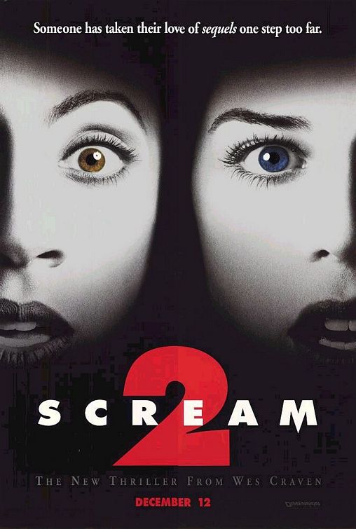
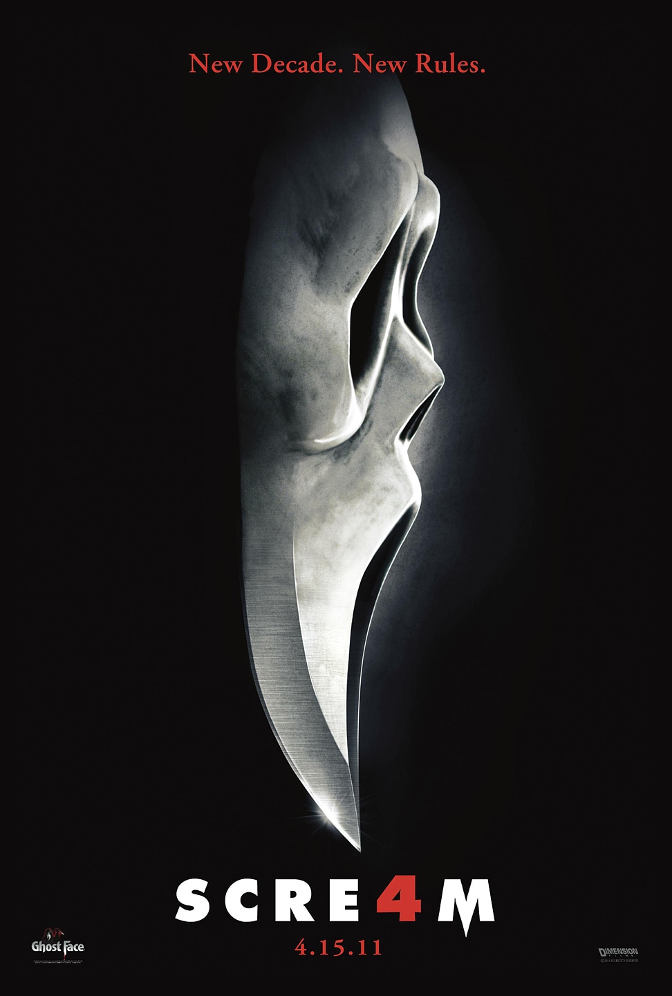
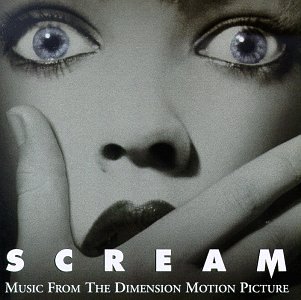
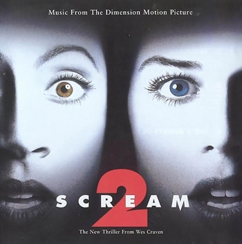
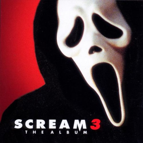
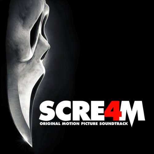
A good example of a horror franchise which has been extremely successful and is of the slasher genre is Scream. They have used Synergy and CMC well in order to create more merchandise and more films for their audience which in turn, turns into profit. Scream is a franchise initially produced by Woods Entertainment and distributed by Dimension Films however throughout the franchise it has been produced and distributed by a number of different companies. There are four films in the Scream franchise which have collectively grossed $568.5 million.
|
|

|
|
|
|
|
|
|
In 2016, Scream is a classic which is watched and re-watched with every generation. With the new paths in which technology has gone down, the Scream franchise has used the opportunity to broaden its influence to bring in an audience and profit. Their innovative and unique antagonist mask makes for a brand that is easy to replicate and display which measures the brands overall success. The use of the red and white house style that is portrayed throughout the Insidious series until the final film in the franchise, Scream 4, makes for a swift marketability with this franchise, therefore proving to be a great success for the franchise would could indeed be increased if more films were brought out.
|
|

|
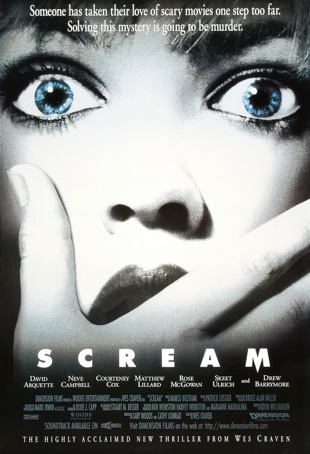
Scary Movie is the binding of horror classics such as 'Scream' 1 and 2, 'I know what you did last summer', 'Halloween' and 'The Blair Witch Project'. The parodies of these films help in bringing publicity to these film franchises in a innovative and fun way. Since the first scary movie there have been 5 further 'Scary Movie' films brought out which cover a spectrum of horror films. The use of the iconic 'Scream' mask on the cover of the promotional poster and also on the DVD cover further brings in an established audience and profit for the 'Scream' franchise.
|
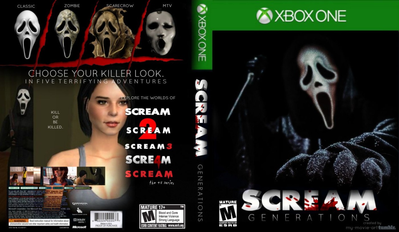
Film franchises generally do not release video games - especially horror franchises which shows the length that this franchise was able to go and how successful it is to be able to release a Xbox game. The game features the iconic Scream antagonist as well as variations of the mask which the player will be able to chose. It features re-made footage from the 4 Scream movies. The colours used (white and red) are similar to the house style of the movie poster, billboard and DVD cover.
|
|
|

|
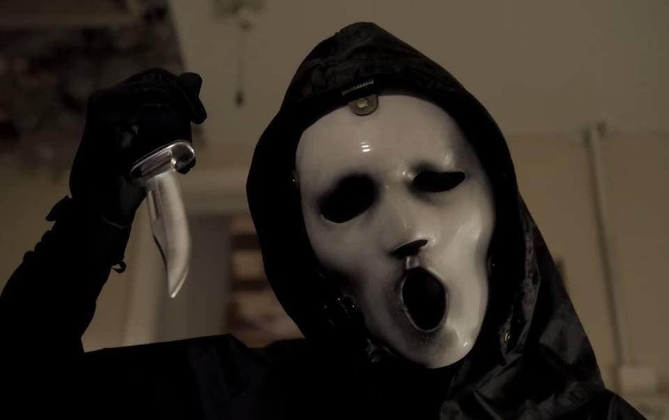
Scream (TV Series) is a modern spin-off of the original Scream series. Featured on MTV on TV and online, it reboots the classic with a new look yet with the same conventions such as the iconic mask from the original film collection. The use of the murder weapon remains the same and established horror audiences and general movie fans are able to revisit the classic from the comfort of their homes. The billboard loosely follows the conventions of the previously seen Scream promotional posters by having the iconic mask however it also features characters in the TV series.
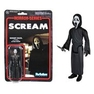
Bringing out toy merchandise all help the franchise with further publicity and bringing in profit. The use of the iconic mask and the murder weapon of choice furthers the identity of the brand and brings in a more active audience and fans who would be interested in buying it for a toy collection.
|
The film franchise has again chose to portray the protagonists when backing the billboard posters which would be on display to millions. It continues the house style of the posters including the white and red text colours, same font and colours and the same picture of the protagonists. The continuity throughout this marketing campaign for the insidious franchise helped Scream 4 to gain a profit on their budget of $40 million by racking in $97million at box office.
|
|
|
|
|
Scream also produced 4 motion picture soundtracks which further proves how CMC and synergy have been used in order to publicise the soundtrack which features the same covers as shown on the promotional posters and film DVD covers. This helps audiences to easily identify the products in shops and online when purchasing.
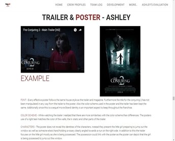
TRAILER & POSTER
EXAMPLE |
|
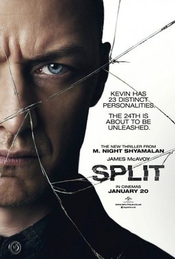
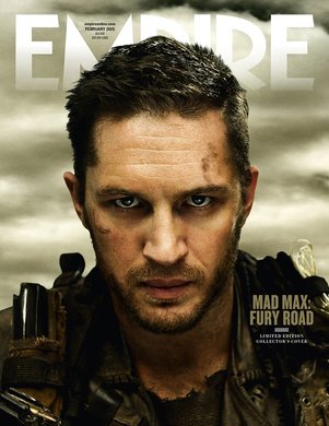
FONT - Every effective poster follows the same house style as the trailer and magazine. Furthermore the title for Split replicates the name of the film. Also the colour scheme used in the poster and the trailer has to an extent been kept the same.
COLOR SCHEME - While watching the trailer the character in the poster is the main subject of the trailer, and the colours are shown to be dim and dark, such as brown, black and white.
CHARACTERS - The poster reveals a character of the movie, in a sinister light although the audience may be unsure if they are an antagonist or protagonist.However in the trailer, it is clear that this character is a menacing antagonist who has kidnapped girls however clearly suffers from having multiple personalities, and leaves the audience wondering the fate of the girls and what the alluded to 24th personality is.
OUR WORK |
|
|
FONT - The font that were used for the poster and the trailers title slates except the billing block is known as Papyrus which is a font that is already on the computers meaning that we did not need to download any files.
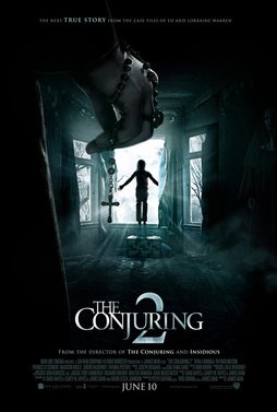
COLOUR SCHEME - Our colour scheme was inspired by the Conjuring 2 trailer and poster as for we keep a consistent teal dark house style. Additionally the house style was also consistent through the lighting used in the trailer and poster. CHARACTERS - The trailer we made focuses on the female protagonist a lot more on the trailer, unlike the poster which consist of the antagonist as the main aspect. However to show some similarity we kept the identity of the antagonist hidden in both trailer and poster, as well as the magazine. |
|
TRAILER & MAGAZINE
EXAMPLE |
|
FONT - I took some time to view many different magazines to there trailers and realised that the typography in magazines stick to being bold and do not really follow the font styles of the trailer, but the fonts that are used look similar to the trailers.The colour of the texts relate to the colours used in the trailer for example the Gold colour which fits well with the landscape and also the background of the magazine.
COLOUR SCHEME - As you can see the magazine follows the colour scheme. There is some continuity in the colour grading between the poster and the magazine, however the magazine have opted for a darker gold photoshopped theme in which the model appears slimmer.
CHARACTERS - The character Max is seen throughout nearly every clip of the trailer as well as being the featured character on the magazine with the same costume.
OUR WORK |
|
FONT - The fonts used in the magazine do not resemble any similarity to the fonts in the trailer, however the font for the title has been kept the same throughout everything. Additionally since we kept the house style with a dark background the fonts needed to be of a bright colour in order to be read properly.
COLOUR SCHEME - The house style and colours of the background were the same as the poster and the trailer. For the magazine bright font colours needed to be used so it could be read on a dark background. The blue font does not really match the colour scheme for the fonts on the poster however it does show clear relations to the blues in the background and the trailer.
CHARACTERS - The main character was placed as the main image for the magazine as for the trailer was based around her, which presents who the main focus is in the trailer, creating clear and concise relations between the narrative and the trailer and makes it easier to understand her relevance in the trailer.
TRAILER & WEBSITE
EXAMPLE |

|
FONT - The fonts from the title slates in the trailer match the fonts that were used in the website. They both follow the metallic and robotic texture and colour. Lastly the thumbnail of the trailer matches the logo on the website.
COLOUR SCHEME - The trailers colour scheme when showing clips of the technology matches the colour from the metallic logo on the website.
CHARACTERS - The website and trailer don't seem similar at first glance, however the website has a hyperlink names 'Characters' which present every single character just like the trailer does.
OUR WORK |
|
The colour scheme between the website and the trailer shows little relation to each other however the logo of our company has been presented in both of them. Furthermore the fonts do not match between the trailer and the website, however the gifs shown on other pages are dark and dreary which relate to the horror genre.
However, the trailer, production company and distributor logo is visible for the audience on our home page which helps to link the trailer and the website.
However, the trailer, production company and distributor logo is visible for the audience on our home page which helps to link the trailer and the website.
POSTER & MAGAZINE
EXAMPLE |
|
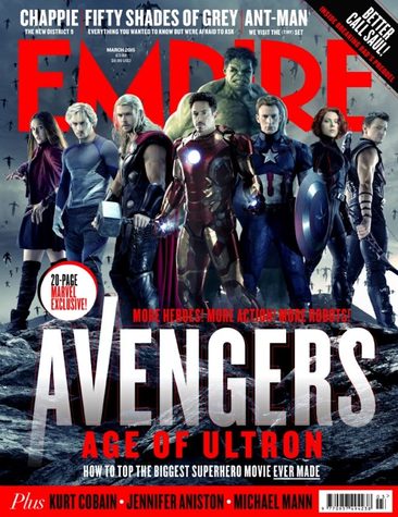
FONT - The fonts from the Avengers magazine don't match with the poster, however the film is still able to be recognised by established fans and audiences.
COLOUR SCHEME - through the use of the colours red and silver which is also portrayed through the magazine logo which the magazine have changed to match the colour scheme.
CHARACTERS - As you can clearly see all the characters have been presented in the poster, as there is no main one character of the film even though it would be a common convention to have an individual as the front cover main image.

OUR WORK |

|
FONT - The fonts from the magazine compared to the poster are different, as well as text sizes, however the title of the trailer we made was kept the same since its a convention.
COLOUR SCHEME - The main colours that were used were blue and white
CHARACTERS - The poster contained the antagonist, but the magazine contained the protagonist to follow the conventions.
COLOUR SCHEME - The main colours that were used were blue and white
CHARACTERS - The poster contained the antagonist, but the magazine contained the protagonist to follow the conventions.
POSTER & WEBSITE
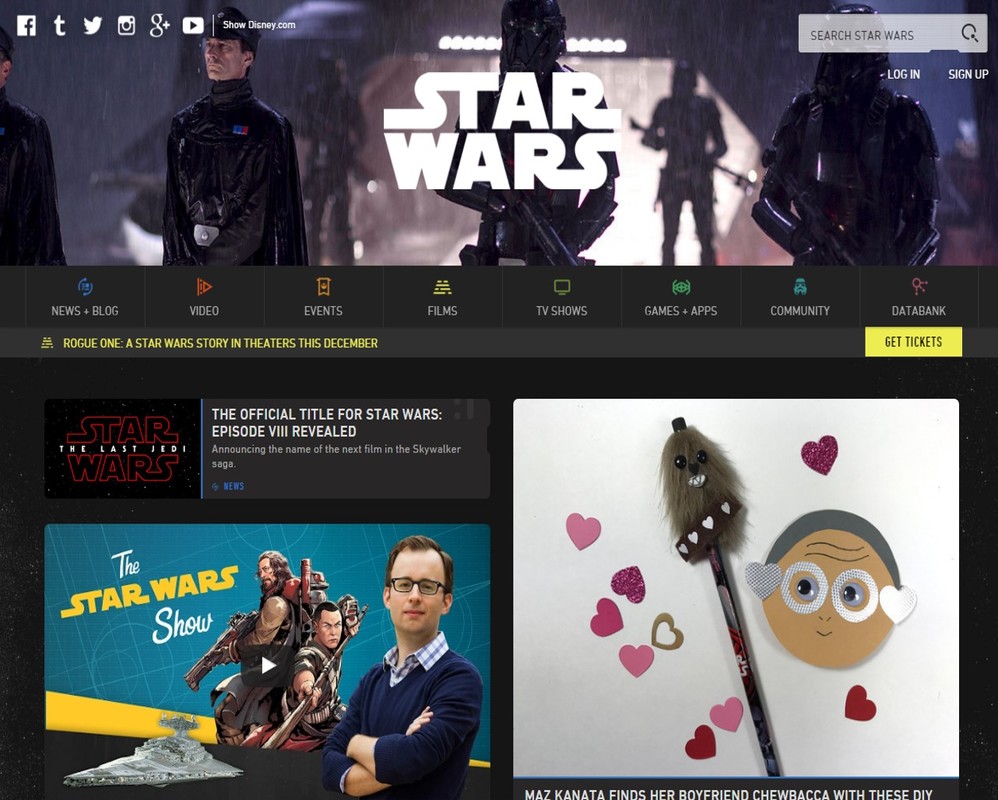
EXAMPLE
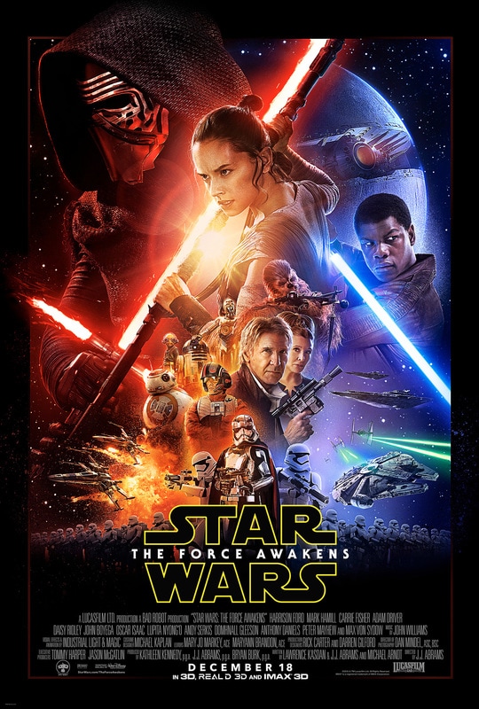
FONT - The bold text is a common convention in anything publicised especially in adverts on their website. Although Star Wars have created a brand that can be easily recognised whatever the colour is.
COLOUR SCHEME - This is a recurrent convention in the star wars movie posters.
CHARACTERS - The poster contains the main characters in the film, however due to the expanding franchise the website avoids specifics in characters due to a wide variety of different characters.
COLOUR SCHEME - This is a recurrent convention in the star wars movie posters.
CHARACTERS - The poster contains the main characters in the film, however due to the expanding franchise the website avoids specifics in characters due to a wide variety of different characters.

OUR SITE
The font that was used on the website is different to the poster, however the posters dark background and mood matches the GIFs I used as a banner to some pages meaning that we did not have a character on the banners of pages as well as the title.
Conclusion
During EVALUATION QUESTION 2, we looked at different ways that could measure the effectiveness of our main and secondary products. We evaluated different types of cross media convergence and synergy and displayed these ideas in order to calculate the success of our media product we created and just how far our product can reach.
|
In order to create different forms of mass media we looked at examples of synergy and CMC. Our trailer, magazine and poster falls under the fact that it will need to be consumed by a large audience through landscape publicity and printed advertisement. Therefore we had to ensure that we had an understanding of different platforms to publish our content on, in order to ensure that our audience can be exposed to our concept on a number of platforms. The ability to bring a product to different platforms can also be used to measure the final success of the product, for example being able to bring out a range of merchandise, games, rides etc (cross media convergence).
|

|

|
Originality is something hard sought by in the media industry, as postmodern media is not an original idea but instead a remake of influences which have been made to create a different perspective in horror, however still following the genre conventions. We have already created our final products however we researched into existing successful horror film franchises which gross some of the top figures at the box office. We looked at Insidious and Scream who have exploited CMC and synergy in order to keep pulling in a profit for their company years after the films had been released. They did this by releasing new films, creating merchandise and releasing their products on DVD and Blu-Ray. Both films have collectively grossed over $807 million at the box office worldwide.
|
|
We analysed successful film franchises and evaluated what it would take to create one. We deconstructed our media products and explored the house style (fonts, colours and layout) and characters displayed on the poster and magazine. Our house style was a font called Papyrus and our main colour scheme was black, white, blue and green. Comparing to the insidious posters for the 3 movies, there is the recurring colours white and red in the main text. They also used the same font which is Neutraliser sans font, and the same font size. Another repeating convention of the posters was to have the antagonist or protagonist on the cover. Insidious 2 and 3 have the protagonist’s, and although it can be argued that the son in the first movie is a victim of possession he is essentially the embodiment of an antagonist. These consistencies make the products recognisable by an established audience which we will be using for our main media products as our brand will be continually publicised.
|
|

|
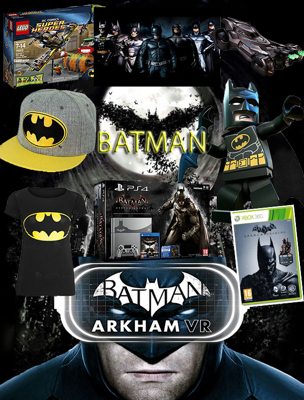
When becoming a franchise, brand identity is essential for film companies to be able to get their media text out there and be a success. An example of a brand which is considered unsuccessful is Green Lantern, which failed to translate a DC comic hero onto the big screen. The films poor domestic box office performance put a stop to any future possible sequels/prequels and any further franchise advertising. Although not a prominent DC figure such as Batman or Superman, the 'Green Lantern' (2011) fell flat on action and accurate plot development which failed to impress fans who saw the hero as a flashy green highlighter rather than a prominent figure. We also looking into the logo for our Production Company, Spooky Entertainment and experiment and made decisions on how our logo could be changed depending on the different platform of media technology it was being presented on. This helped with our understanding of different branding which conglomerates adopt in certain situations. We used the title Papyrus for the title of our film to give it a rugged and old look yet make for a strong brand as its not common and would be easily recognisable and easy to change around and replicate.
|
|
Lastly, we looked at synergy through other media platforms, which involved collectively looking at what we have previously used as influence to visualise our film on different media devices and platforms that our relevant to everyday life, excluding for example merchandise such as paper plates, or as a toy. However we did look at the relevance of creating a trilogy for our franchise and illustrated our antagonist as a character in a Lego game and in a graphic novel. This shows our understanding of the reach that our franchise has and the overall effectiveness that we have displayed in the bringing together of ideas from our main product and ancillary products.
|

|
