This is my question 2 evaluation page. Throughout the page you will get the chance to see the film The Reminiscent across many different media platforms to demonstrate how the main product and the ancillary texts are combined. I will be looking at the synergy, continuity of all 3 of the final products before looking into the different forms of cross media convergence. Media convergence is the merging of distinct media to create entirely new products. Convergence is key in today's era with many different digital media platforms such as the Internet, smartphones/tablets, streaming capabilities, BLU-RAY, music, and video games for example.
It is Important to have a strong brand for the horror film and its aims to become a franchise, this is something I will be looking at on this page as I will discuss the brand identity of The Reminiscent and how it looks compared to other real media texts and whether or not there is a strong enough brand to develop sequels.
It is Important to have a strong brand for the horror film and its aims to become a franchise, this is something I will be looking at on this page as I will discuss the brand identity of The Reminiscent and how it looks compared to other real media texts and whether or not there is a strong enough brand to develop sequels.
EXAMPLE
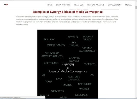
Examples of Synergy & ideas of Media Convergence
In order for a film to produce a much larger profit, it must present the media text to the audience on a variety of different media platforms, this is necessary as in todays society the influence of an un regulated internet has made it easer then ever to pirate films, because of this modern development it is even more important for a film franchise to set aside a large budget in order to market the merchandise and increase profits.
Success of Real Media Texts
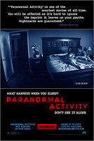
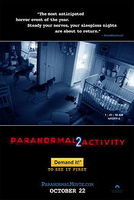
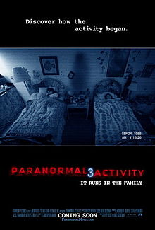
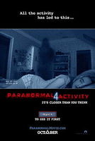
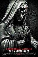
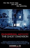
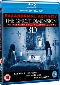
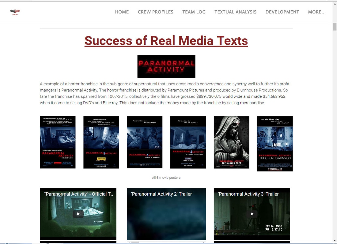
A example of a horror franchise in the sub-genre of supernatural that uses cross media convergence and synergy well to further its profit mangers is Paranormal Activity. The horror franchise is distributed by Paramount Pictures and produced by Blumhouse Productions. So fare the franchise has spanned from 1007-2015, collectively the 6 films have grossed $889,730,075 world wide and made $54,668,952 when it came to selling DVD's and Blue-ray. This does not include the money made by the franchise by selling merchandise.
|
|
|
|
|
|
All 6 movie posters
|
|
|
|
Paranormal Activity was able to keep the continuity throughout all of its products which made it much easier to market the franchise and its merchandise, this was done by using the same colour scheme and typography throughout its products which gave it brand identity and the target audience could easily identify with the use of red and the iconic dark blue filter to give the security camera effect.
|
|
|
|
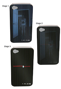
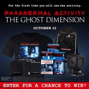
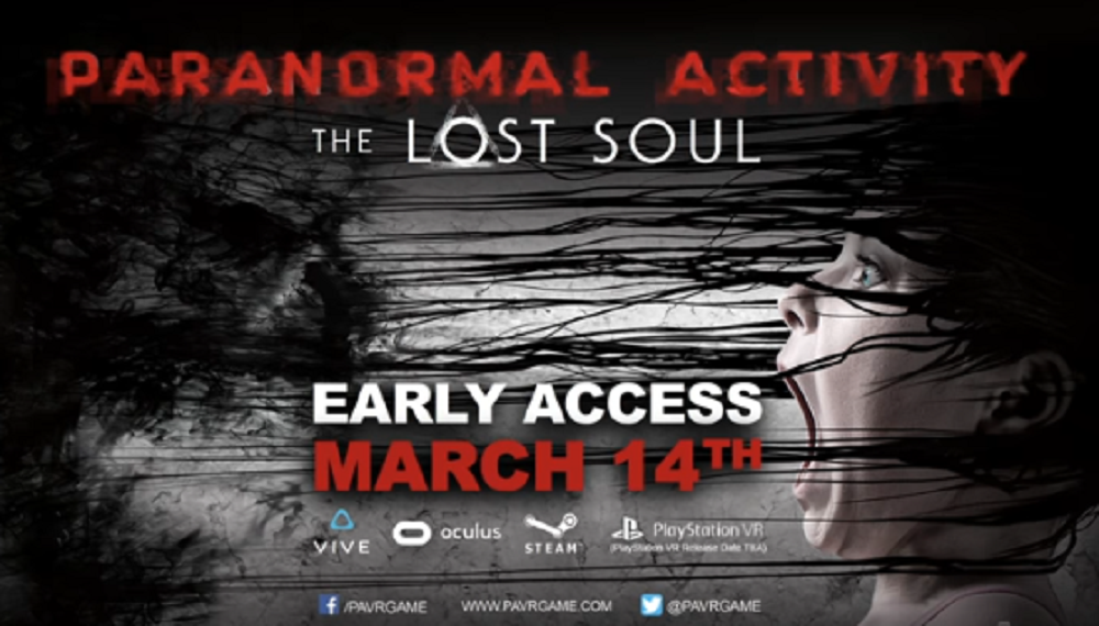
Above are examples of how the Paranormal Activity Franchise has expanded into different areas of media in order to increase its profits. Due to us living in an age of unregulated internet it has never been easier for people to illegal watch movies without paying for them thanks to the development of media technologies. You can see that throughout all of these products the typography has been kept the same in order to give the franchise a distinct look, to aid this they have also used the same colour scheme on their products with the black red and blue. As you can see the franchise has expanded into merchandise such as phone cases, clothing, 3D BLU-RAY and VR games, these examples show that the franchise is keeping up with the developments in society as virtual reality has only been a gaming concept since 2016. The use of a 3D BLU-RAY is that it gives the audience an incentive to buy the product as they could simply get a 2D version of the internet.
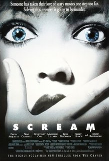
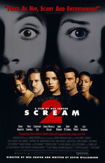
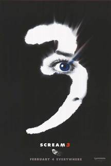
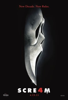
Another example of a horror franchise that uses synergy and cross media convergence well is scream, while this movie franchise is unlike my own as this is a slasher, there are 4 movies in this franchise spanning from 1996 -2011, there is also a spin off TV series of the same name which started in 2015 and has now had 3 series. the films are distributed by Dimension Films and have collectively brought in a world wide gross of $604,382,926.
|
|
|
|
All 4 Scream posters
|
|
|
There is a consistent theme with the movies that has greatly assisted when establishing the franchises branding. the colour scheme of red, white and black is key for all of the marketing of the franchise as well as being put into the merchandise. This causing an element of synergy to be incorporated into all of the products because of how easy it is to identifiable the branding of the franchise, and with Ghost Face as the antagonist this creates a strong point for the franchise to divers into other areas creating opportunities for synergy and cross media convergence.
|
|
|
|
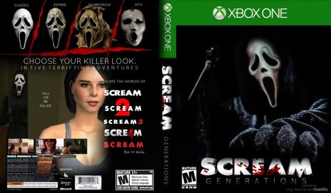
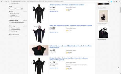
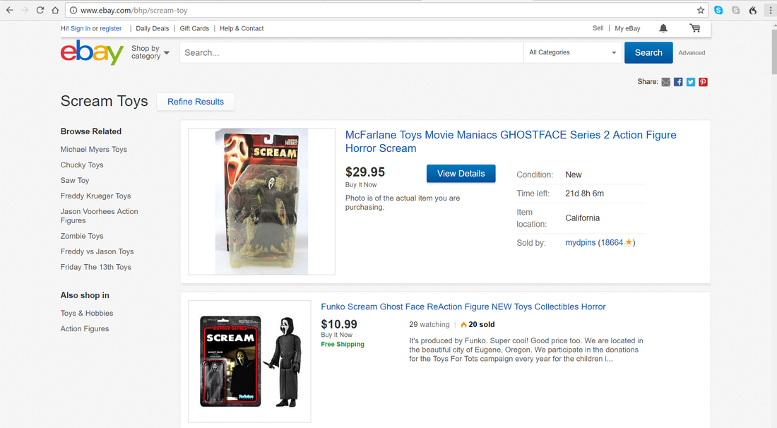
The scream franchise has a lot of merchandise, which is mostly thanks to their iconic antagonist Ghostface, this character is the is the main force behind the franchise as there are not only Halloween costumes you can buy to make yourself look like this character but there are also toys and action figures that you can collect, there are also two example of a video game for the movie franchise which stick to the colour scheme of white, black and and red used in the movies with the same typography throughout the products to keep a theme that the audience can easily identify.
Scream TV series
|
|
Another product from the franchise is the MTV adaptations of the movie into a TV series. The show still contains all the key key features of the movie such as a killer wearing the Ghostface costume, a lot more can be done with a TV show particularity from a financial standpoint as the TV series allows for a greater deal of advertising for the whole franchise. The show allows for a sense appeal to the current and future audience's on a constant basis as it is a TV show, making the show a strength to the marketing of any future instalments in the franchise. as the shows target audience will be the same as the target audience for the movies this means that the show should have a large following due to it being recognisable with the movies through its use of typography and iconic characters.
|
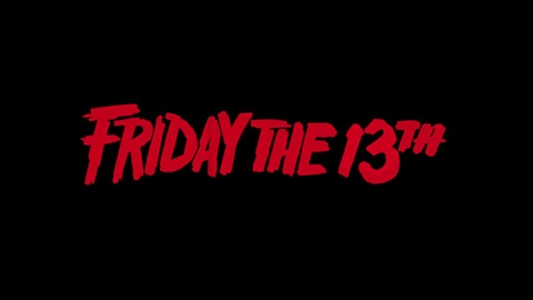
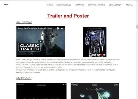
Trailer and Poster
An Example
|
|
|
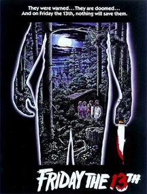
Font: There is a slight familiarity when it comes to the font, the both contain the white and red font however the font in the trailer is not the same as the font on the poster, which is the more iconic of the two as that typography appears in all the later poster and trailers.
Colour scheme: The colour scheme used in theses products are very similar the the red and white font as well as the use of cool colours in both of these products as hey are set in the same location.
Characters: Both of these products contain all of the protagonists but do not show the antagonist Jason Voorhees face, so they are keeping to the same convention.
My Product
|
|
Font: The same font was used in both the trailer and the poster creating as the title used the exact same font to create a feeling of similarity between the products.
Colour Scheme: The created a constant look through all our media platforms, for example, when colour correcting the trailer i used cool colours so it would match up with poster create a consistent tone about the film.
Characters: We also made sure to show the antagonist on both media platforms. This helped the target audience to familiarise themselves with who was going to be in the trailer.
Trailer and Magazine
An Example
|
|
|
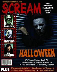
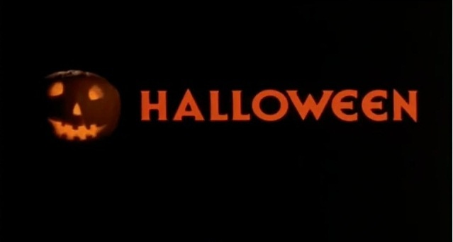
Font: Both of these products use the iconic orange Halloween title which is the iconic title for the movie featured in all of the sequels to create familiarity between the franchise for the audience.
Colour Scheme: The only real similarities in the colour scheme is the orange of the title and the the cool colours used in the picture of the antagonist on the magazine as it matches with the low key lighting in the trailer creating consistency between the two products.
Characters: Both of these products feature the antagonist Mike Myers, this allows the audience to get a sense of familiarity when comparing the magazine to the movie as they now know who to expect in the movie.
My Product

|
|
Font: Across both of these products the same font for the title is used as it promotes the film well giving consistency allowing the audience to easily identify the movie from the products.
Colour Scheme: The colour schemes are both using cool colours, this was done in the trailer during the colour correction to darken the footage and add a turquoise tint to it, while the poster does not use the exact same colour the blue is close that audience would get a sense for the tone of the film.
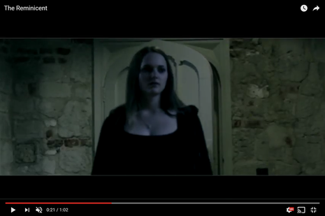
Characters: The protagonist was used in the magazine to give the extended use of the protagonist in the trailer context so that the audience would be able to identify the character and there would be a sense of familiarity as she had appeared in much of the trailer so the audience wouold easily be able to identify the movie from seeing the main image.
Colour Scheme: The colour schemes are both using cool colours, this was done in the trailer during the colour correction to darken the footage and add a turquoise tint to it, while the poster does not use the exact same colour the blue is close that audience would get a sense for the tone of the film.
Characters: The protagonist was used in the magazine to give the extended use of the protagonist in the trailer context so that the audience would be able to identify the character and there would be a sense of familiarity as she had appeared in much of the trailer so the audience wouold easily be able to identify the movie from seeing the main image.
Trailer and Website
An Example
|
|
|
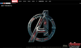
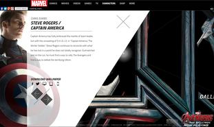
Font: The trailer and website both have the iconic "A" that is featured in the Avengers title, this instantly gives the the products consistency. This continues the brand identity so that when they link the two media platforms together, the audience knows that they are both promoting the same film.
Colour Scheme: Both of these products use the colour scheme that is featured on the antagonist with the use of red and silver so that the audience instantly sees the consistency while the trailer uses bright colours the website uses allot of dark colours which does not show consistency between the two products.
Characters: Both the trailer and website features the protagonist "Captian America" as well as all of the other characters, because you can flick through them the purpose of this is to promote the film to the audience as when they view the website they can get information on all of the characters which helps to promote the film.
My Product
|

|
Font: The trailer and website use the same font when it comes to the title of the film using the papyrus font this gives the two products a sense of familiarity, so the audience can clearly see they are advertising the same products.
Colour Scheme: The website and and trailers colour scheme are different as the website includes white and red, as well as black, this was done for the reason that when a turquoise font was used it did not match the wanted horror tone so it was changed to red.
Characters: The website includes a list of the cast which is includes the characters in the trailer, as you can see the antagonist also appears in the home page of the website to give consistency between the products.
Poster and Magazine
An Example
|
|
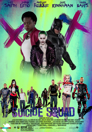
Font: The products both use a different style of font for the title of the movie which shows there is not a consistency between the products while it still promotes the film the magazine will not have the same effect as the poster with is iconic skull face "Q".
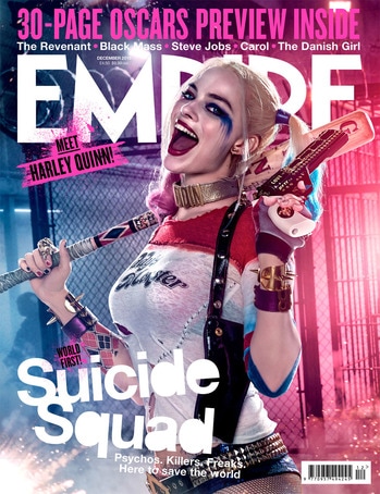
Colour Scheme: Throughout these products bright colours are used as that is the theme of the movie, it gives the audience something that stands out as on the magazine the bright pink and blue background are used to signifies the protagonist Harley Quinn's pink and blue hair to help promote the movie.
Characters: The characters featured on both of the products is Harley Quinn who is one of the main protagonists in the film her iconic look with the pink an blue pony tails and baseball bat help to promote the movie as it give familiarity between the two products for the audience to identify with.
My Product
|
|
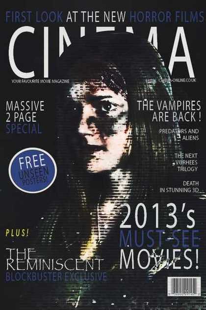
Font: In both of these products the same font is used for the title which gives consistency when promoting the film as it allows the audience to easily recognise what they are marketing.
Colour Scheme: The products use the same range of colours, however as they are different shades there is a lack of consistency between the two, the poster uses turquoise which is also in the trailer but the magazines use of dark blue means it lacks the familiarity between the products and it fails to properly promote the movie.
Characters: These products use different characters, while the poster features the antagonist the magazine includes the protagonist this was done in order to see the binary opposites that are the antagonist and protagonist in order to promote the film as both of these characters are featured in the trailer there is a sense of familiarity for the audience when looking at both products.
Poster and Website
An Example
|
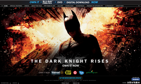
|
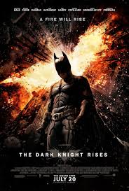
Font: Both of these products include the same white font for the title which is very useful as it gives the products consistency which helps to promote the film.
Colour Scheme: The products both include the same colour scheme of orange and black, the orange is a very typical colour used in action movies. the consistence between these products helps to give the audience the tone and theme of the film that there will be lots of action taking place which would appeal to parts of the audience promoting the film.
Characters: The products both include the protagonist Batman who is an iconic superhero which helps to promote the film, the use of the same character on both of the products shows that there is consistency when it came to promoting the film.
My Product

|
|
Font: The poster and website use the same font for the title to give the products consistency as they promote the film, by keeping the typography the same it creates familiarity for the audience looking at the products.
Colour Scheme: The poster and and website use the same colours when it comes to the banner on the home page of the website, while the other colours used on the website used are red and white this shows that there is not a consistency between the products but with the banner it helps to create familiarity.
Characters: Both of these products feature the antagonist on them which helps to create a feeling of familiarity for the audience as it shows it is clearly marketing the same movie.
Logo - brand identity
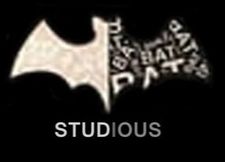
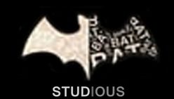
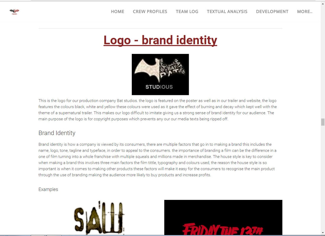
This is the logo for our production company Bat studios. the logo is featured on the poster as well as in our trailer and website, the logo features the colours black, white and yellow these colours were used as it gave the effect of burning and decay which kept well with the theme of a supernatural trailer. This makes our logo difficult to imitate giving us a strong sense of brand identity for our audience. The main purpose of the logo is for copyright purposes which prevents any our our media texts being ripped off.
Brand Identity
Brand identity is how a company is viewed by its consumers, there are multiple factors that go in to making a brand this includes the name, logo, tone, tagline and typeface, in order to appeal to the consumers. the importance of branding a film can be the difference in a one of film turning into a whole franchise with multiple squeals and millions made in merchandise. The house style is key to consider when making a brand this involves three main factors the film tittle, typography and colours used, the reason the house style is so important is when it comes to making other products these factors will make it easy for the consumers to recognise the main product through the use of branding making the audience more likely to buy products and increase profits.
Examples
|
|
|
Our Product
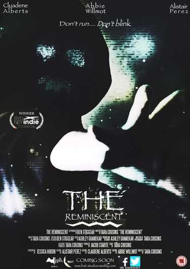
Throughout all of our products the film title "The Reminiscent" is written with the same font and colour, this consistence is important for creating a strong brand by keeping the house style. We used the colour white as it is very rare for movie titles to have a pure white title, we did this as we wanted it to stand out but the colour scheme is something that could be adjusted slightly in order to fit the colour scheme of which ever media platform it is on. To make sure the audience did not simply walk past our product because of the basic colour the typography we have chosen is very unique and therefore has a strong brand identity with the torn decaying effect, making it suitable for branding purposes when making sequels like that of the "Saw" and "Friday the 13th" film franchises.
Example
Brand identity is just as important for production companies as it is for film franchises, as it allows audiences to easily recognize a respectable production company and will make the consumers more likely to view the films made my the company, this make is highly important that they have a strong recognizable logo, typically logos are now composed of graphical elements and the name of the organisation, however "20th century fox" has another aspect to its brand identity, then the logo appears in trailers it is accompanied with a specific tune, this make the brand instantly recognizable to the audience even if the have not seen the logo itself.
Our Product
Bat Studios and its subsidiaries:
A media conglomerate is a company that owns multiple companies that are involved in mass media enterprises, for example this would be television, radio, publishing, motion pictures, the internet and theme parks. The largest media conglomerates currently in America are The Walt Disney Company, 21st Century Fox,CBS Corporation, Time Warner, etc.
BAT Studios has shown their understanding of branding against other media conglomerates, as we have decided to convert our production company into a subsidiary of a large media corporation, this is taking the inspiration from the multiple media corporations.
|
BAT Studios Interactive Entertainment :
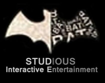
BAT Studios interactive Entertainment is an industry focused on the creation of various video games. There are multiple platforms for them to get involved in for example game consoles, computers, virtual reality, augmented reality and mobile devises. They would create these games by using the inspiration from the films produced by BAT Studios, meaning the interactive entertainment sector would be working with the film industry to produce products, increasing the profits for both of the media platforms.The logo uses brand identity as it has used the same shape of the main logo but now includes the words Interactive Entertainment in order to keep with the house style of the main BAT Studios logo, but at the same time promotes the interactive entertainment. |
|
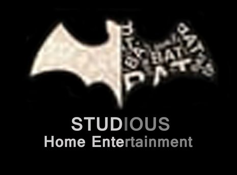
BAT Studios Home Entertainment:
BAT Studios Home Entertainment this is a pre-recorded organisation in charge of the distribution of all the BAT Studios films on all of the different media platforms such a DVD, Blu-Ray, Netflix, sky movies, etc. This would greatly increase profits as the companies such as sky movies would be streaming the films as prices, giving us a proportion of the profits.This logo uses brand identity as it has used the same shape of the main logo but now includes the words Home Entertainment in order to keep with the house style of the main BAT Studios logo, but at the same time promotes the home entertainment. |
|
|
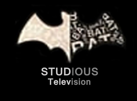
BAT Studios Television:
BAT Studios television is a way of BAT Studios increasing its profit, by broadcasting several television programs to be shown world wide that would be produced by the BAT Studios team, this is beneficial as it promotes the production company by allowing us to capture a wider audience, who will then want to go see the films produced by Bat Studios, this also allows us to advertise out films for minimal costs on the channels owned by Television division. This logo uses brand identity as it has used the same shape of the main logo but now includes the words Television in order to keep with the house style of the main BAT Studios logo, but at the same time promotes the television division. |
|
BAT Studios Musical Entertainment:
Bat Studios Musical Entertainment is a music company with the purpose of composing and recording records and singles with artist and composers, this would include all of the music featured in BAT Studios films as the artist have contracts with the same company, this is important for promoting the films produced by BAT Studios as popular artist being featured would appeal to an audience that may of originally not been interested in the film. This logo uses brand identity as it has used the same shape of the main logo but now includes the words Musical Entertainment in order to keep with the house style of the main BAT Studios logo, but at the same time promotes the Musical entertainment. |

|
|
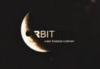
Orbit Distribution:
Orbit Distribution operates as a division of BAT Studios, the company was brought out by the media conglomerate BAT Studios. The function of Orbit Distributions is to distribute films world wide as it is a major distributor. This is highly important for BAT Studios as it means they no longer have to make deals with distributes in individual companies, allowing for easier deals for the film to be distributed in multiple countries world wide. |
Synergy through other Media Platforms
GAME CASE
|
|
|
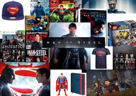
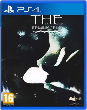
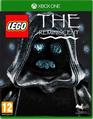
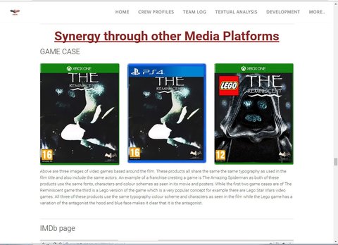
Above are three images of video games based around the film. These products all share the same the same typography as used in the film title and also include the same actors. An example of a franchise cresting a game is The Amazing Spiderman as both of these products use the same fonts, characters and colour schemes as seen in its movie and posters. While the first two game cases are of The Reminiscent game the third is a Lego version of the game which is a very popular concept for example there are Lego Star Wars video games. All three of these products use the same typography colour scheme and characters as seen in the film while the Lego game has a variation of the antagonist the hood and blue face makes it clear that it is the antagonist.
IMDb page
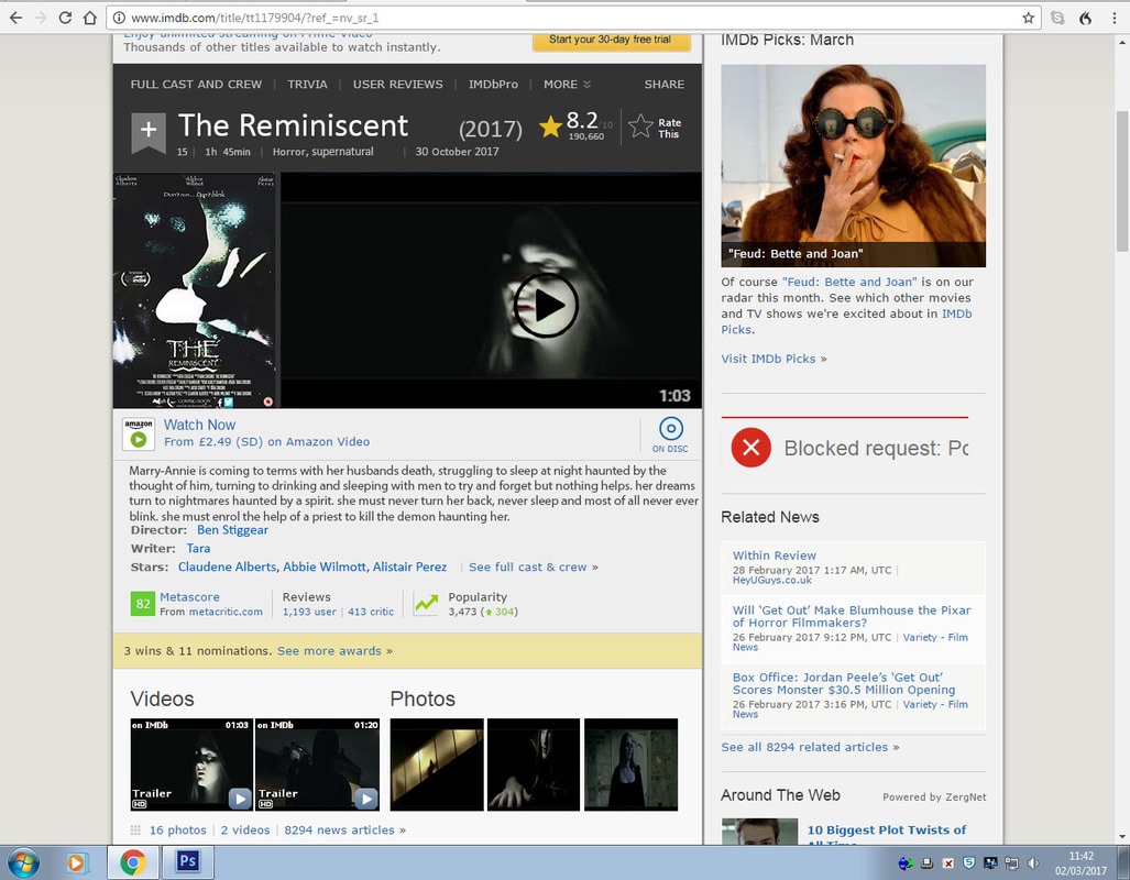
Above is a picture of the films IMDb page (Internet Movie Database) this is a website that contains all of the important information related to films, TV shows and video games. the poster used in this image is the same one as the original film poster used to promote the movie, the site also includes a short description of the movies as well as screen shots form the movie itself to give readers a sense of what the film is about.
The Reminiscent app
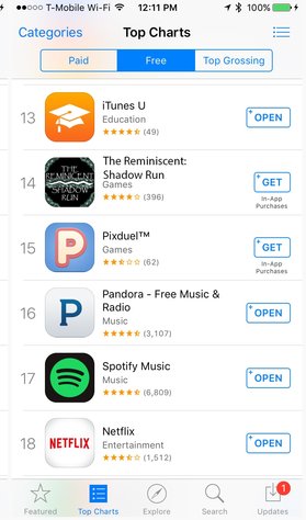
Above is the image of the app for The Reminiscent movie's game "The Reminiscent: Shadow Run" in the Apple store. In the Apple store the game is free in order to draw in a large audience for the game which advertises all of BAT Studios products and the Reminiscent movie itself, however the game itself has "In-App Purchases" this means that the majority of players will then buy content in the game such as extra lives, power ups and character customization. the apple store is pre-installed on all Apple I phones, as Apple sold 74.83m smartphones worldwide last year it is the leading company in its sales of mobile phones, making it the most suitable choice for the app to first come out on.
Cineworld Homepage
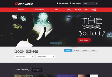
|
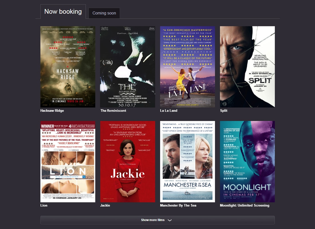
|
Above are two pictures of our film featured on the Cineworld homepage, this particular chain of cinemas is the second-largest cinema operator in the UK with over 800 screens in 82 cinemas. Typically the cinema would have been the main way for a film to make the majority of its profit but living in a post internet age it means that the target audience of 15-18 year old's are now viewing movies illegally this is why it is important to add incentive to the movie with the option of viewing the movie in 3D as are unable to get that experience at home. in both pictures the house style has remained the same with the use of the same font and colours scheme of blue, black, white and yellow throughout.
I tunes page
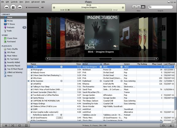
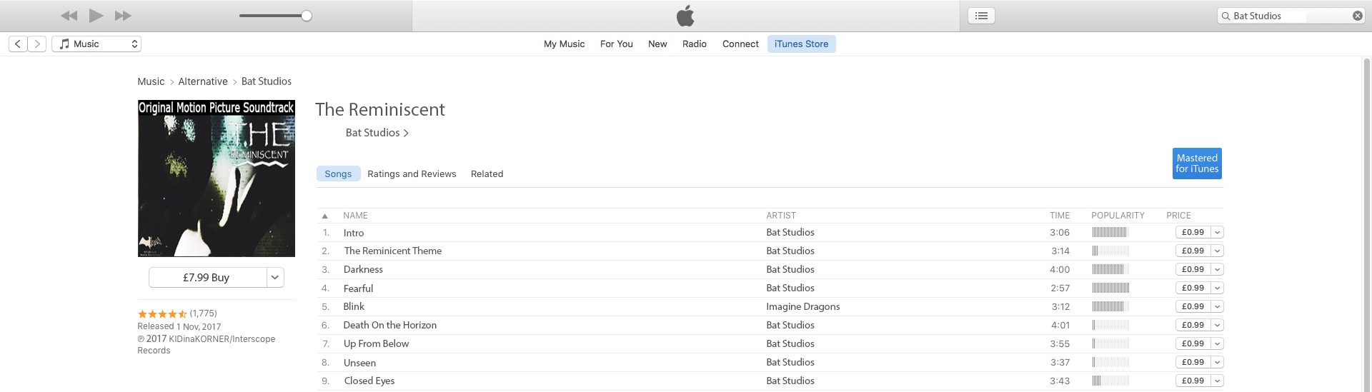
Above is a picture of our motion picture soundtrack available in iTunes. Due to the drop in the sale of physical copies of CD'S in stores it has meant that online retailers and digital media stores like iTunes are the main source of the majority of purchased music. With over 800 million accounts iTunes is the prime place to market the soundtrack from our film. The page features the album art from the soundtracks single, as well as the single itself and the other songs included in the actual movie. while the majority of the younger audience will illegally download this content their is still a proportion of the audience typical the older audience at around 20+ will purchase the soundtrack making this profitable.
Album Covers
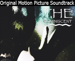
|
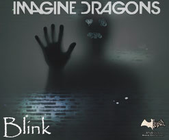
|
above are tow pictures of music album art based around the film The Reminiscent. This is typical of the majority of feature films to release soundtracks and singles of the music heard throughout the film, especial since the singles are typically released by a famous artist or band. On the left is the Original Motion Picture Soundtrack from The Reminiscent movie, this has a similar design to the poster as it features the antagonist and the static background as well as the typography for the film title. on the right is the single from the soundtrack sung by the Imagine Dragons called Blink, this includes a completely different image then used in any other products but it includes the same typography as well as the static effect and the subsidiary company logo.
Billboard
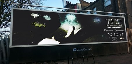
|
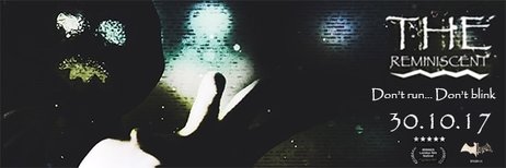
|
Above is a picture of our film being advertised on a billboard while the majority of the audience will be hearing about and viewing advertisements for our movie online it is still important to have physical advertisements in the forma of billboards to give the vital information, in order to get as many people to go and see the film. This poster design is different to our final film poster however it still follows the house style by using the same typography for the film title, tagline and release date, it also uses the same colour scheme of black, blue, white and yellow, it does feature the same dominant image as it is a strong image that will catch the audiences attention.
Wikipedia
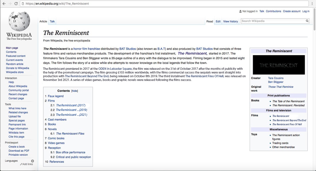
Above is a picture of the film featured on Wikipedia, which is a free internet encyclopedia. On the website you can find all of the important information about The Reminiscent movie such as the release date, what the filmed grossed world wide and where it premiered. the site includes the film title in its original font shown in the trailer to promote the film.
Youtube
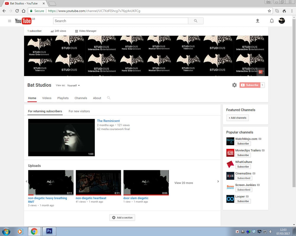
Above is a picture of the Bat Studious YouTube page, the site is estimated to be the third most visited site on the internet which makes it a prime place to advertise the movie. The site is used for the purpose of advertising the Reminiscent movie franchise as is contains the trailers for the movie as well as snippets from the trailer for a breakdown purpose that audience find appealing when trying to find out information about the film. The site also includes all of the Bat Studios subsidiaries which links it well to the main company.
Sky movies
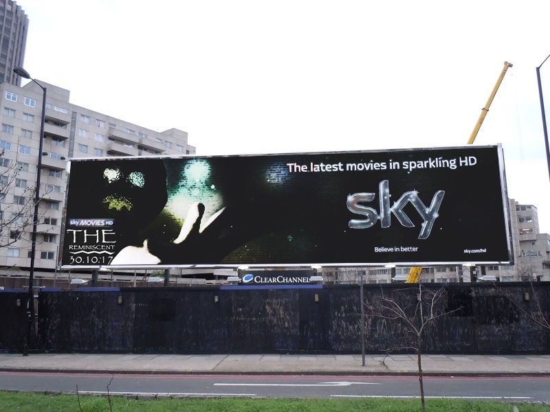
Above is a picture of the film being advertised on a billboard in London, this billboard has a similar design to the previous, however this is an advert from Sky Movies. Sky advertises the majority of its new releases, particularity if they performed well at the Box Office, the movies are released in the sky movie store which you buy. The difference between this poster and the last one is the Sky logo on the poster to advertise Sky Movies as well as the film.
Netflix
Above is a GIPHY of the film on Netflix. Netflix is a subscription-based website that allows you to stream movies and TV series and in 2017 Netflix has recorded over 86 million subscribers.this GIPHY features the film title as seen on the poster as well as a brief description of the movie and 3 screen shots from the film to show the audience what to expect.
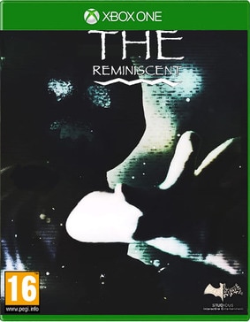
Sequel Poster
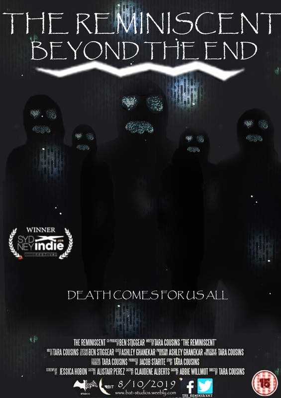
Above is a picture of a sequel poster for The Reminiscent. Sequels are a very common practice for a movie that has performed well in the Box Office ass there is less of a risk for the production company to develop the movie as it is likely the film will now have a strong fan base increasing the likely-hood of the audience viewing the sequel, as they normal develop pre-existing characters. A prime example of a franchise expanding into a sequel after a boom at the box office is the Saw franchise as the first Saw was a very low budget of $1.2 million and the movie grossed $103 million meaning a sequel would be likely to gross even more. The sequel poster keeps the same colour scheme of turquoise and black it also has the static effect used in the previous poster to keep consistency between the products it also has the same typography for the title and tagline as used before.
Thorpe Park Ride
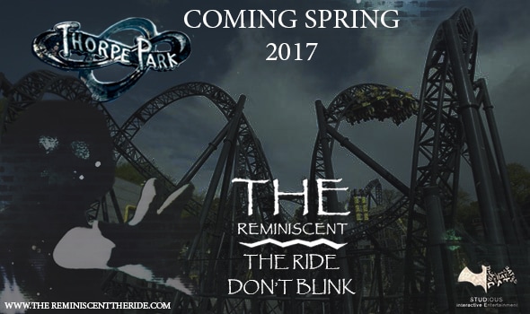
Above is the advertising poster for the release of The Reminiscent Ride, as Thorpe Park is the largest theme park in the UK it seemed best to partner with them, as it is a theme park the ride is based of our Horror film franchise The Reminiscent. an example of this type of synergy is Saw the Ride which is based in Thorpe park. This poster used the same font as used throughout all of the products to give it a strong and noticeable typography, it also features a similar colour scheme using dark colours and there is also a faint static effect on the poster with the antagonist in the corner to properly promote the ride and film.
Conclusion
I looked at all the different factors to considered when questioning how effective the combination of our main product and ancillary texts are.
|
Examples of synergy and ideas of media convergence were useful to look at as the trailer is digital media while the poster and magazine are printed media, but they all have the same purpose to promote the film by reaching a large audience through the different forms of media technologies, making it important to establish many different forms available for the audience. There are multiple ways the audience can be exposed to a particular film, and a films success a film's could be determine just how effective their advertising through cross media convergence is.
|
|
Originality is very rare in media industry as everything has been done before, this means film companies would be foolish not to study past films that have succeeded and consider what they did right. Even though the final products are already produced, it was wise to look at the success of existing real media texts to see what the films have done to gross millions of dollars at the box office. The success of the two film franchises I looked at Paranormal Activity and Scream, prove the effectiveness of the combinations of main products and ancillary texts with all 6 Paranormal Activity films collectively grossing $889,730,075 million at the box office and the Scream franchise collectively bringing in $604,382,926 million worldwide.
|
|
|
Once I analysed exactly what it takes to make a successful film franchise, I began to look at my own main product and ancillary texts to explore how they compare with each other. I decided to look at 3 main factors when comparing them; the fonts used, colour schemes and characters featured. I found that the colours turquoise and black were important to the films tone. I also found that throughout each of the final products, main and ancillary text's, serif fonts was often used such as in Avengers and Friday the 13th. I also found that it was typical to feature one main character in a product, similar to the Batman posters, in the case of The Reminiscent poster and magazine. The consistencies between the products made the main products and ancillary texts effective because they are recognisable from one another even though the website was lacking consistency when it came to the colour scheme.
|
|
Brand identity is vital for all film companies when considering to develop themselves in to a film franchise. A strong brand can be the difference between a successful franchise and a failed one. Successful example of a brand having a strong identity is 20th Century Fox with its iconic logo and theme music making it one of the Big 5. I looked into the logo for our production company Bat Studios, and showed how the logo could be altered to fit the nature of the media technology it is presenting, and also demonstrated my understanding of branding. Using the papyrus font for title of our film gave it a decayed look making it a strong. Effective brand that was present throughout our main product and ancillary texts as the subsidiary logos are present on all of the adverting material.
|
|
Finally I looked at synergy through other media platforms. This involved a combination of everything I had previously looked at in order to illustrate how the film could possibly look presented on a wide range of different media platforms. I tried my best to only consider relevant media platforms such as video games, and a soundtrack. I decided to illustrate what The Reminiscent would look like with a sequel. This looks at the overall effectiveness of the combination of the main products with the ancillary texts.
