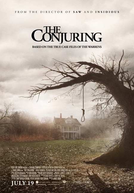
Synopsis: In 1971, the Perron family move into a farmhouse in Rhode Island. The family finds a hidden basement with a locked entrance. Soon they are haunted by ghosts, Carolyn meets the famous paranormal investigators Lorraine and Ed Warren. They visit the house and Lorraine and Ed feel that the house is possessed. Further investigation shows that a witch has sacrificed her baby to Satan and has possessed other mothers that lived in the farmhouse to kill their children. Lorraine and Ed must collect evidences to convince the Church it is necessary an exorcism to save The Perron family from evil. Mise-En-SceneLighting: Low key lighting is used to build up the idea of mystery and create and ominous atmosphere in the poster as this makes the farm house seem isolated, with a small part of high key lighting behind the house to make it stand out in the poster.
NVC: The NVC is the shadow in the bottom right hand corner of a shadow of a women hanging, we can see no details of the women which makes it interesting to the audience wanting to figure out who and what she is. Costume: The women is wearing a dress but that is the only detail to be seen as it is a shadow of the women. Setting: The poster is set in farmland with the use of the old creepy farmhouse being the only structure seen makes it a very isolated place as well as the fog connoting there will be lots of isolating and mystery in the film Props: The loos in the foreground which builds tension as the audience is interested in figuring out who was hanged and why creating an intellectual puzzle. Camera: The poster is and establishing shot of the old farmhouse with the tree and loos in the foreground, the significance of this shot is so we can see wear the story is set, the focus on the loos makes it an item of importance as it can be seen as icon for the horror genre for it is only really horror movies in which people are hanged establishing it as a horror movie poster. Colour: the colours used in the poster are black, grey, green and yellow. the black is used to show the fear that the antagonist will be putting into the antagonists. The grey represents the uncertainty of the Perron family as nothing is as black or white as they once believed before they started getting haunted. Green connotes life in the film as it is the only vibrant colour in the poster fighting through all the other dull colours to stand strong its binary-opposite is the yellow as it is the fallen leaves from the dead tree with the loos hanging from the branch making is represent death in the movie making the battle between life and death a key plot point to the story with is a very normal convention for a horror movie. Typography: the font used throughout the poster is New Times Roman this is a traditional font showing the story will stick to its routs of being based on a true story the title 'The Conjuring' is in black to represent death a the plot involves a family being haunted. Mood & Styling: The lighting in the poster sets a very dark atmosphere which is iconic for horror trailers, it also creates a depressing mood which allows the views to emphasis with the characters. Specific Conventions: The use of the line 'From the directors of SAW and INSIDIOUS' it is using a very common convention for publicity as fans of those films will now be more likely to see this one as it is by the same director the large masthead as the movies name is also very common as it stands out the audience and is memorably so they will not miss or forget the name of the movie. By placing the realise date on the poster in white is stands out and by not making it the biggest text on the poster it doesn't steal attention from the other details which is a comon convention.
0 Comments
Leave a Reply. |
AuthorWrite something about yourself. No need to be fancy, just an overview. ArchivesCategories |
 RSS Feed
