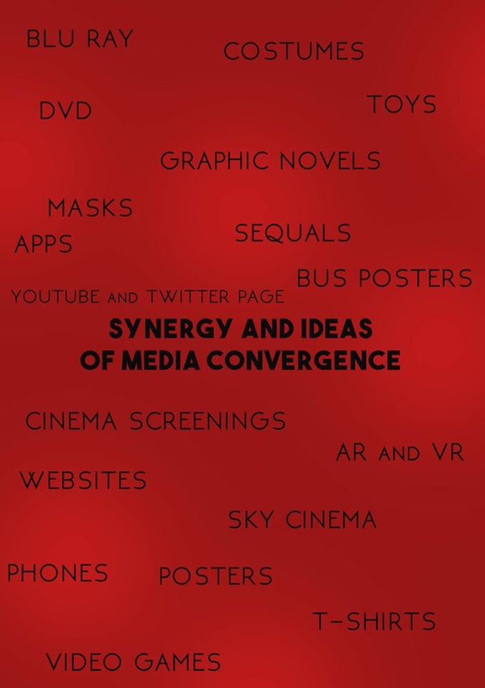
EXAMPLES OF SYNERGY AND IDEAS OF MEDIA CONVERGENCE
For a film or series to be successful and obtain an acceptable profit they need other platforms of entertainment and advertisement to increase their popularity. In the modern age a film does not do well without the help of adverts being placed in platforms such as YouTube and merchandise.
LOGO - BRAND IDENTITY
|
|
|
The logo on the right was the first ever logo that was made by me. It is still an icon on the website placed on the top left of the screen. The logo on the left is a newer logo I made which was used on the poster as well as the trailer for our film. The newer logo has a different bat as the template as well as a different font has been used. Furthermore I have used two colours opposite to each other in order to bring out the logos aesthetics. My strong use of typography and clipping mask makes it harder to copy. Lastly i created a logo in order to put a stamp on mine and my groups work so no one can copyright it.
BRAND IDENTITY
The term brand identity is how consumers view the company and many aspects need to be assessed in order for that, such as the name, logo, tagline, type & fonts, and tone. All of these aspects need to be eye catching and different to other companies. This is so recognisable sequels (continued house style throughout the franchise) can be made which follows the brand identity of the first film.
EXAMPLES
|
|
|
OUR PRODUCT
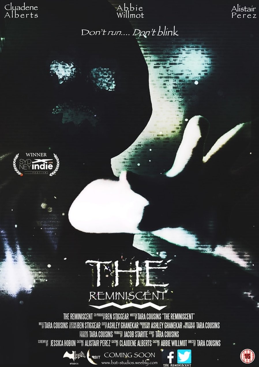
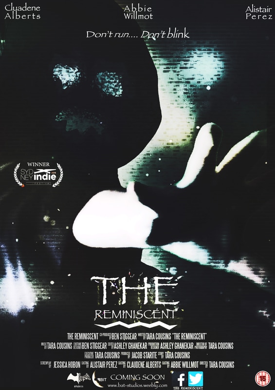
Throughout the whole duration of every creation we have made, the title 'The Reminiscent' has had the same font and colour used consistently. The reason for the use of white is because it is not an overused colour in the horror genre, unlike red and oranges. Furthermore we have added a rotting away effect on the type to catch the passerby's eyes and make it suit the horror genre.
Throughout the whole duration of every creation we have made, the title 'The Reminiscent' has had the same font and colour used consistently. The reason for the use of white is because it is not an overused colour in the horror genre, unlike red and oranges. Furthermore we have added a rotting away effect on the type to catch the passerby's eyes and make it suit the horror genre.
|
|
EXAMPLE
Brand identity also has a huge role to play for production companies also. This is because the films that come under the production companies can gain a lot more attention if the production company is easy to notice by viewers.
Brand identity also has a huge role to play for production companies also. This is because the films that come under the production companies can gain a lot more attention if the production company is easy to notice by viewers.
BAT STUDIOS SUBSIDIARIES
A company the owns smaller companies within it is known as a media conglomerate, and a good example would be Time Warner. For BAT studios I decided to use the older version logo because it is brighter and easier to see.
A company the owns smaller companies within it is known as a media conglomerate, and a good example would be Time Warner. For BAT studios I decided to use the older version logo because it is brighter and easier to see.
|
This industry's main purpose is to create multi-platform video games, ranging from console to PC and even AR and VR's (Augmented and Virtual reality. The games that are created focus on the story and context from the film. The logo does not change in shape or position, however the text I changed.
|
They focus on using the production team to create smaller programs for the viewers entertainment as well as to hold their memory for when the next movie comes out. The logo does not change in shape or position, however the text I changed.
|
The purpose of this industry is to create and record tracks from the music used in the film and trailer. They grab famous artist who made music in the trailer and film to create more tracks for sequels as well. The logo does not change in shape or position, however the text I changed.
|
REMINISCENT APP
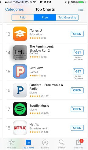
This app is another game made to relate to the context of the film The Reminiscent and its trailer. This app is being shown on the Apple store as 14th place on the Top apps list. This game was inspired by the app known as Temple Run, where the objective of the game is to run away from an enemy chasing you.
This app is another game made to relate to the context of the film The Reminiscent and its trailer. This app is being shown on the Apple store as 14th place on the Top apps list. This game was inspired by the app known as Temple Run, where the objective of the game is to run away from an enemy chasing you.
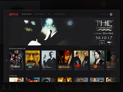
NETFLIX HOMEPAGE
Netflix is the biggest online streaming service for high end movies as well as indie's. The image below presents the reminiscent movie being the main cover above all the high end movies on the homepage with the release date as well as the star rating it was given by movie critics.
Netflix is the biggest online streaming service for high end movies as well as indie's. The image below presents the reminiscent movie being the main cover above all the high end movies on the homepage with the release date as well as the star rating it was given by movie critics.
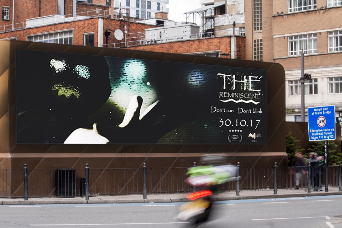
BILLBOARD
Even though digital advertisements are the best way to attract viewers in this day and age physical advertisements still plays a hug role for the industry as for it still brings more consumers. The image below is our films banner on a hug billboard outside next to a busy street. The star rating, title, tagline and release date is still on the banner.
Even though digital advertisements are the best way to attract viewers in this day and age physical advertisements still plays a hug role for the industry as for it still brings more consumers. The image below is our films banner on a hug billboard outside next to a busy street. The star rating, title, tagline and release date is still on the banner.
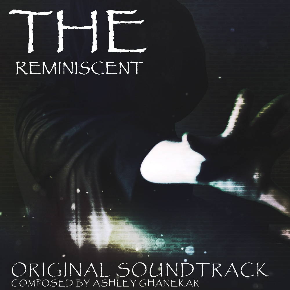
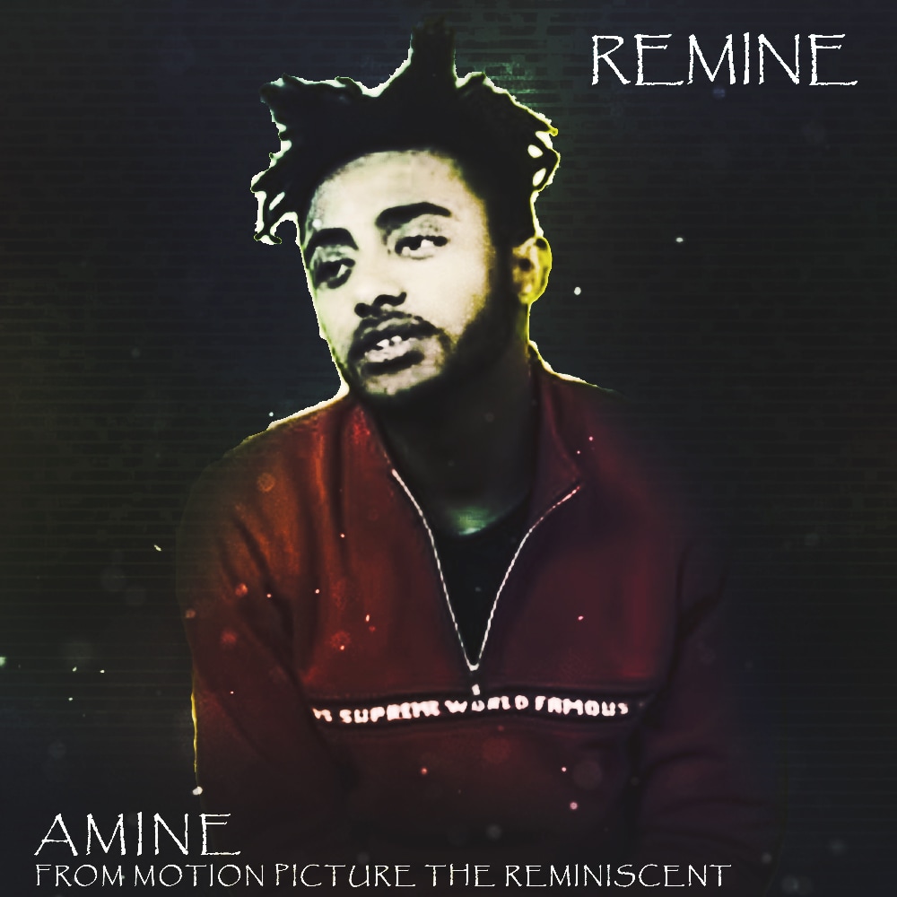
ALBUM COVERS
A good example of a franchise which included albums from famous musicians as well as themselves is Suicide Squad. The first cover on the bottom left is a soundtrack album which consist of all the sounds and music created for the movie and its trailer. Additionally the album on the bottom right contains the tracks created by a famous rapper known as Amine who created music for the film. The typography Papyrus has been used throughout the albums.
A good example of a franchise which included albums from famous musicians as well as themselves is Suicide Squad. The first cover on the bottom left is a soundtrack album which consist of all the sounds and music created for the movie and its trailer. Additionally the album on the bottom right contains the tracks created by a famous rapper known as Amine who created music for the film. The typography Papyrus has been used throughout the albums.
|
|
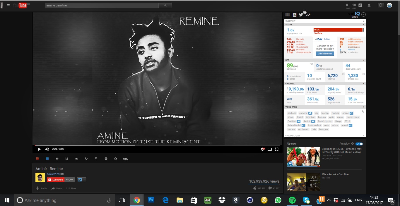
YOUTUBE VIDEO
This image presents a YouTube video created to play the soundtracks created by the famous rapper, with the album cover being the image the viewers see when they listen to the tracks. This video was played on the rappers main music channel (VEVO) to attract more attention.
This image presents a YouTube video created to play the soundtracks created by the famous rapper, with the album cover being the image the viewers see when they listen to the tracks. This video was played on the rappers main music channel (VEVO) to attract more attention.
SUCCESS OF REAL MEDIA TEXT
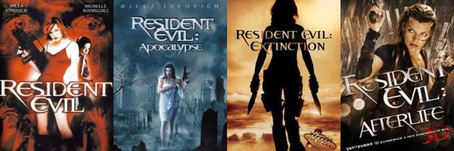
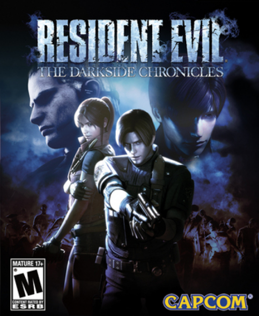
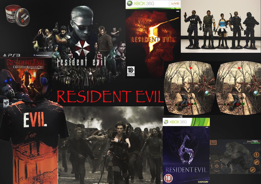
A very good example of a successful franchise in the horror genre is known as resident evil. Their use of CMC and synergy increases the amount of merchandise that can be created, which would ultimately increase the amount of profit that the industry makes. Resident had over 4 sequels. Throughout the trailers the use of the light teal colours and the mechanical scenery has been kept similar throughout the entirety of the franchise.
A very good example of a successful franchise in the horror genre is known as resident evil. Their use of CMC and synergy increases the amount of merchandise that can be created, which would ultimately increase the amount of profit that the industry makes. Resident had over 4 sequels. Throughout the trailers the use of the light teal colours and the mechanical scenery has been kept similar throughout the entirety of the franchise.
|
|
|
|
|
RESIDENT EVIL GAMES
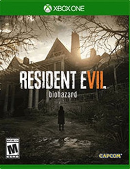
As well as having multiple movies, resident evil is well known for their gaming franchise and have many different games on different platforms. From the game cube to the newest resident evil game Bio hazard which can be played on PC and Consoles. Furthermore with the new game, the profits increased by an extra $39 million.
As well as having multiple movies, resident evil is well known for their gaming franchise and have many different games on different platforms. From the game cube to the newest resident evil game Bio hazard which can be played on PC and Consoles. Furthermore with the new game, the profits increased by an extra $39 million.
|
|
|
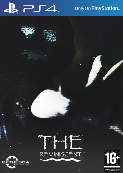
PS4 GAME CASE
|
|
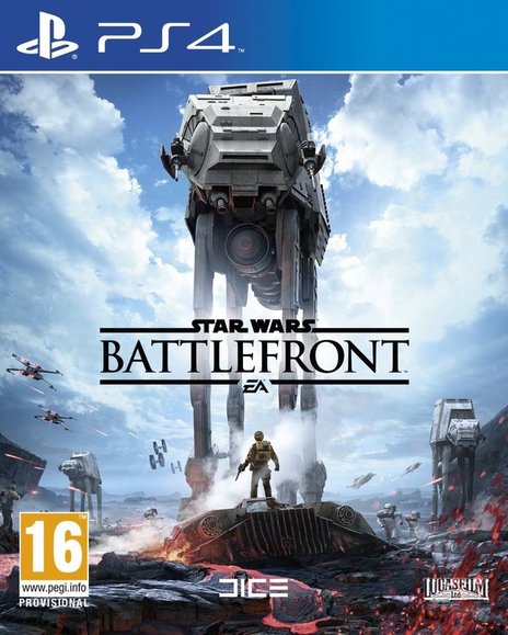
This is the PS4 game case which has an indistinguishable design from the Xbox case, however its on the PS4 help the franchise acquire income. As should be obvious on the Star Wars case the title is set on the center. The game case likewise takes after the position conventions with the rating and studio being on the base, however the title is additionally close to the base.
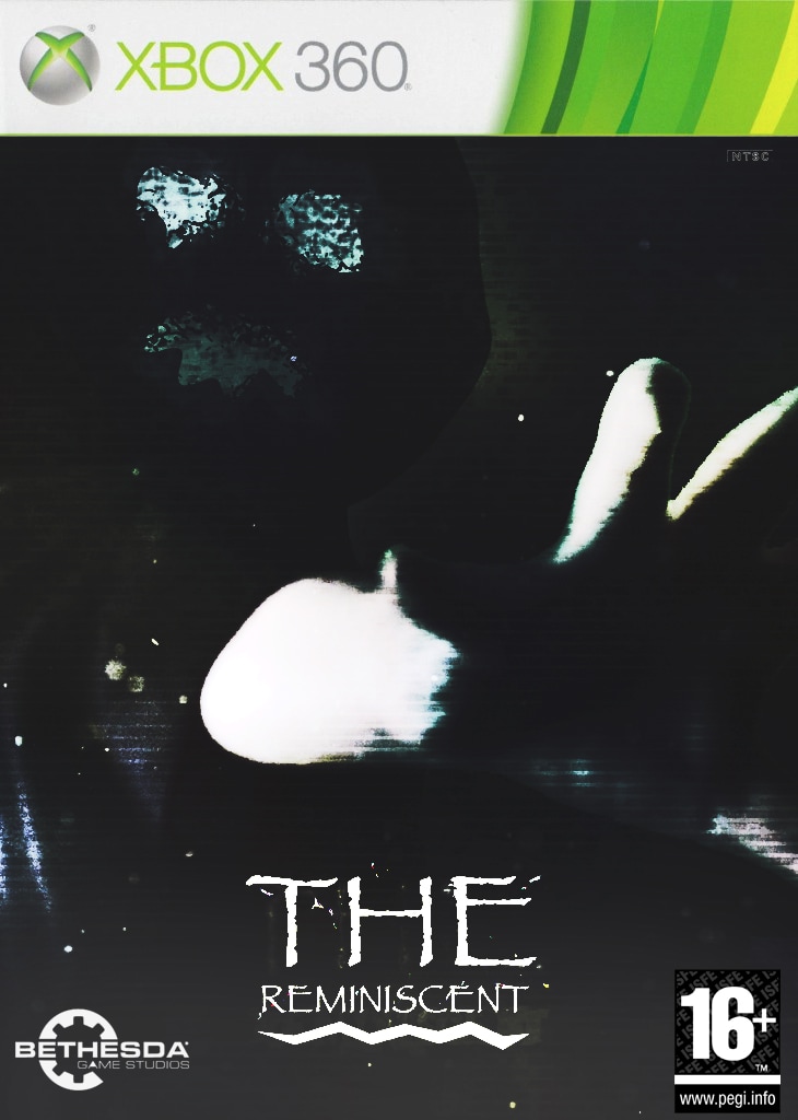
XBOX GAME CASE
|
|
This is an Xbox Game case which targets an older and maturer audience, however the age rating of the movie is 15 and PEGI's rating ranks go up in 3,7,12,16,18 years old so the 16 rating is the closest to the movies. Also the game case on the right only has a image of the game and the title, which means that game case front covers should not have an excessive amount of text. Lastly the new Xbox case cover template is used as for a new system has been added to Xbox where 360 games can be played on the Xbox One (NEWER CONSOLE) through Backwards compatibility. The game case also follows the position conventions with the rating and studio being on the bottom, however the title is also near the bottom.
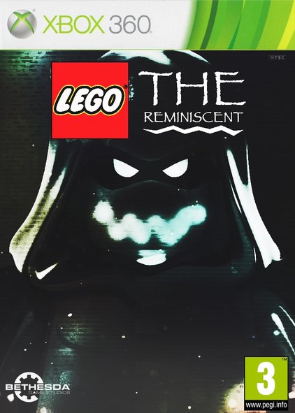
LEGO GAME CASES
|
|
I created a Lego game case to bring variety and show another form of synergy. All Lego game cases are given the age rating of PEGI 3 as for it targets children players and help broaden their creativity as well as their thinking skills. Also I kept the dark teal static background to show consistency and help viewers identify where this game was inspired from (The Reminiscent). The game case also follows the position conventions with the rating and studio being on the bottom and the title of the game being on the top.
EXAMPLES
|
|
TRAILER & POSTER
|
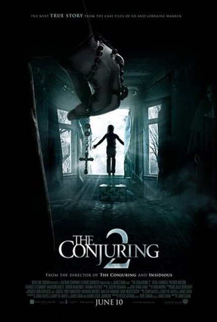
EXAMPLEFONT - Every successful poster takes after a similar house style as the trailer and magazine. Moreover the title for the conjuring 2 has not been controlled at all from the trailer to the poster. Additionally the shading plan utilized as a part of the poster and the trailer has been kept the same. Additionally since this is a continuation movie Brand Identity is an important thing to keep all through the franchise.
COLOUR SCHEME - While viewing the trailer I realized that there are more similarities with the color scheme than differences. The posters utilization of a light teal matches the shade of the dividers, the television static and different parts of the trailer. CHARACTERS - The poster does not uncover the personalities of the characters, rather they show the little girl planning to hop out the window and also another person's hand holding a rosary clearly angled towards a nun on the right side. In addition to this the trailer concentrates on the little girl for the most part as she is being controlled. The ownership could interface with the poster as the poster can delineate that the girl is being had to bounce out the window. |

|
OUR WORKFONT - Also the fonts that were utilised for the poster and the trailers title slates aside from the charging piece is known as Papyrus which is a font that is as of now on the PCs implying that we didn't have to download any true type font file.
COLOUR SCHEME - The colour scheme was additionally encouraged by the Conjuring 2 trailer and poster as for I keep a steady faded teal house style. In addition the house style was kept the same through the lighting utilized in the background as a part of the trailer and poster. CHARACTERS - Furthermore trailer that was made concentrates on the female hero significantly more on the trailer, not at all like the poster which comprise of the enemy as the principle viewpoint. But to demonstrate some similarity we kept the personality of our antagonist covered up in both trailer and poster, and also the magazine. |
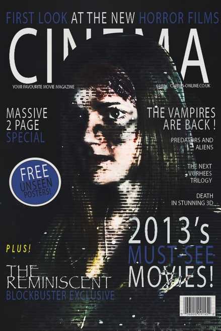
TRAILER & MAGAZINE
|
EXAMPLEFONT - I set aside some of my time to see a wide range of magazines to there trailers and understood that the typography in magazines stick to being intense and don't generally take after the font styles of the trailer, however the fonts that are utilized appear to be like the trailers. Also the metallic texture is used on both the title on the magazine and trailer even though the fonts are not the same.
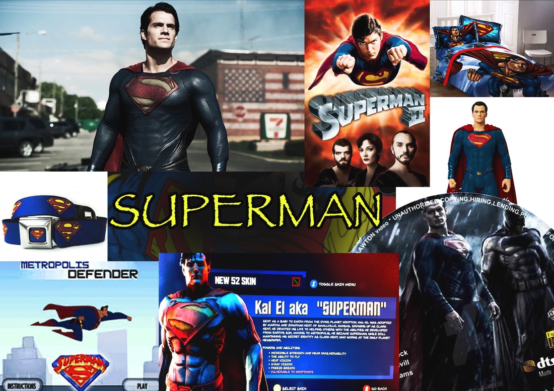
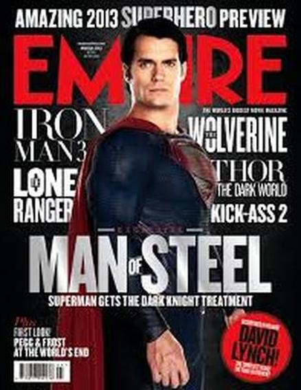
COLOUR SCHEME - The magazine follows the colour scheme quite nicely. One of the costumes colour on the character in the trailer and magazine has been implemented to the colour of the text. Red cape = Red Masthead. Also the black and grey gradient background on the magazine matches the smoke and many clips on the trailer. CHARACTERS - Superman has been used throughout nearly every clip of the trailer as well as being the dominant image on the magazine with the same colours and costume. |

|
OUR WORKFONT - As you can see the font utilised as a part of the magazine don't take after any comparability to the font used in the trailer, but the font was kept the same. Additionally since we kept the house style with a dull a dreary background the text styles should have been of a brighter colour so it can be read properly.
COLOUR SCHEME - The colours used for the background and other aspects have been kept the same like poster and the trailer. The fonts needed a brighter to be brighter so it could be read on the background which was dark. While analysing the blue font does not really fit in with the background. CHARACTERS - The fundamental character was set as the dominant image for the magazine concerning the trailer was based around her, which presents who the primary focus is in the trailer, making clear and compact relations between the trailer and the narrative and makes it simpler to comprehend her significance in the trailer. |
TRAILER & WEBSITE
|
EXAMPLEFONT - The fonts used in the trailer is different to the fonts in the website. The fonts in the website are more formal compared to the robotic and slightly comicy typography used in the trailer.
COLOUR SCHEME - The colour scheme for the guardians of the galaxy trailer consist of metallic reds, browns and wooden textures. CHARACTERS - The trailer doesn't seem to have any similarity towards the website, however the only similarity I found was that all the characters get shown in both. |
|
OUR WORKThe colour scheme between the site and the trailer demonstrates no connection to each other however the logo of our organization has been introduced in them two. Moreover the fonts don't coordinate between the trailer and the site, however the gifs appeared on different pages are dull and terrible which identify with the trailers mood.
|
POSTER & MAGAZINE
|
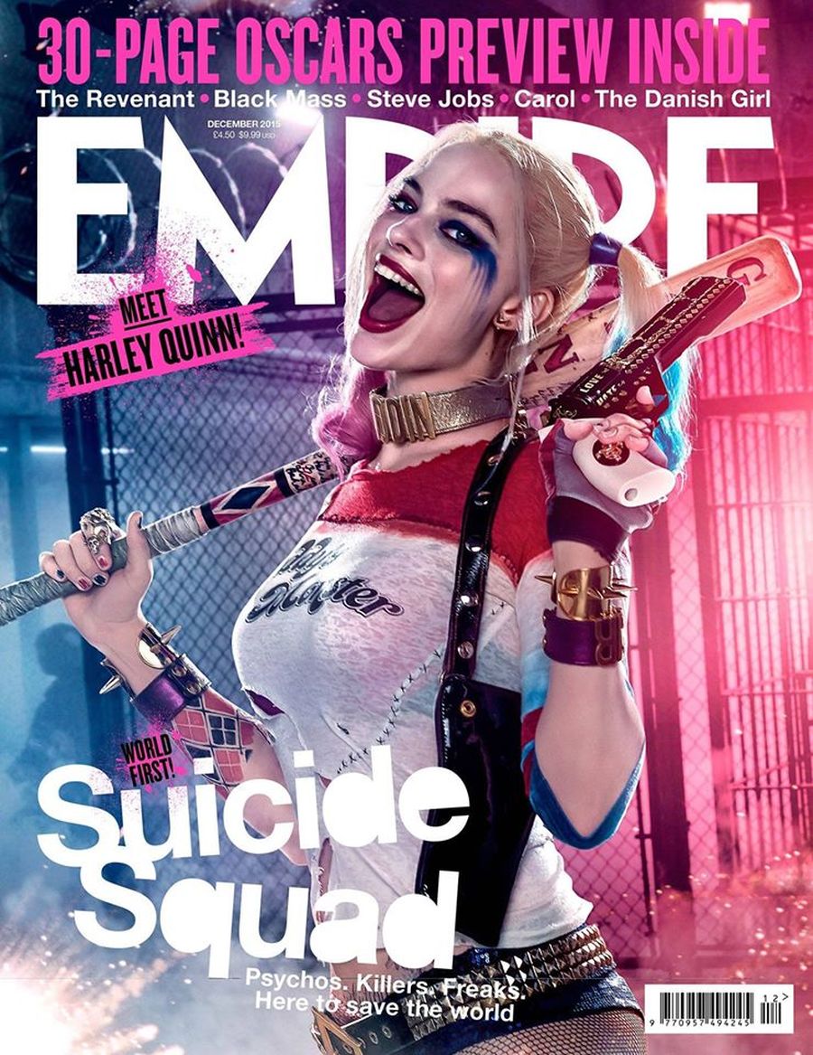
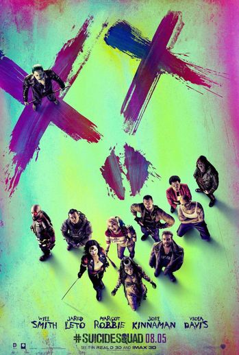
EXAMPLEFONT - The fonts from the suicide squad magazine compared to the poster are different however the colours of the fonts are similar to the characters and the background.
COLOUR SCHEME - The colour scheme from the poster to the magazine are very similar. Firstly the rainbow theme is continued with the purples and pinks being the most used colours because of the character Harley's hair. CHARACTERS - As you can clearly see all the characters have been presented in the poster, however the magazine does not include all character as for having one individual (Preferably) being the main character is a common convention in magazines. |
|
OUR WORKFONT - All of the fonts used from the magazine contrasted with the poster are distinctive, however the title of the trailer we made was kept the same since its a key convention.
COLOUR SCHEME - The static texture has been applied to both poster and magazine to keep consistency, as well as the light teal and green background colour, however the font colours were different between the two as for the magazine contained blue and white unlike the poster which only contained white. CHARACTERS - The magazine had the protagonist and the poster had the antagonist to follow the key conventions. |
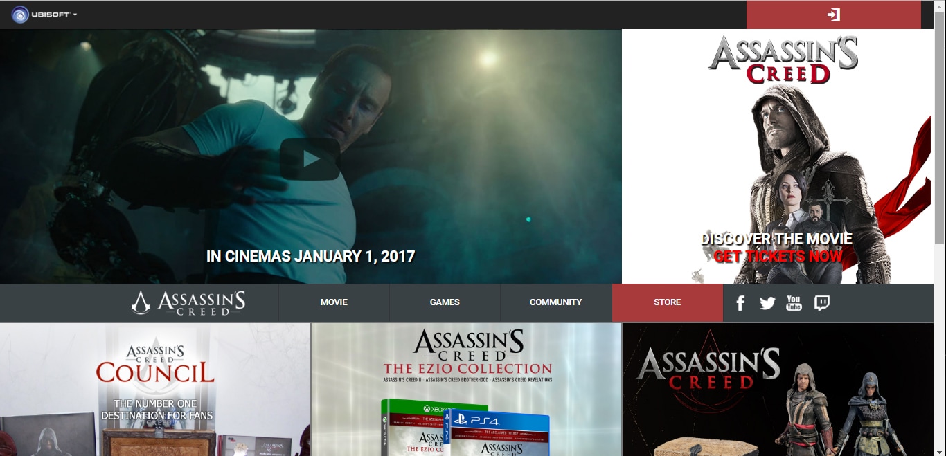
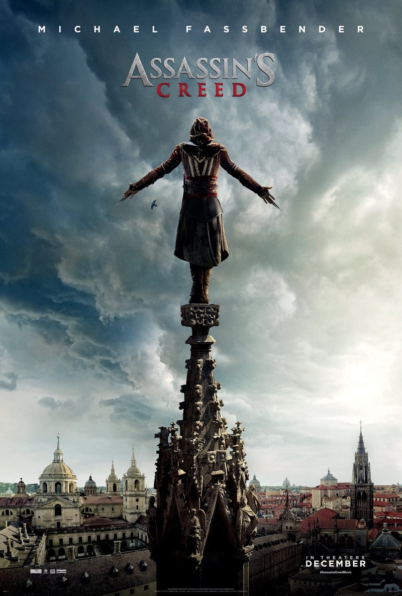
POSTER & WEBSITE
|
EXAMPLEFONT - This example presents a strong connection between font. The title is the same throughout the games as well as the poster and website. Furthermore the bold text is used everywhere as well, however there is not much text on the poster or the website page.
COLOUR SCHEME - The colour scheme has been kept consistent throughout with the sky blues, whites and reds from the costume. All the merchandise and games on the website as well as the movie keep the red and whites as it is a convention used throughout the entire assassins creed franchise. CHARACTERS - The main character being Ezio the assassin is used throughout the franchise and is the dominant model as a whole. |
|
OUR SITEThe font that was utilised on the site is diverse to the poster, however the posters dull background and mood goes with the GIFs that we utilised as a standard to a few pages implying that we didn't have a character on pages and in addition the title.
|
