IN WHAT WAYS DOES YOUR MEDIA PRODUCT USE, DEVELOP OR CHALLENGE FORMS AND CONVENTIONS OF REAL MEDIA PRODUCTS?
What are conventions?
It is about all the distinctive media conventions that have been utilized as a part of the majority of our media items, which would incorporate a Trailer, Horror Magazine and Poster.
They are what allow a text to be put into a certain genre and allow them to be associated with a genre of products. This allows established audiences to be able to easily identify a media product and be able to consume product that would fill their wants and urges as an audience. As a film maker, producers follow conventions in order to create a successful film. For example for our film, which is in the psychological/supernatural genre we looked at existing media texts to meet those expectations.
What it consist of?
It is key that as producers we don't just repeat this conventions in the same way but instead bring a new light to it, in order for audiences to be able to consume it in a new way and that the genre doesn't predictable.
Genre Conventions
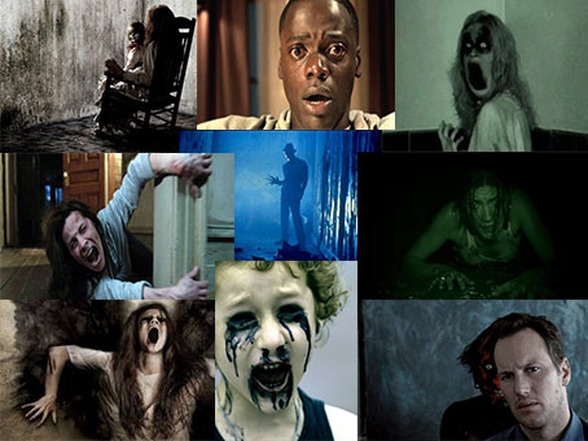
The subgenre for our trailer is Supernatural / Psychological horror. This is a highly popular sub genre in the modern day as it attempt to inflict a sense of realism on its audience. Psychological horror films are often based on the disturbed human psyche especially on possession and dark forces. The protagonist will fall prey to an evil force that is victimising them. The majority of protagonists in psychological horrors are females which is why we decided to use a female lead in our trailer.
Our Trailer |
Real Media Text |
|
|
|
Transitions
|
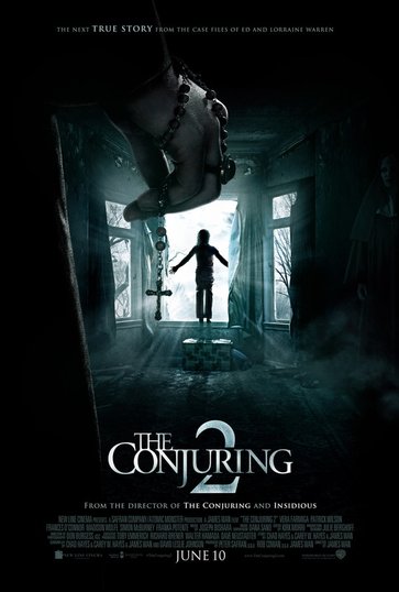
We used fades as a the main transition of the teaser trailer as it is a common convention used in horror trailers at the start to build the tension as the fade to black creates mystery, overall this was a useful convention to use as it went well with the slow pace at the start of the trailer during the first 20 seconds to build tension. The inspiration for this transition was the conjuring 2 teaser trailer as this is a supernatural trailer as well we realised that the trailer relies on setting the mood more than using blood and weapons, this made it important to set a dark and eerie tone with the fade to black as it builds tension. However the fade that we used is not as successful as it is to short, as you can see above the stages of the transition are very clearly fading when compared to us it might not be as clear to the audience thus might lack the building up of tension.
|
|
Fast Cuts
|
|
Lights Out
|
Fast cuts were used at the end of the trailer particulate in the scene with the jump cuts this was used to match the heartbeat and non-diegetic sound going on as the pace of the music quicken so did the speed of the cuts, this was used to show the build-up of tension to the climax of the trailer with the final jump scare. This convention was used as it helps to build up the tension of a trailer for the audience creating an emotional pleasure for the audience, unlike the real media text we did not use multiple texture shots which challenges its typical use of fast cuts as we used it for the purpose of jump cuts, meaning we did not want the cuts to be as fast as the example shown.
Colour Correction
|
|
|
We used the colour correction to match the house style of the poster and magazine using a turquoise tint, as well as darkening shots that were to bright so that they all contained low-key lighting, setting a dark mood for the trailer. We used paranormal activity as a starting point for the colour's we wished to use in the trailer as it is a huge supernatural horror franchise, we found that dark blue appears in many supernatural trailer however this is typical through the use of security camera effects, this meant we didn't want to make it as dark a blue used in the real media text.
Establishing Shot
|
|
Harry Potter
|
The establishing shot was used at the start of the trailer using a canted angle and camera panning up, this was used to show the location we used this convention as it is typical of nearly all horror movies, and specifically for supernatural movies they take place in houses with the use of the camera panning. To improve upon this shot we would have had the camera zoom into the location from a wider shot as it panned up on of the old creepy house, and is a useful convention to set the mood of the trailer.
Over The Shoulder Shot
|
|
No Country For Old Men
|
This convention was used over the shoulder of our antagonist as we didn't want the face to be seen helping to create and intellectual puzzle as to who the antagonist. this shot was used for the second jump scare which is not typical for this shot type but with the accompany of a loud drone and protagonist walking into shot it provides a small visceral pleasure developing this convention as it is usually used to follow a conversation. We developed this convention by not using it for dialog as shown in the real media text as it was for the third jump scare, we liked the look of the shot as it hides the features of the character with their back to the camera which fulfilled the purpose of hiding our antagonist, while this shot is typically used with a shot-reverse-shot we broke this convention as it would of revealed our antagonist which would of ruined the intellectual puzzle.
Jump Shots
|
|
Split
|
This type of shot was used twice in the trailer as our antagonist only moves when it is not seen like the weeping angles from doctor who, by using jump cuts we were able to give the antagonist the appearance of quickly moving location, building up the tension as he moved closer and closer. This is a typical shot for supernatural movies however we developed this convention in this genre of typical to show the progression of an antagonist moving without being seen the camera will pan between the protagonist and antagonist, jump cuts like shown in my real media text example are typically used to show how unstable a character is or the possession of a character by using it for jump cuts we have developed the convention.
Titles/Typoghraphy
|
|
A Nightmare on Elm Street
|
itle slates are key in order for the audience to access key information such as the film name, production team and actors, release date and tag line of the film. The font we chose had a rock filter over it which gave a sinister and dark feel to the trailer. We kept to the simplicity of the titles in the Nightmare on Elm Street trailer with clear font which was in capitals.
Poster
|
|
|
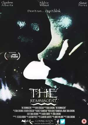
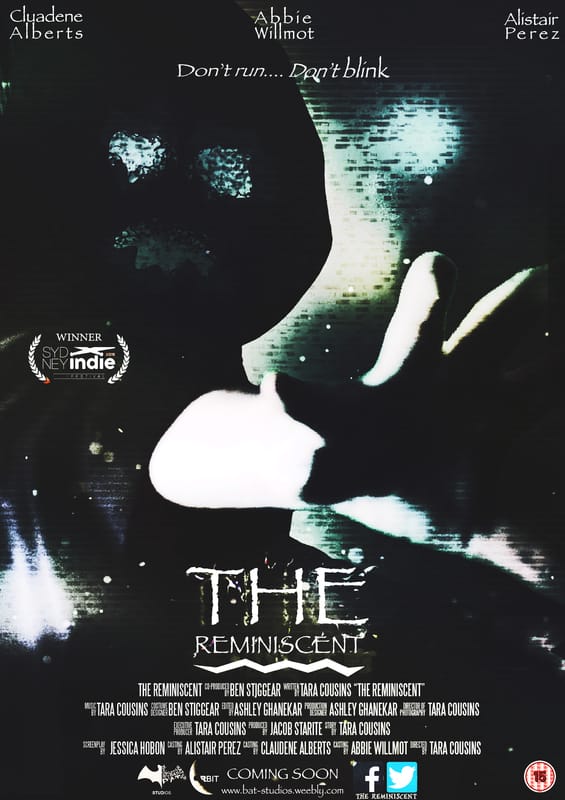
Our Poster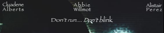
We used a sans serif font for the tagline and actors names on our poster as it kept with the theme of an older feel like the trailer show in the location used. we only used capital letters at the start of each word as we wanted the beginning to stand out but as there is little text on the poster we didn't want them to be to eye catching
The title of the horror film is one of the most vital conventions used in a film poster as this is one of the key ways to advertise the film. we have used this convention by following the typical typography of using a font with a ruff and degrading edge this is important as for supernatural trailers portray death and decay coming back to the world.

To create our billing block we used a billing block template this allowed us to add the names of the stars, producers and other important people that took part in the production of the film. By doing this we have followed the convention as we also placed it at the bottom of the page bellow the title, image and tagline, by placing the billing block there it helped us structure the page to help us create a convincing, successful horror poster.
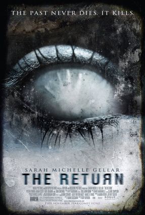
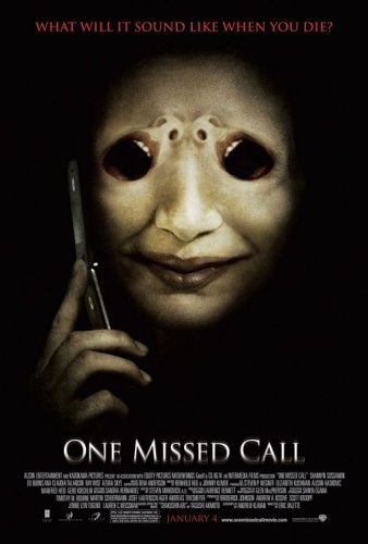
Our posters realise date is not an actual date but simple the words coming soon this challenged the convention as typically an exact date is given so the audience known when the film is coming out. |
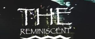
Real Media Text
The tag line is a very important convention as it gives you an idea about what will happen in the trailer, we challenged the convention of having most of our text in lower case as we felt it was to bold with the type of font we used, typical posters use sharper fonts and capital letters as show in the RMT, which we challenged by using a more rounded font
However we developed this convention. White, red and black text is typical in horror posters with a blue tint colour scheme. However to better the poster the word "REMINISCENT" should be in a bigger font than the word "THE" while it catches the audiences attention they may get confused about the title.
The Billing block is an important convention for every horror film poster as it allows the audience to see who was involved in the production of the film.
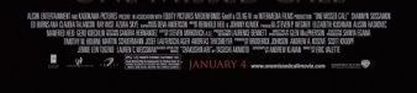
However we felt that as this is a teaser trailer and no exact date is given as to when the trailer will appear it was best to not include the exact date as it keeps with the theme of mystery that teaser trailers create about the movie they are advertising. On this poster you can see that the release date is January 4. |
Magazine
Our Magazine |
Real Media Text |


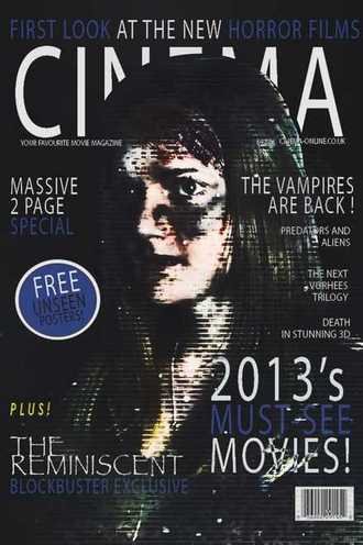
We used __ as the font for the house style of the magazine for the cover lines and masthead as it’s a basic font therefore doesn’t distract from the main image and would be easily recognisable by an established audience. We used capital letters as it is a convention for magazines to have the masthead in capital letters.
These cover lines are smaller text than the rest of the text are they are extra information about what’s inside the magazine. We also chose them to be white as they contrast better against the black background. The cover lines are related to horror topics for example “The next Voorhees trilogy”. By having this cover line, it brings more publicity to the magazine, as Jason Voorhees is a well-known horror character therefore as we feature that character we would have extra publicity for our magazine.
This splash is used as extra advertisement especially conventional for music and film magazines for a special deal or exclusive article inside the magazine. I followed the house style of the magazine using blue and white, I used white text for the ‘FREE’ part as it would stand out against the blue background. I also had the white outlining so that it would further stand out.
The title of the horror film is one of the most vital conventions of a film magazine as it has to reflect the same text and effects used on the movie poster. This is so that it can be recognised by its audience as the same text is used throughout any advertising and in the showing of the film. We used ‘Papyrus’ as the text for it and used a rough edge as this is important for supernatural as it portrays deaths and decay.
As blue, white and black were the house style colours for the magazine, alternating colours were used to bring attention to the advert of the magazine. We used the same font for the house style of the magazine throughout as this is a convention of magazines that the text is the same. We also kept the text in capital letters throughout.
|


It is a convention in movie and music magazines for the subject of the main image to be over the masthead. This is used for well-known magazines, as the audience would be able to recognise the masthead even though it’s behind the subject of the main image.
The colour scheme in this magazine is white, red, blue and black, which appears as the theme colours for the existing movie. The cover lines regard other media texts as ours does, such as ‘Mad Max’ and ‘Doctor Who’, therefore providing further advertising and bringing in a wider audience for the magazine. This magazine has used alternating colours, white for the main cover lines and red for the less important cover lines.
This splash is used with the house style colours as extra advertisement for the magazine. As the house style for this magazine is blue, red, black and white the splash is reflected as following the house style.
This is the title of the horror film and used to reflect the same font used on the films movie poster and in the film when it would be shown on screen. This is so that it can be recognised wherever by an established audience. The font used reflects the theme of the magazine, as it is outlined by blue shiny text as the genre of the film is science fiction, ‘Cowboys & Aliens’.
‘Magazine of the year’ is used to further push the magazine and how popular it is. However, in my magazine, ‘First look at the new horror films’ was used. It gives a good idea about what is contained in the magazine and what type of magazine it is. In the real media text it is bold and one colour, with sharp font.
|
Ben -Sound
Non-Diegetic Sound
|
|
Nightmare on Elm Street
|
Non-digetic sound is sound that comes outside of the story source.This is a common convention that all trailers use as it creates atmosphere and tension in the trailer through the post-production editing stage. we used this convention as it guaranteed the project to be more effective, through the use on music to build tension in=t creates a hyper reality, the real media example from insidious chapter 2 has voices on in the background which is a theme we wanted for the trailer as it is ominous especially with the theme of isolation in our location.
Diegetic Sound
|
|
Fight Club Door Slam
|
Digetic sound is in the world of the movie, for example: breathing, shattering glass or a door slam. The characters in the film can hear this sound as well as the audience. These sounds are useful for creating jump scares. We created these sounds during the production stage to make sure our project is effective, this convention was used as all trailers have some type of digetic sound within them the use of a door slam is accompanied with the first jump scare, by raising the volume of the footage in post-production.
Montage
|
|
Predator Breathing and Heart Beat sound effect
|
During our montage in our film, we used to sound effects a heart beat and heavy breathing these sounds were used as it increases the tension of the footage as the pace of the cuts fastens then so does the pace of the heartbeats, the real media texts influenced the way we used the sound for we felt that on there own they didn't build the tension with the same effect but together they allow the audience an emotional pleasure of fear.
Ben-Camera Angles
Canted angle
|
|
Mission Impossible
|
The canted angle was used in the running scene as we wanted it to make the shot stand out, it was also being used as part of a dream sequence which is the typical use of canted angles as it sets scenes apart from one and other. The real media text as shown above is an example of how a canted angle is used to create tension by prolonging the shot it builds the tension for the audience as it creates mystery about what will happen next which is one of the purposes of the shot being used in our trailer as the audience doesn't know what the protagonist is running away from creating an intellectual puzzle.
High Angle
|
|
Captain America Example
|
We used this shot to show the weakness of our protagonist especially since she is a female who are typically shown as weak in horror movies, unless they are a finale girl who only becomes strong when fighting the antagonist which wouldn't appear in a trailer. like the real media text we used this shot to show the weakness of our female protagonist which is typical as all films need to either be sexist or misogynist in order to show character development an later portray the female protagonist as strong and a finale girl which makes the movie empowering.
Colours used
Poster
|
|
Magazine
|
|
Trailer
LIGHTING - Tara
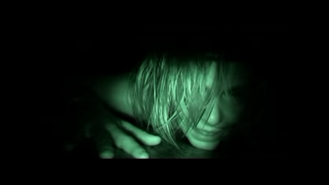
We used 'Rec' as influence for our scene on the left, however we chose not to use a night vision effect or filter as our trailer didn't follow the theme of having a recording. Therefore we had to use lighting effectively to create a realistic drag scene. For example, we used three flashlights to create lighting on the antagonist's face and hands, to highlight the struggle before she is pulled into darkness. The lighting was used from a high angle pointing down onto the antagonist.
Length - Tara
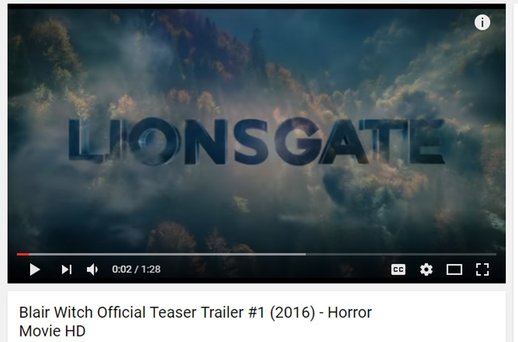
Blair Witch's teaser trailer featured the production company and distributor introductions which were placed symmetrical with our teaser trailers, as well as a vague cloud effect which we added into the background.
Below are the structural conventions of Teaser Trailer, and a shot by shot analysis for the Conjuring 2 teaser trailer.
Jumpscares - Tara
For our trailer we have followed the conventions of the 'Split' trailer by placing jump scares at or around the 20, 45 and 60 second mark. We also used influence from The Conjuring trailer for our company and distribution introductions.
POSTERS

Our Poster Vs Real Media Text

We noticed that some real media texts diffrentiate in terms of layout, house style and details. For example, with out poster, we have the main Cast's names on the top of our poster whereas Nightmare on Elm Street doesn't. They also chose to have a specific date on their poster whereas our's says "Coming Soon".
In our poster, we followed the main conventions that a real media poster follows to make it look realistic and professional. These conventions are in place in order to have a layout an established audience would recognise. Therefore we looked at a psychological horror's poster in order to create something similar.
SETTING
OUR TRAILER
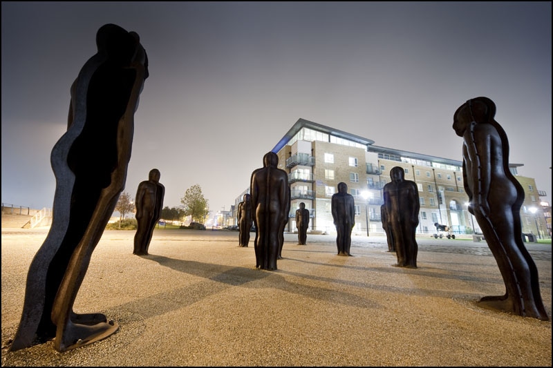
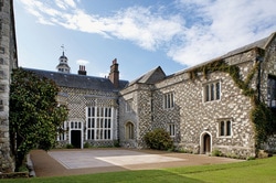
In our trailer the setting that we had chosen was an old manor house. The reason that this location was chosen is because an old building is a common convention in horror movies and consist of many broken and or rough areas within it. We also used a scenic statue place in order to reinforce the fact of something moving when you blink, therefore having an antagonist moving among silhouettes would fully create a horror atmosphere. |
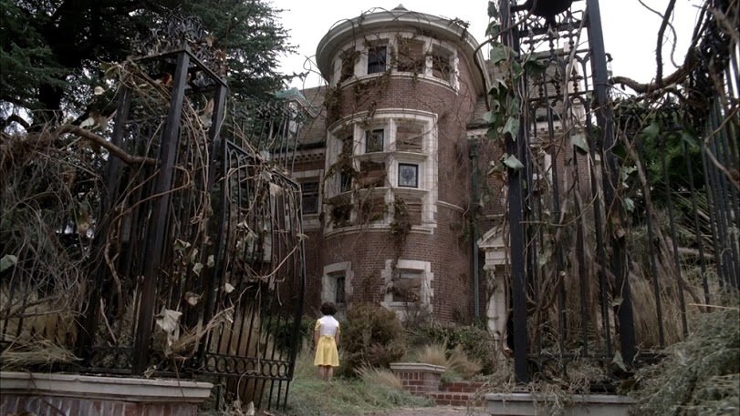
REAL MEDIA TEXTS - TARA
The real media text above present haunted houses and manors which are utilised to create tension through the large size it is. The idea behind it is that the larger the building, the more in it that is unknown by the audience. This therefore has an intimidating effect and is the reason for why we have decided to use this convention for our trailer. We used influence from Insidious and American Horror Story. |