Within the horror genre there are many common conventions that are used when creating a typical teaser trailer, however in order to make sure that a trailer does not simply become to predictable it is important to challenge and develop these conventions. During the development stage in order for a film to be clear as to what sub-genre it is in it is important for the film to use the majority of typical conventions for example a zombie film must involve a zombie, even if the genre has been challenged by creating a hybrid putting together multiple genres like comedies and zombie movies becoming a zom-com. While you must keep some of the typical conventions for the audience to be able to easily distinguish between different genres through stock characters, situations, lighting and many more, to set the right tone and mode through the conventions used.
Our Trailer |
Real Media Text |
|
|
|
Editing
Transitions
|
|
The Conjuring 2
|
We used fades as a the main transition of the teaser trailer as it is a common convention used in horror trailers at the start to build the tension as the fade to black creates mystery, overall this was a useful convention to use as it went well with the slow pace at the start of the trailer during the first 20 seconds to build tension. The inspiration for this transition was the conjuring 2 teaser trailer as this is a supernatural trailer as well we realised that the trailer relies on setting the mood more than using blood and weapons, this made it important to set a dark and eerie tone with the fade to black as it builds tension. however the fade that we used is not as successful as it is to short, as you can see above the stages of the transition are very clearly fading when compared to us it might not be as clear to the audience thus might lack the building up of tension.
Fast Cuts
|
|
Lights Out
|
Fast cuts were used at the end of the trailer particulate in the scene with the jump cuts this was used to match the heartbeat and non-diegetic sound going on as the pace of the music quicken so did the speed of the cuts, this was used to show the build-up of tension to the climax of the trailer with the final jump scare. This convention was used as it helps to build up the tension of a trailer for the audience creating an emotional pleasure for the audience, unlike the real media text we did not use multiple texture shots which challenges its typical use of fast cuts as we used it for the purpose of jump cuts, meaning we did not want the cuts to be as fast as the example shown.
Colour Correction
|
|
Paranormal Activity
|
We used the colour correction to match the house style of the poster and magazine using a turquoise tint, as well as darkening shots that were to bright so that they all contained low-key lighting, setting a dark mood for the trailer. We used paranormal activity as a starting point for the colour's we wished to use in the trailer as it is a huge supernatural horror franchise, we found that dark blue appears in many supernatural trailer however this is typical through the use of security camera effects, this meant we didn't want to make it as dark a blue used in the real media text.
Types of shots
Establishing Shot
|
|
The Conjuring 2
|
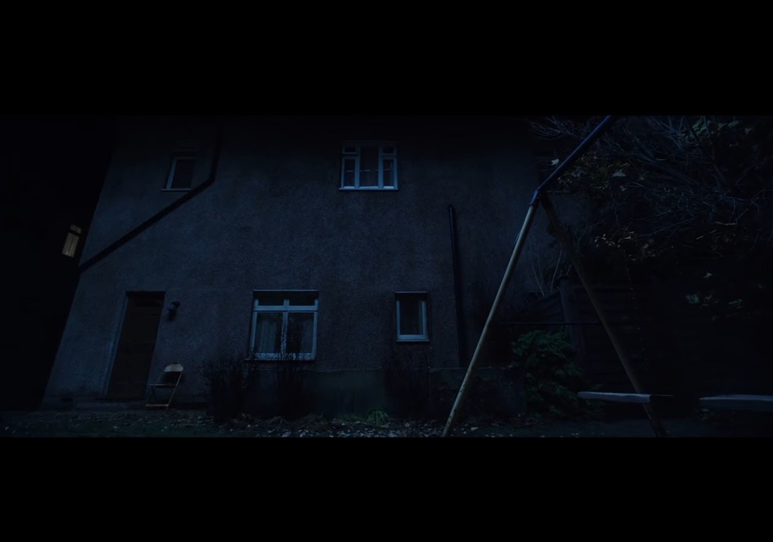
The establishing shot was used at the start of the trailer using a canted angle and camera panning up, this was used to show the location we used this convention as it is typical of nearly all horror movies, and specifically for supernatural movies they take place in houses with the use of the camera panning. To improve upon this shot we would have had the camera zoom into the location from a wider shot as it panned up on of the old creepy house, and is a useful convention to set the mood of the trailer.
Over The Shoulder Shot
|
|
Friend Request
|
This convention was used over the shoulder of our antagonist as we didn't want the face to be seen helping to create and intellectual puzzle as to who the antagonist. this shot was used for the second jump scare which is not typical for this shot type but with the accompany of a loud drone and protagonist walking into shot it provides a small visceral pleasure developing this convention as it is usually used to follow a conversation. We developed this convention by not using it for dialog as shown in the real media text as it was for the third jump scare, we liked the look of the shot as it hides the features of the character with their back to the camera which fulfilled the purpose of hiding our antagonist, while this shot is typically used with a shot-reverse-shot we broke this convention as it would of revealed our antagonist which would of ruined the intellectual puzzle.
Jump Shots
|
|
Split
|
This type of shot was used twice in the trailer as our antagonist only moves when it is not seen like the weeping angles from doctor who, by using jump cuts we were able to give the antagonist the appearance of quickly moving location, building up the tension as he moved closer and closer. This is a typical shot for supernatural movies however we developed this convention in this genre of typical to show the progression of an antagonist moving without being seen the camera will pan between the protagonist and antagonist, jump cuts like shown in my real media text example are typically used to show how unstable a character is or the possession of a character by using it for jump cuts we have developed the convention.
Titles/Typoghraphy
|
|
The Conjuring 2
|
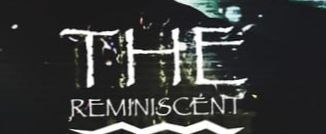
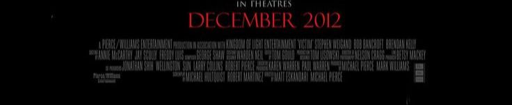
The title slates were used to get across all of the important information in the trailer such as the director information, release date, name of film and the trailer the font we chose was used as with the rocky effect it gave the illusion of decay which would set an eerie tone for the trailer. Title slates from the Conjuring 2 teaser trailer was the inspiration for the titles of our trailer as we liked the warn effect on the text but felt the bright silver colour with the black gradient didn’t fit properly so we adapted it to match with the theme of death and decay in the trailer.
Poster
|
|
|
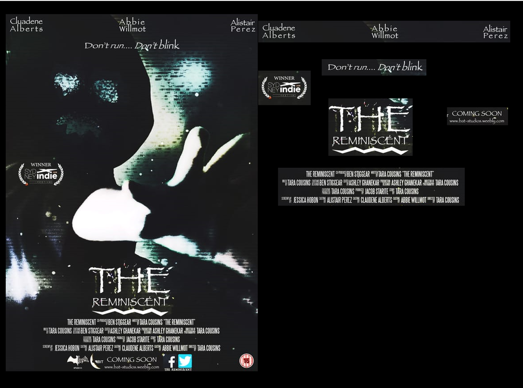
Our Poster
We used a sans serif font for the tagline and actors names on our poster as it kept with the theme of an older feel like the trailer show in the location used. we only used capital letters at the start of each word as we wanted the beginning to stand out but as there is little text on the poster we didn't want them to be to eye catching
The title of the horror film is one of the most vital conventions used in a film poster as this is one of the key ways to advertise the film. we have used this convention by following the typical typography of using a font with a ruff and degrading edge this is important as for supernatural trailers portray death and decay coming back to the world.
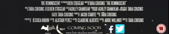
To create our billing block we used a billing block template this allowed us to add the names of the stars, producers and other important people that took part in the production of the film. By doing this we have followed the convention as we also placed it at the bottom of the page bellow the title, image and tagline, by placing the billing block there it helped us structure the page to help us create a convincing, successful horror poster. You must include a billing block as acts as a copyright for all of your work.
Our posters realise date is not an actual date but simple the words coming soon this challenged the convention as typically an exact date is given so the audience known when the film is coming out. |
Real Media Text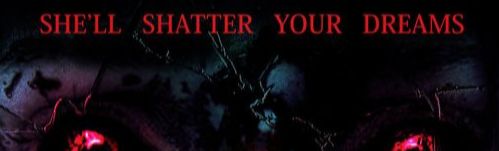
the tag line is a very important convention as it gives you an idea about what will happen in the trailer, we challenged the convention of having all the text in capitals as we felt it was to bold with the type of font we used, typical posters sharper fonts our used which stand out when in capitals as shown on the real media text which we challenged by using a more rounded font
however we developed this convention as typically red fonts our used in film posters but as our colour scheme used blues and the convention is to typical we felt the poster needed some originality, which is why we went with a white font instead. however to better the poster the word "REMINISCENT" should be in a bigger font then the word "THE" while it catches the audiences attention they may get confused about the title.
The Billing block is an important convention for every horror film poster as it allows the audience to see who was involved in the production of the film.
However we felt that as this is a teaser trailer and no exact date is given as to when the trailer will appear it was best to not include the exact date as it keeps with the theme of mystery that teaser trailers create about the movie they are advertising. |
Magazine
Our Magazine |
Real Media Text |
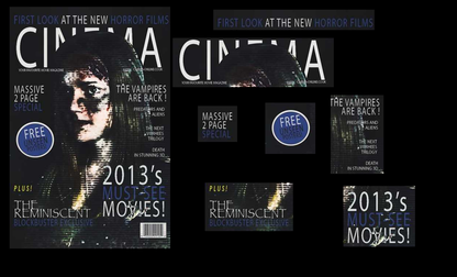
The masthead for our magazine is covered by the dominant image which is a typical convention to use as you can see from the real life media text example on the right.
The text in the cover line stands out on the black background thanks to it being white which fits with the colour scheme of the trailer and poster, however it is not clear as the font is very thin.
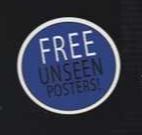
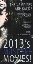
The text in the graphical element is used to promote the the magazine through the use of the word 'FREE' in capital white letters on the white background in order to promote the magazine and act as a sell line.
The main cover line uses the same papyrus font that is used in the poster and magazine to create consistency between the products, so that the audience can easily identify what the magazine is promoting, as the house style is the same which is typical for a magazine.
|
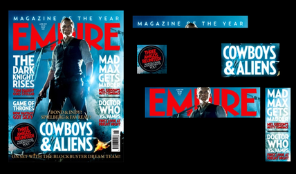
However unlike this image, our image covers to much of the masthead making it very difficult to read, as the masthead is supposed to stand out in order to draw the audiences attention as it is a symbol of familiarity for the audience so while we followed this convention it was not carried out correctly.
This convention was used as it nearly all magazine front covers contain cover lines in order to promote the content inside the magazine, we felt that this was necessary in order to create a hyper reality about the magazine.
This is a very typical convention to use as you can see from the real life media text, this convention was not developed in any way as there is no need too, by placing the sell line on a graphical element it makes it very eye catching.
As the real media text shows the this main cover line matches the colour scheme of the magazine which is in the same house style as the movie in order to promote it, so there was no need to develop this convention as it works well at allowing the audience to recognise what a magazine is promoting easily.
|
Sound
Non-Diegetic Sound
|
|
insidious chapter 2
|
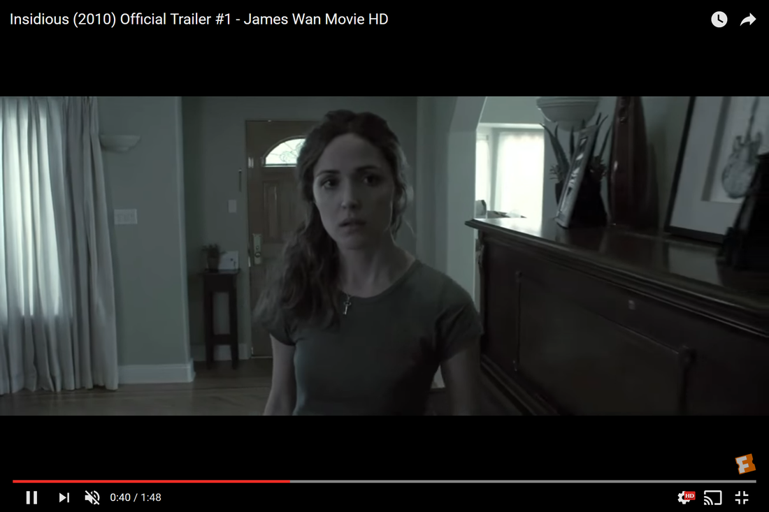
Non-digetic sound is sound that comes outside of the story source.This is a common convention that all trailers use as it creates atmosphere and tension in the trailer through the post-production editing stage. we used this convention as it guaranteed the project to be more effective, through the use on music to build tension it creates a hyper reality, the real media example from insidious chapter 2 has voices on in the background which is a theme we wanted for the trailer as it is ominous especially with the theme of isolation in our location.
Diegetic Sound
|
|
Insidious chapter 2
|
Digetic sound is in the world of the movie, for example: breathing, shattering glass or a door slam. The characters in the film can hear this sound as well as the audience. These sounds are useful for creating jump scares. We created these sounds during the production stage to make sure our project is effective, this convention was used as all trailers have some type of digetic sound within them the use of a door slam is accompanied with the first jump scare, by raising the volume of the footage in post-production.
Montage
|
|
PET and dont breath
|
During our montage in our film, we used to sound effects a heart beat and heavy breathing these sounds were used as it increases the tension of the footage as the pace of the cuts fastens then so does the pace of the heartbeats, the real media texts influenced the way we used the sound for we felt that on there own they didn't build the tension with the same effect but together they allow the audience an emotional pleasure of fear.
Camera Angles
Canted angle
|
|
Paranormal Activity 2
|
The canted angle was used in the running scene as we wanted it to make the shot stand out, it was also being used as part of a dream sequence which is the typical use of canted angles as it sets scenes apart from one and other. The real media text as shown above is an example of how a canted angle is used to create tension by prolonging the shot it builds the tension for the audience as it creates mystery about what will happen next which is one of the purposes of the shot being used in our trailer as the audience doesn't know what the protagonist is running away from creating an intellectual puzzle.
High Angle
|
|
Insidious 3
|
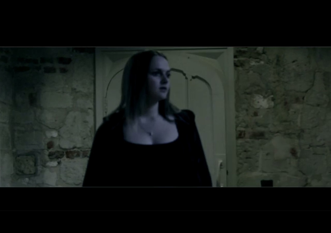
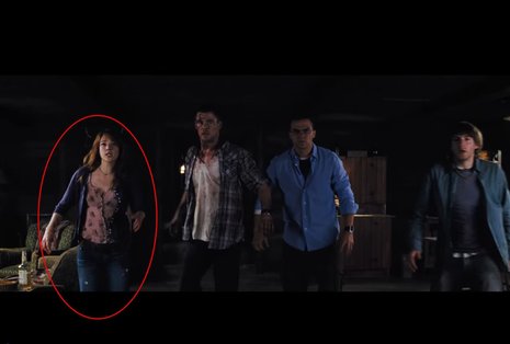
We used this shot to show the weakness of our protagonist especially since she is a female who are typically shown as weak in horror movies, unless they are a finale girl who only becomes strong when fighting the antagonist which wouldn't appear in a trailer. like the real media text we used this shot to show the weakness of our female protagonist which is typical as all films need to either be sexist or misogynist in order to show character development an later portray the female protagonist as strong and a finale girl which makes the movie empowering.
Colours used
Poster
Magazine
LIGHTING

|
Insidious
|
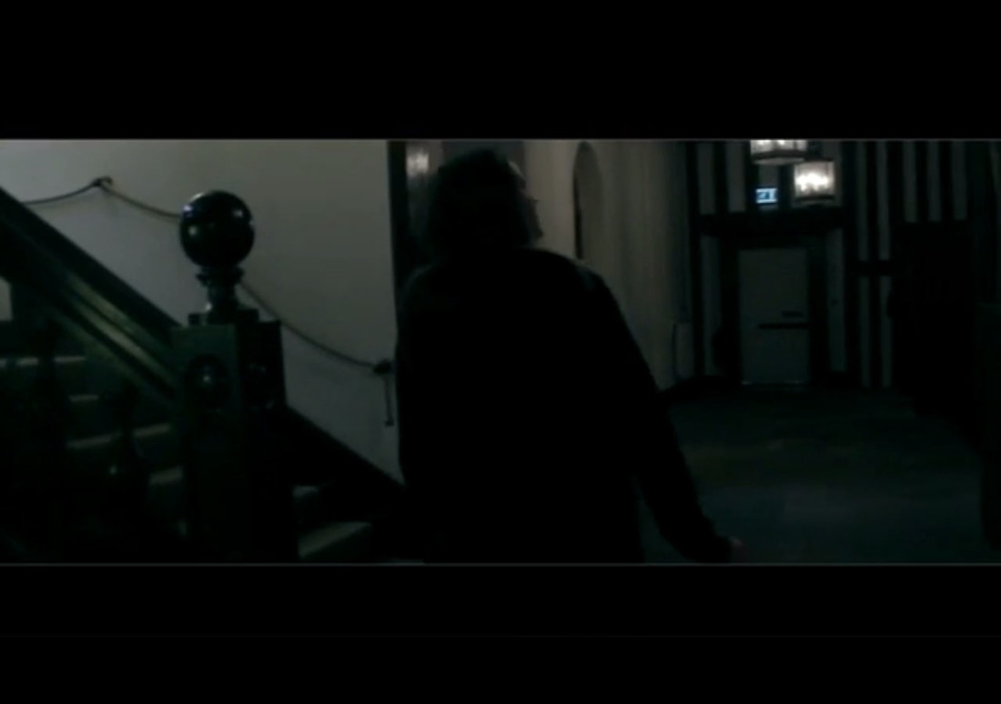
Insidious was the inspiration for the low key lighting used in our trailer, as you can see in the real media text the background has a dark tone to it much like the image from our own trailer as dark colours are used. Low key lighting is a very typical and essential convention to use when making a horror trailer with out it the setting would not match the tone of the movie which would break the hyper reality the film is trying to create so by using this convention it made the project look realistic.
Stock Characters
|
Cabin in the woods (2012) - Dana Polk
|
While the sub-genre of supernatural doesn't typical have the convention of a finale girl, our antagonist is a female that survives to the end of the film effectively making her a finale girl. this character is based of Cabin in the Woods finale girl as this character broke the typical conventions not having a unisex name, nor dressing in overly masculine clothes and that she is the last character to die in the movie even though she is classified as a finale girl. We decided to follow this idea of developing the convention in certain areas like Cabin in the Woods did, by not giving her a a unisex name. However we did dress her in a tracksuit which is not feminine, in order for the audience to easily identify who the character is as it is important to have a feeling of familiarity around conventions in a movie.
|
Scream franchise - Ghost Face
|
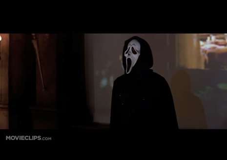
The convention of using a masked antagonist is a very typical one as you can see from the real life example of the iconic character Ghostface. My antagonist face was not shown in the trailer to create the idea of mystery that this convention is used for I used a vale to cover my antagonists face and made sure there face was looking down in shots, this shows that I have used the convention to create mystery as it was intended to do.
Jump scares
|
|
The Conjuring 2
|
The Conjuring 2 is the inspiration for the jump scares used in our trailer we used the timing of each other the jump scare in the Conjuring 2 trailer to inspire the Reminiscent trailer, each of the jump scares appear at 20, 30 and 45 seconds. Jump scares are an important part of a trailer as it creates visceral pleasures my making the audience jump, without the use of this convention the trailer could not be very effective.
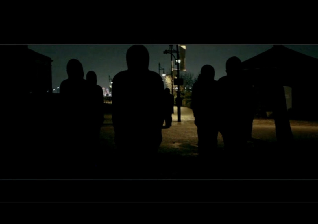
All settings seem to be isolated
The Conjuring 2
|
|
|
OUR TRAILER
|
|
|
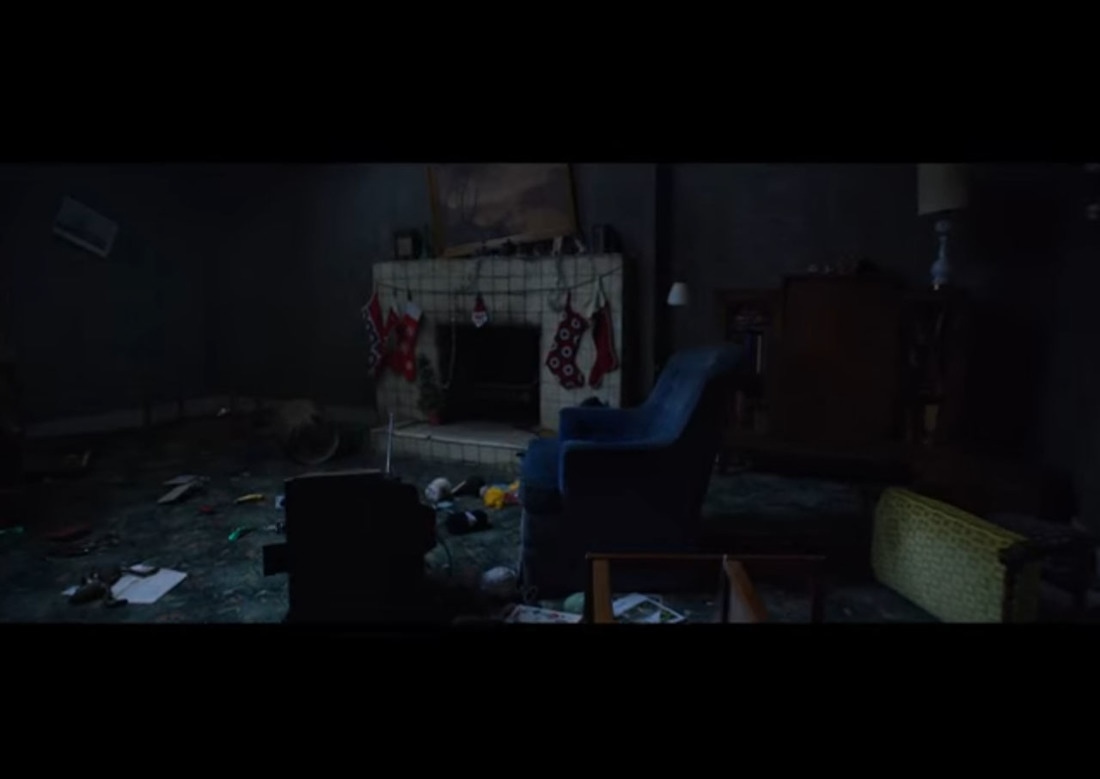
After researching into supernatural films we found that it was common for the locations used to to isolated, we used this convention as it kept with the plot of our story as the antagonist has just lost her husband so the theme of isolation is very in keeping with the plot. As you can see from the real media text example for The Conjuring 2 all of theses shots use low key lighting which we did using colour correcting as in the darkness you cant see anything creating an idea of mystery as well. i focused on making sure that all of the interior shots in my location used low key lighting to keep to the convention as without the low key lighting the locations wouldn't have seemed isolated and the tone wouldn't have fit with my teaser trailer,this contributed to by trailer creating a hyper reality with the mood thanks to the locations.
Todorov - Narrative Structure
|
|
|
I have decided to follow parts of Todorov's theory:
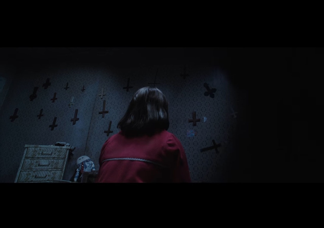
Equilibrium: Marry-anne is wondering through an empty house looking for any since of life. I have done this by not showing the antagonist or using any of the jump scares before 20 seconds and by using slow fades as a transition to slow the pace, while the music is eeri and sets a dark tone nothing major has happened to set of the disequilibrium yet.
Disequilibrium: She finds herself face to face with a demon that can only move when your not looking at it and she must try to escape from it with her life. I showed the disequilibrium firstly with the use of a jump scare at 20 seconds after that i used fast cuts as a transition to quicken the pace of the trailer as well as two other jump scares and a montage scene in which the antagonist gets closer and closer.
Resolution: The resolution is not shown in the trailer as it would spoil the plot of the movie, and as this is a teaser trailer the whole point of it is to create mystery.
Not including the resolution in a trailer is a very typical thing to do for example the real media text Annabelle includes the equilibrium which lasts until around 40 seconds which includes them receiving a package containing the Annabelle doll. It is not until the disequilibrium which lasts for the remainder of the trailer, in which the protagonists are attacked by ghosts in there home that the trailer begins to use faster cuts, but like my own trailer this one does not include a resolution either.
Conclusion
Overall in order to create projects that followed all of the typical conventions would not have been effect as the audience would know what to expect, however it is important to include the majority of these conventions in some form or the other so there is a sense of familiarity after all the conventions have been established for a reason due to they fact that they work, for example by using fast cuts it helped to build up tension in the trailer during the disequilibrium which is a very typical thing to do, much like following the typical layout of a movie magazine and poster as it helps to catch the audiences attention, but over all my projects follow the majority of conventions.
