5 POSTER INSPIRATIONS
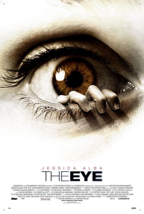
The reason for why the image has inspired us is because of the simplicity of the design, however it is still a powerful poster. The Eye is enlarged and the most eye catching aspect of the poster as well as the type being neatly placed on the bottom of the poster.
|
The poster above relates well with our poster design, as for a female is being presented as a helpless individual with an intimidating force (entity, shadow) above her. The title is easy to read and does not contest with the palette on the poster design.
|
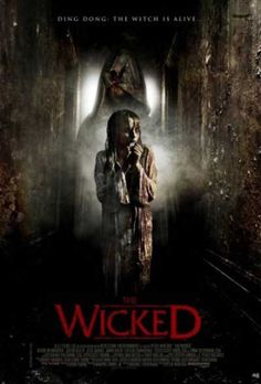
The palette of this poster is very dull yet creepy. The blurred out faced with no mouth or eyes scare the viewer. The title is placed well, shines bright, and can be read, however the type on the top of the poster can be hard to read and does not work well with the colours
|
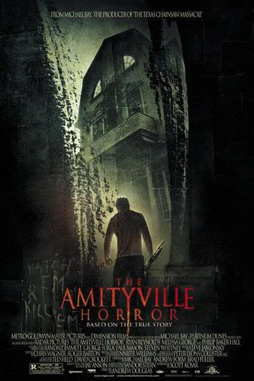
Firstly the red title works in harmony with the dull green and grey background. The poster presents the man (yellow glow) as well as catching the viewers eyes on the building. The worn away trees and weapon in the mans hand reinforce that it's a horror poster.
|
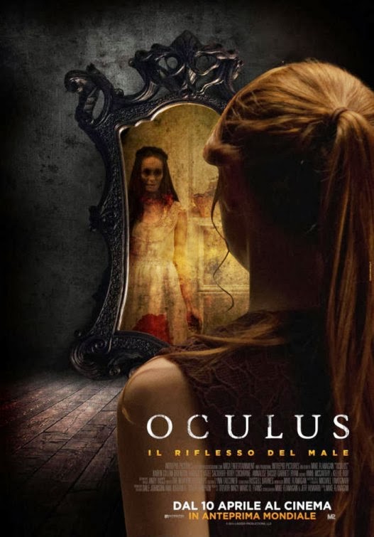
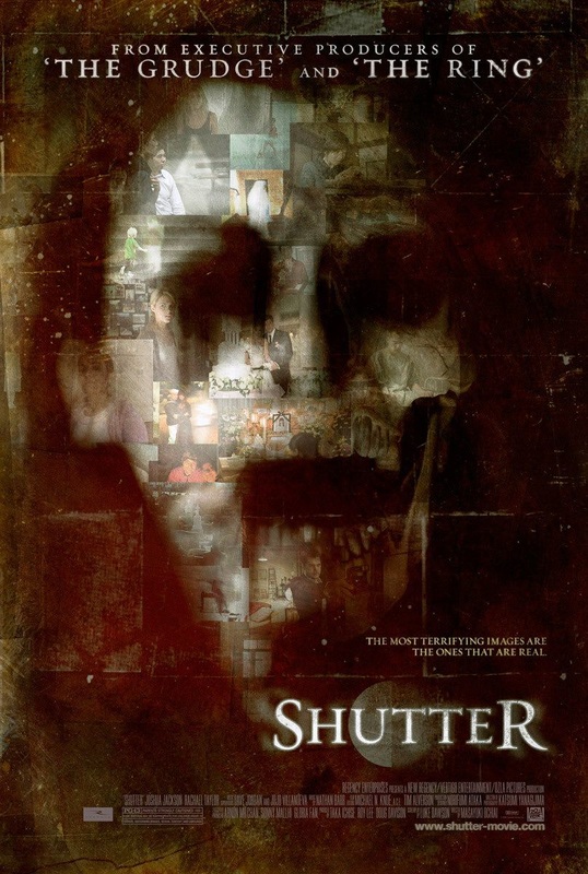
This poster presents a women looking at a mirror and seeing an evil female reflection. This shows that the protagonist and antagonist are both female which is an unlikely occurrence. The palette for the title and other type work well with the posters lighting.
|
5 MAGAZINE INSPIRATION
We liked the simplicity of this magazine design as it gives all the attention to the middle of the magazine through the use of a white background and black/grey image, which is showcasing the protagonist of the movie. For our magazine design we could follow this style of design to give all the attention to our female protagonist as well as the entity behind her.
|
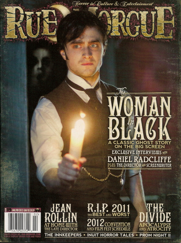
This magazine was well designed and straight to the point. Just by looking at the shades of red and oranges, the viewer can understand that this connotes that the movie is dangerous. The yellow tag-line and other aspects stand out really well and helps the viewers eyes depict what is being written. Furthermore the barcode is well placed.
|
This magazine is very inspiring to us as for the entity behind the protagonist is creepy and hidden, which is in good relation to our treatment since the antagonist does not showcase his identity and yet still haunts the protagonist, however in our magazine design the facial expression and body of our antagonist will not be revealed, leaving a shadow. Lastly the title and other type are readable.
|
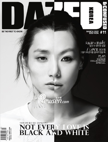
This magazine enticed me and my group through the way it utilised binary opposites (black-white). The way it could relate to our work is through the fact that the our poster and or magazine will have a good women and and an evil ghost. Furthermore the palette for the type is clear and bright, which makes it easy for viewers to read.
|
The last magazines type stood out really well to us as for it doesn't not battle with the background colours. Additionally the idea of having an entity behind a normal individual is closely related to what type of design my group and i want to go for. The style of type is also a good inspiration to us as it is old rustic and creepy.
|
DRAWN AND DIGITAL POSTER DESIGNS - ASHLEY

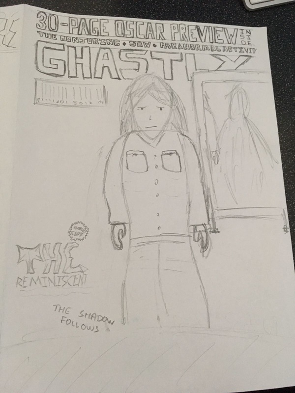
This poster does not reveal the antagonist or protagonist, which is similar to 'The Ring' poster. The date will stay below the title and the credits will be below the table. Laslty the house will be in the middle of the poster surrounded by trees.
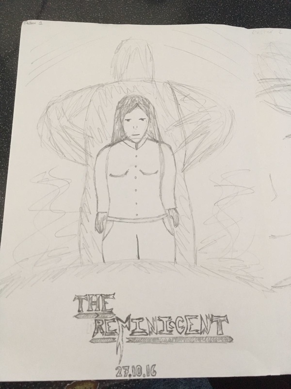
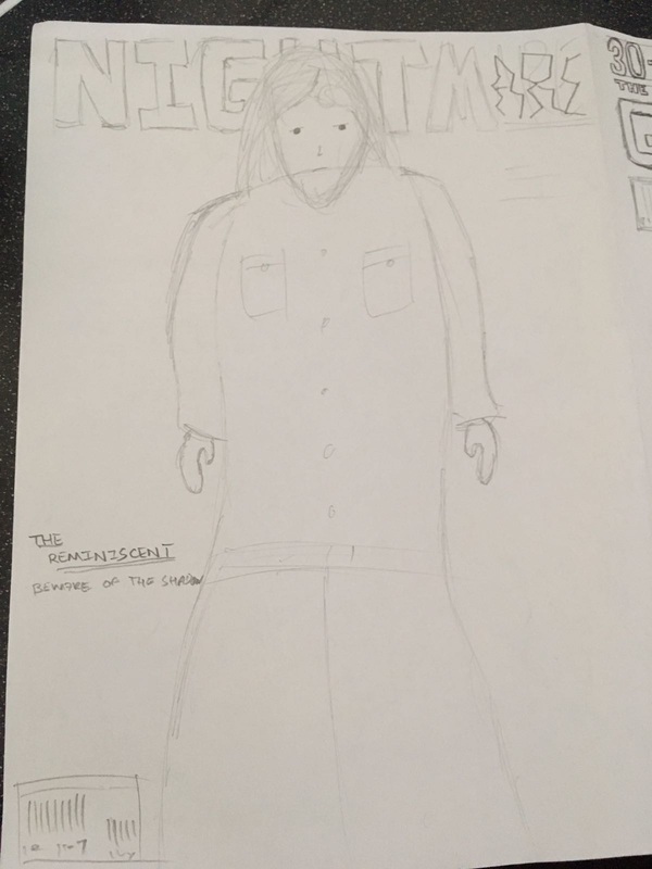
In this drawing, I placed the woman on the middle of the poster as well as the bigger shadow entity behind her, isolating her. The title of the film will be placed on the bottom of the poster, below the characters, and then the date will be placed below the title. The text style is quite evil and menacing.
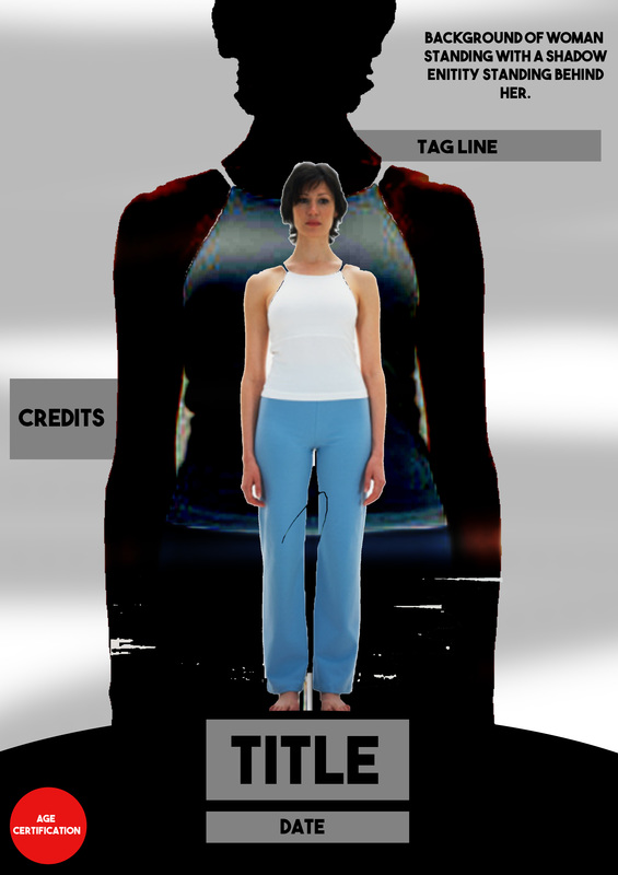
This poster follows the drawing above it also. Just like my other Photoshop draft i needed to add some really important elements to my poster which were the age certification, the credits as well as the tag line. a stock image of a woman's whole body was used for this. Lastly I placed a black clipping mask with a filter for the dark complexion.
|
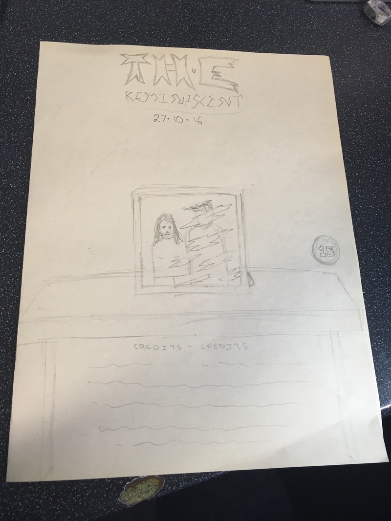
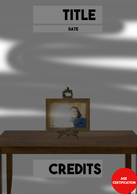
Firstly the poster contains a drawing of a photo in a frame on the table. This draw design does not uncover the antagonist or protagonist in the poster. The date will stay below the title and the credits will be below the table.
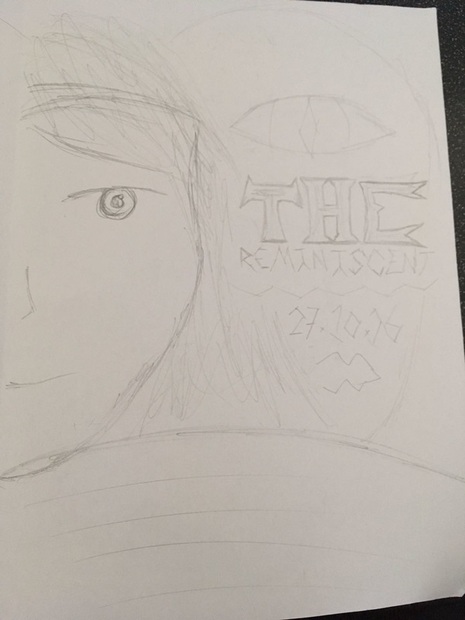
This drawing includes half the face of the woman as well as half the 'face' of the shadow entity behind her. The title will be placed above the shadow entity, on the middle right of the poster, as well as being slightly faded to keep the entity in sight. The date will be below the title. The shadow entity will have one evil eye and a wide smile.
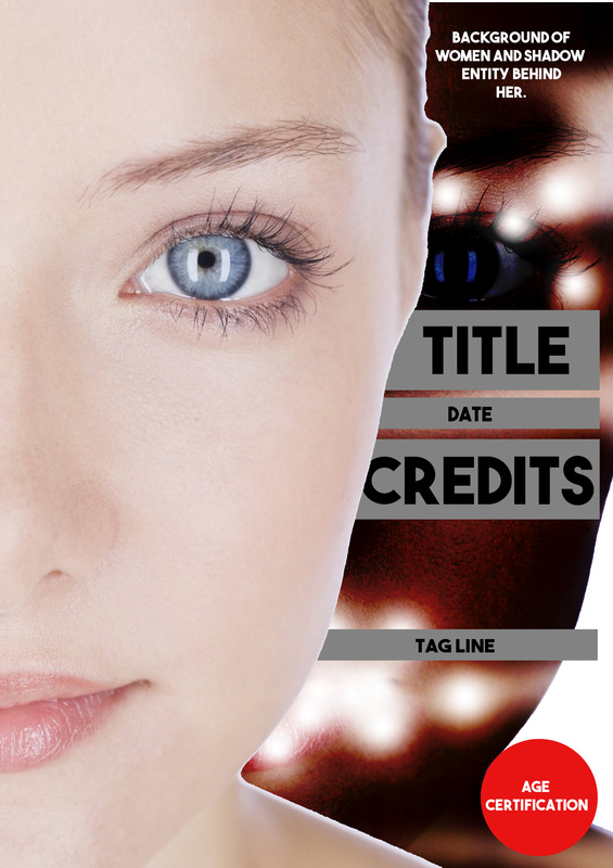
This is the Photoshop draft for the drawing above it. As you can see i needed to add some essential aspects to the poster design, which were the age certification, the credits as well as the tag line, however further on in the process i will add more elements to my poster. I used stock images of a woman's face. I used the eraser tool on the shadow entities mouth to make an evil smile and placed a black clipping mask with a filter for the dark complexion.
|
|
|
|
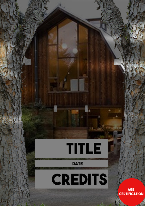
This digital poster design follows the drawing on the top right. As you can see there is a photo frame stand on a table. furthermore the title and date is on the top of the poster and the credits are below the table. Lastly I added an age certification on the bottom right of the poster.
|
As you can see in this digital design, i have added an age certification on the bottom right of the design with the house being a dominant image. Additionally the date will be below the title and the credits will be below the date.
|
DRAWN AND DIGITAL MAGAZINE DESIGNS - ASHLEY
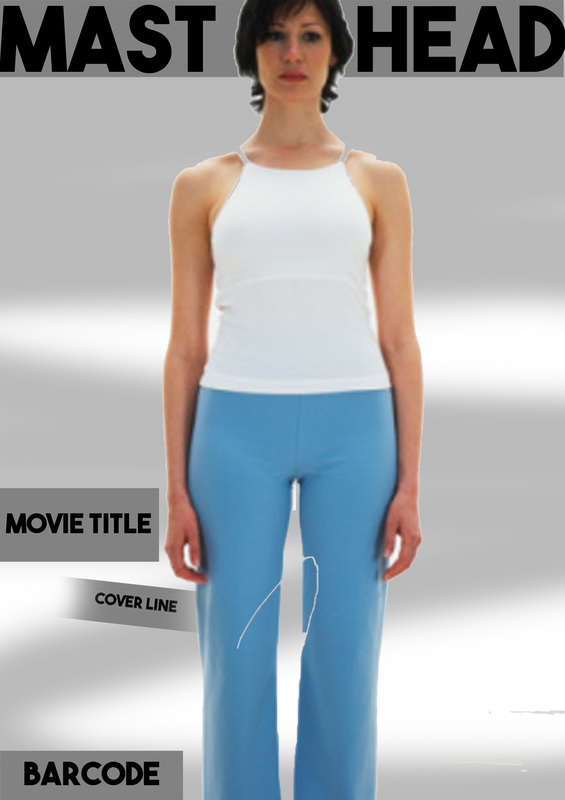
The drawn design above was my first magazine design which consisted of many elements. Firstly the Cover Lines were placed on the top of the magazine cover and the masthead (Ghastly) was placed just below it. Also i placed the bar-code just below the masthead to keep a clean layout. The main image of the woman with the entity in the mirror behind was placed on the middle right of the magazine with the Movie title, selling line and the another cover line along side it on the middle left.
|
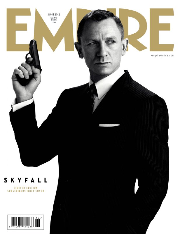
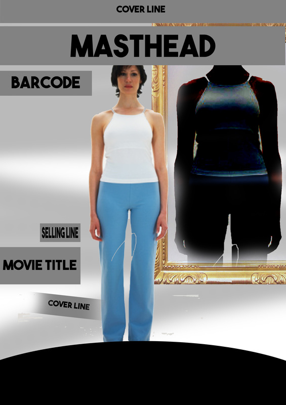
This design is very simple and follows the James Bond Empire magazine which is very simplistic, but yet empowers the main character and its importance presented in the film. The masthead is called nightmare and will be placed on the top of the magazine. The bar-code will be placed on the bottom left of the magazine. Lastly the middle left of the magazine will hold the movie title and cover line.
|
|
|
|
I used the eraser to on the shadow entity to keep the body inside of the mirror, which made it look like it was in the mirror. Lastly I placed a black clipping mask with a filter for the dark complexion.
|
The simple use of the woman and only the woman with a sad expression brings curiosity into the viewers mind. More will be added on to the final design.
|
PRACTICE POSTER SPEEDART - ASHLEY
This speedart presents the practice poster I have created to remind me of the certain tools i use, as well as to strengthen my final piece in the end. For my final piece i will be transferring the billing box i have used on this practice poster.
FINAL POSTER DEVELOPEMENTS - ASHLEY
|
|
|
|
FINAL POSTER STEP BY STEP
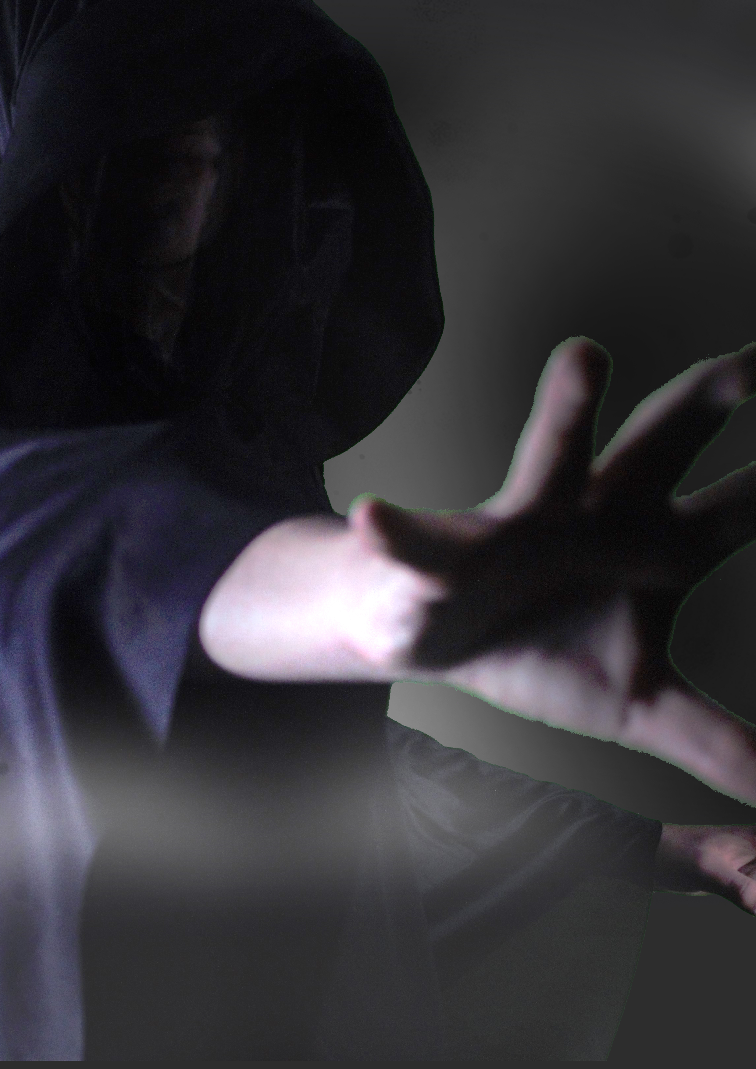
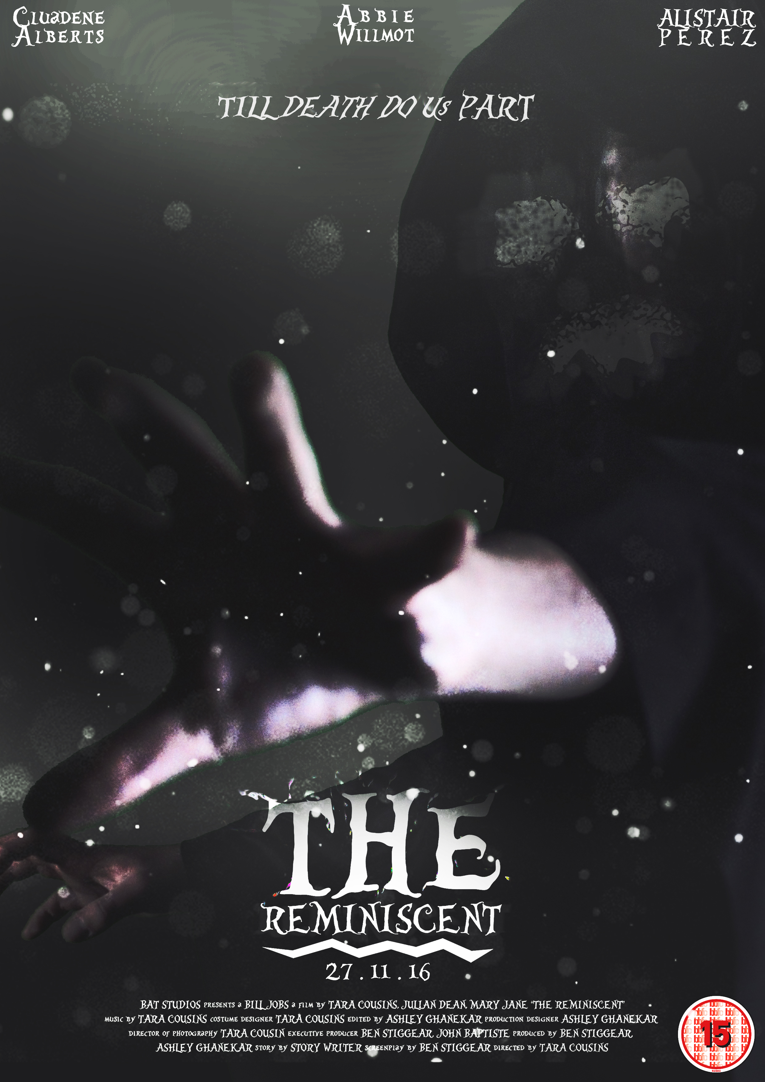
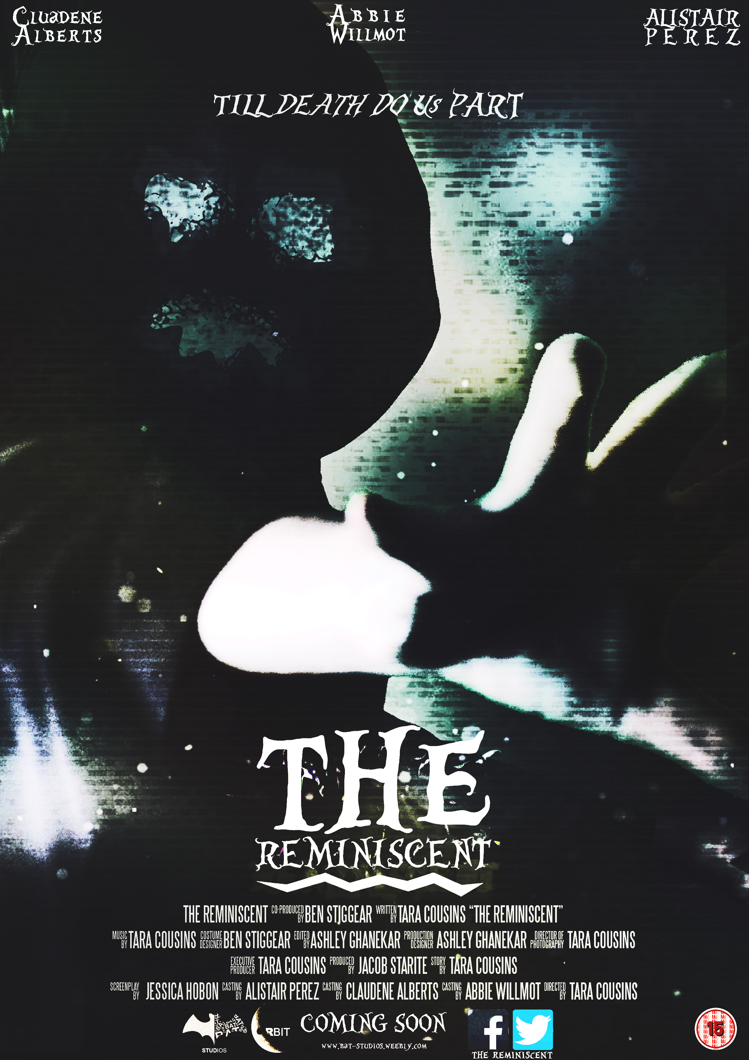
Firstly I added the best picture from the photo shoot to the poster and darkened the face.
|
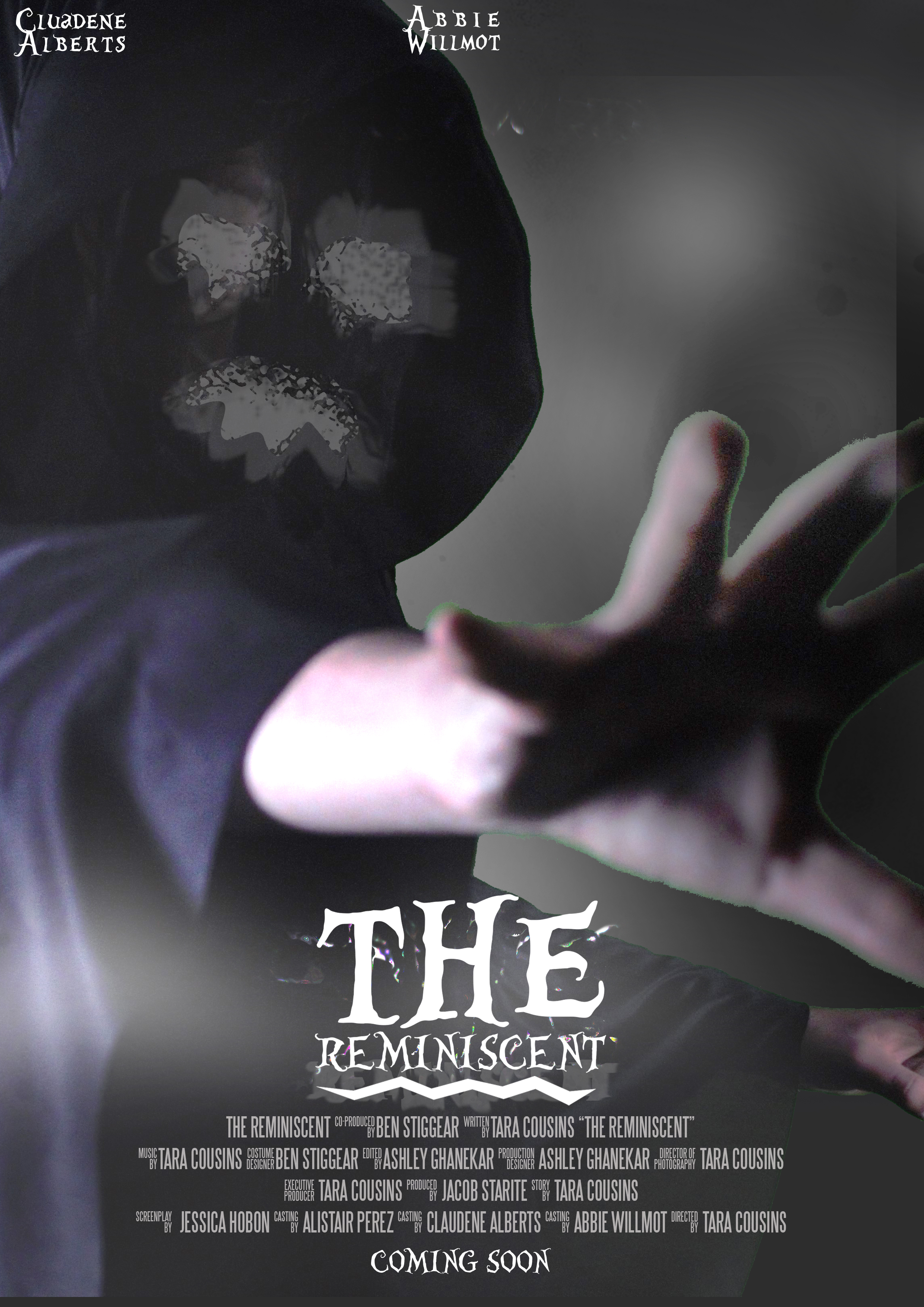
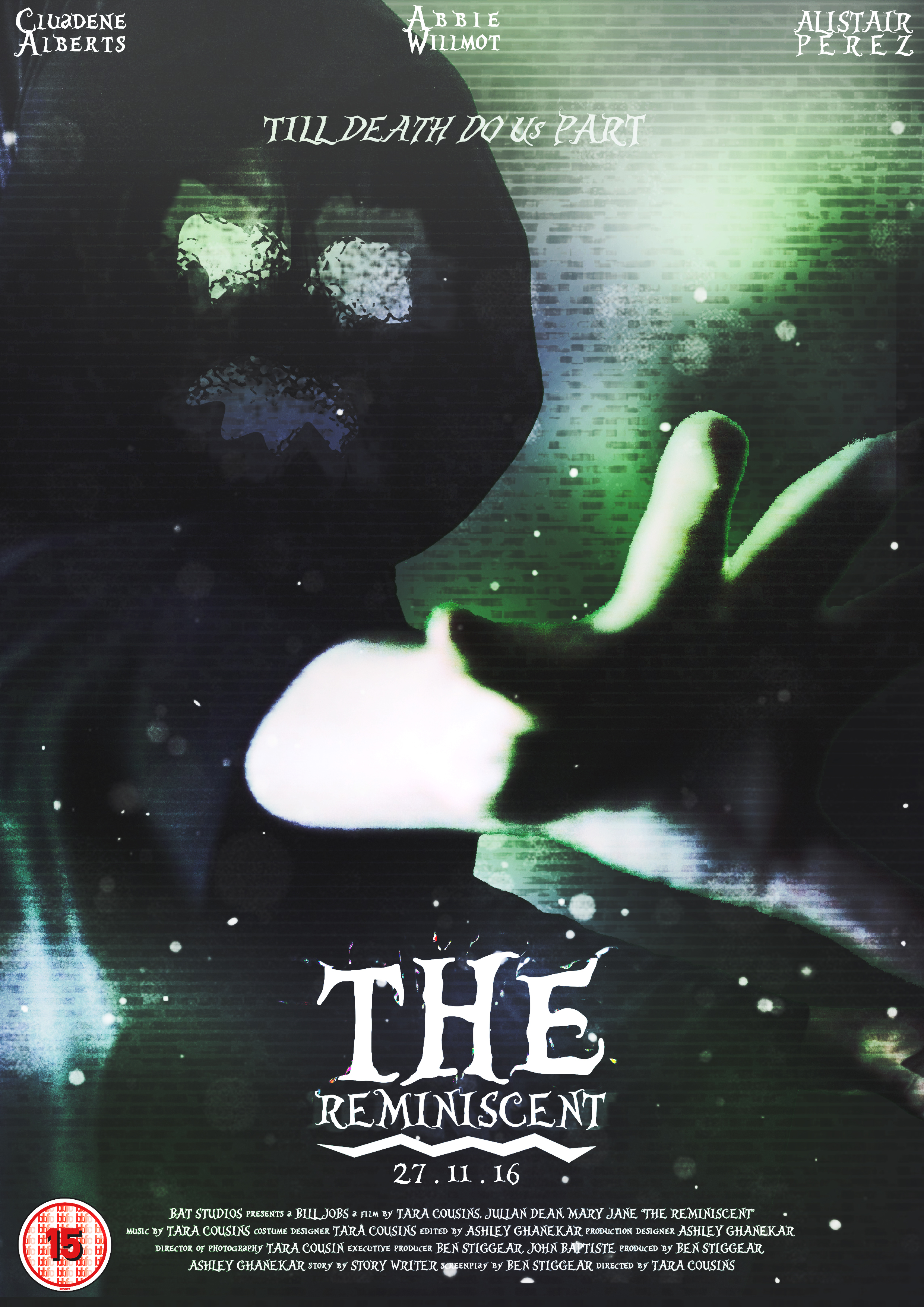
Then I added the title and the billbox to the bottom of the poster. Also two names from the cast members were added on the top of the poster as well as me making the face of the entity.
|
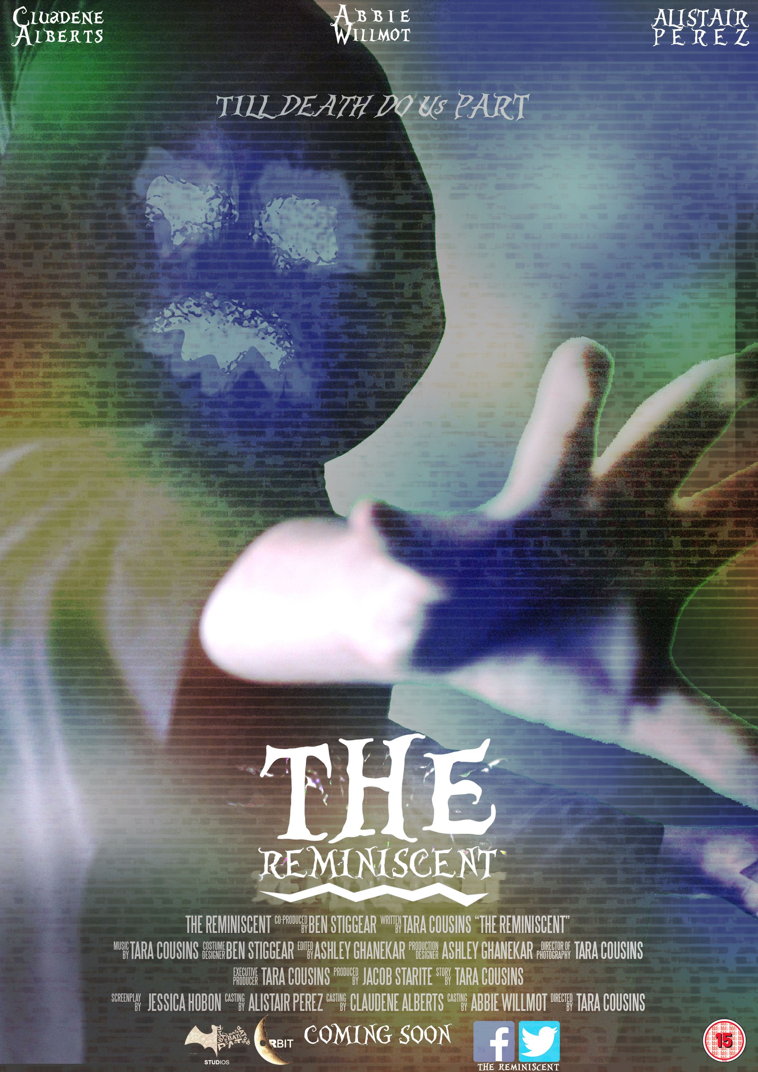
Then facebook and twitter links were added to the billbox as well as our team logo and distributor and the website link. The last name of the cast was added to the top as well as a quote from the trailer.
|
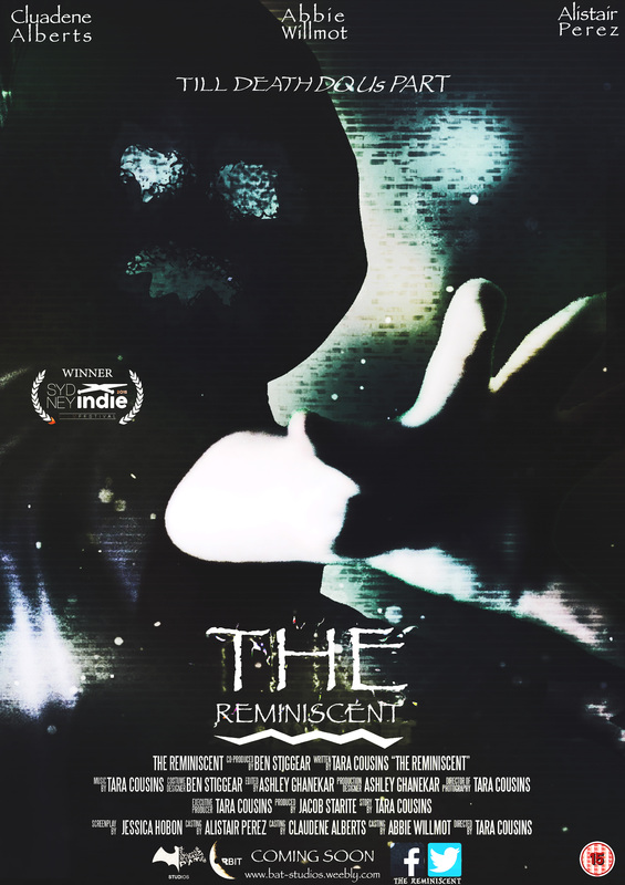
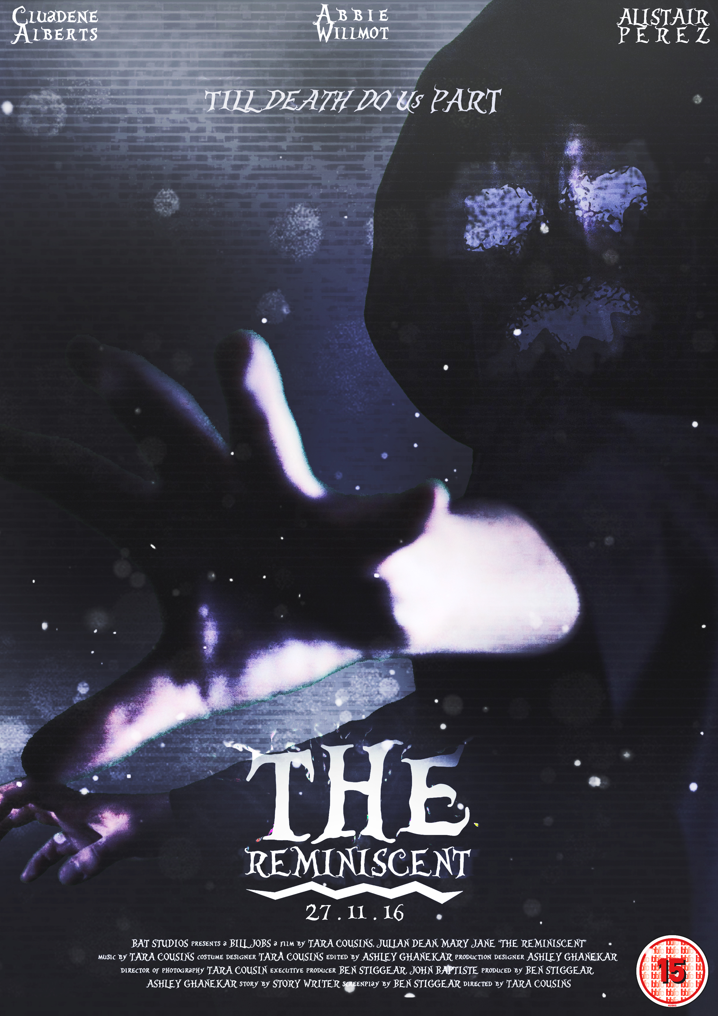
Lastly I made a custom colour corection to darken and dull out the poster. I have changed the font to papyrus so that it matches the font used on the trailer.
