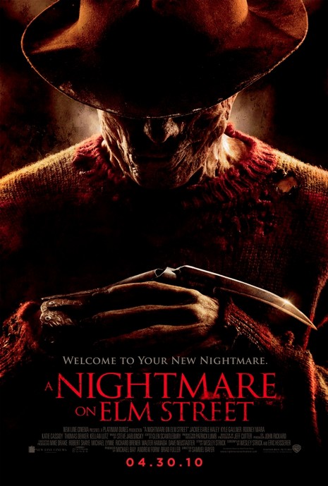
Synopsis: Freddy Krueger returns in A Nightmare on Elm Street, in the re-imagined work of the 1984 horror classic directed by Wes Craven. A group of teenagers are all being stalked by Freddy Krueger, a horribly disfigured killer who hunts them in their dreams. As long as they stay awake, they can protect one another but when they sleep, there is no escape. The teens whose dreams are terrorized by Freddy Krueger must help each other to survive by staying awake. Mise-En-SceneLighting: Low key lighting is used to create mystery and set a moody atmosphere, however the use of high key lighting of Freddy Krueger's iconic blade weapon makes it stand out as it will be a very good marketing tool for the remake of the film.
NVC: Freddy's face is hidden due to the shadow from his fedora but you are still able to make out a smirch on his face, as well as the horrific scaring he has on his face. His hand position is used to create the idea that he is waiting for you which will make the audience feel intimidated. Costume: the costume used is the same as in the original movie with Freddy sporting his iconic fedora, red and green stripped sweater and his bladed hand weapon, the sweater has lots of rips in it to make him look even more intimidating. Setting: You can not see any of the setting as the main focus of this poster is on Freddy Krueger for he is the main selling point which the poster is relying on as it is using iconography. Props: The only prop used in this poster is Freddy's iconic bladed glove weapon the use of the light shinning off it makes it stand out to the audience as it connotes death in the film. Camera: The shot is framed in a mid shot this is because they are using the iconic costume of Freddy Kruegar to signify that it is a horror movie as well as showing it is a remake of the original, this shot is used to place the iconic weapon in the centre of frame so the audiences eyes are caught by it. Colour: The colours used are red, green , brown and black. These are all dull colours which signify this will be a dark horror movie. the red signify's the hatred that Freddy has for the teens in the film. Green is used to connote life in the film but as there is very little of it in the poster, the brown is used to create the mystery in the film as it hides Freddy's face. The black connotes death death and due to the vast amount of it in the poster it becomes clear there will be lots of murders in the film. Typography: The use of sans serif font shows that this movie will have a modern twist on it making it differ from the original making it hopefully stand out as its own icon film and not just a remake Mood & Styling: The mood in this poster gives off a mysterious mood because of the low visibility. Specific Conventions: The use of horror icons such as Freddy Kruegar is a very specific convention for selling the movie, as it is a remake it has to stick to the original to some degree so it cant stray to far from the conventions used in the original.
0 Comments
Leave a Reply. |
AuthorWrite something about yourself. No need to be fancy, just an overview. ArchivesCategories |
 RSS Feed
