Introduction
The purpose of our audience feedback is to ensure that our target audience have their say in how the final product has been produced. By getting more people to view our finale products we are able to get a wider range of feedback for the strong and weak points of our products. In order to give us a clear outline during the production stage we asked the target audience a wide range of questions. Our three products the film poster, magazine and teaser trailer are now completed it is important that another audience research is carried out, in order to make sure that we met our target audiences visceral and emotional pleasures. Due to our target audience being aged 15-25 the research will be conducted using a wide range of diffrent types of social media.

I used Facebook in order to promote my trailer, poster and magazine to my target audience of 15- 25 year old's i also used this opportunity to post my 3 surveys in order to get the audience feedback i required.
I used Whatsapp to send my target audience a link to the surveys I required them to fill out as it was an easy way for them, as my target audience involves 17 and 18 year old's it meant i had easy access to a lot of that age group.
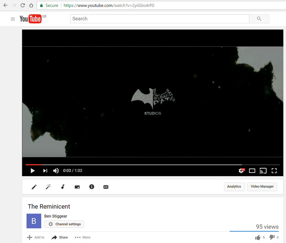
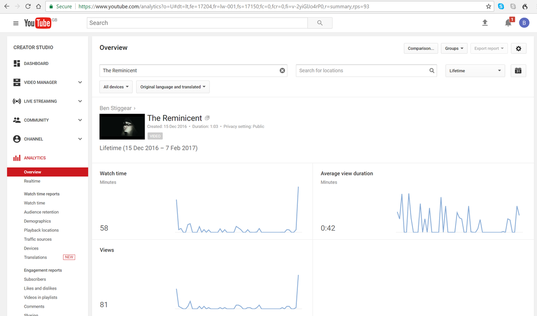
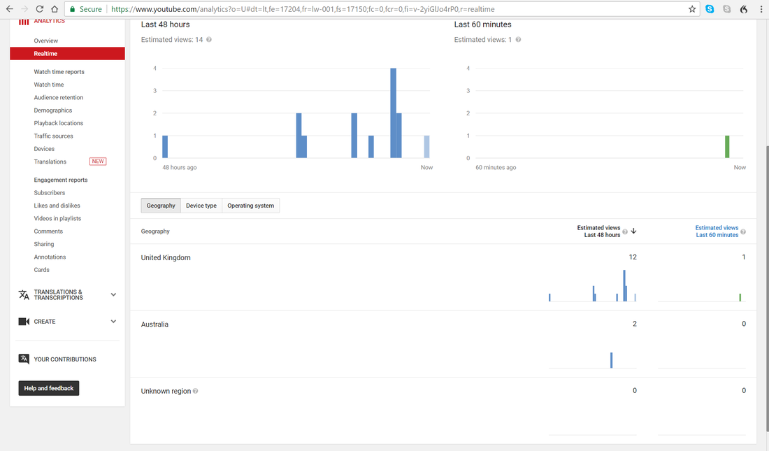
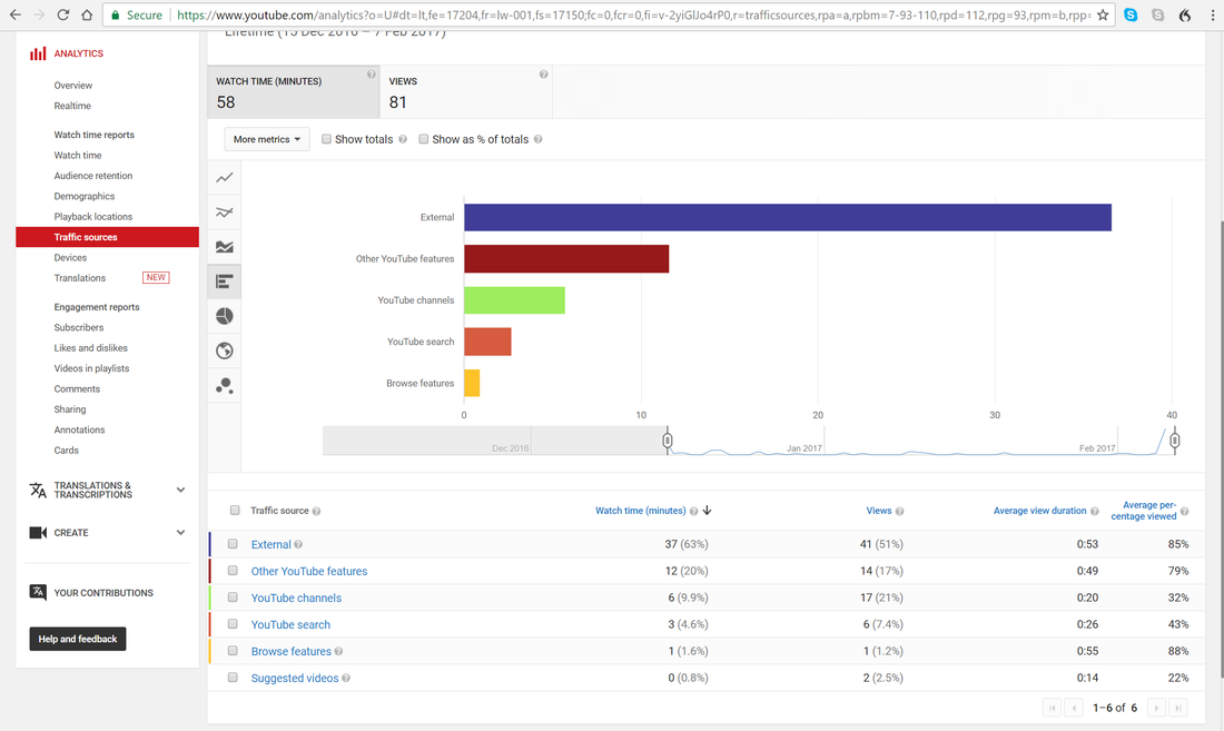
YouTube was used to publish my trailer, it was also used so that i could receive comments from my target audience on what the liked and didn't like about my trailer.

I decided to conduct face to face interviews which were recorded, this involved me asking a set of questions on the finale media products. This was highly beneficial at allowing me to explain anything the participant didn't understand about the media products.
Our Products
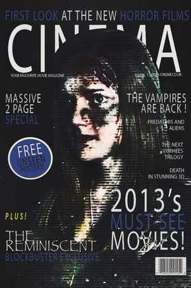
Poster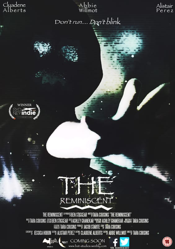
|
Magazine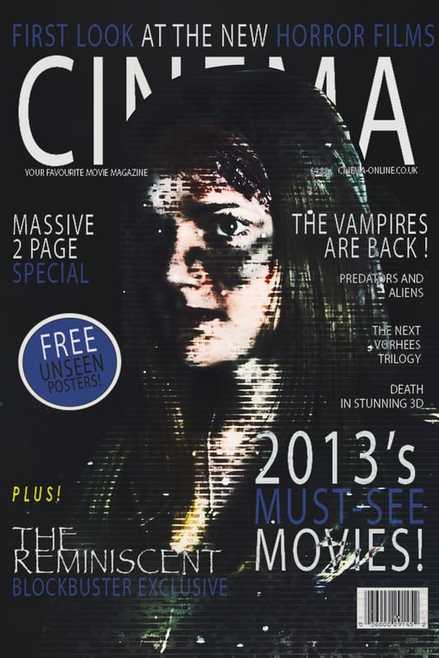
|
Teaser Trailer
Poster
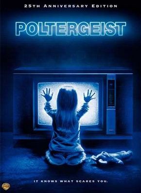
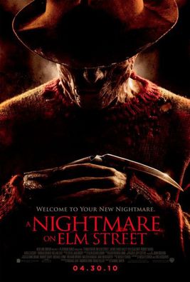
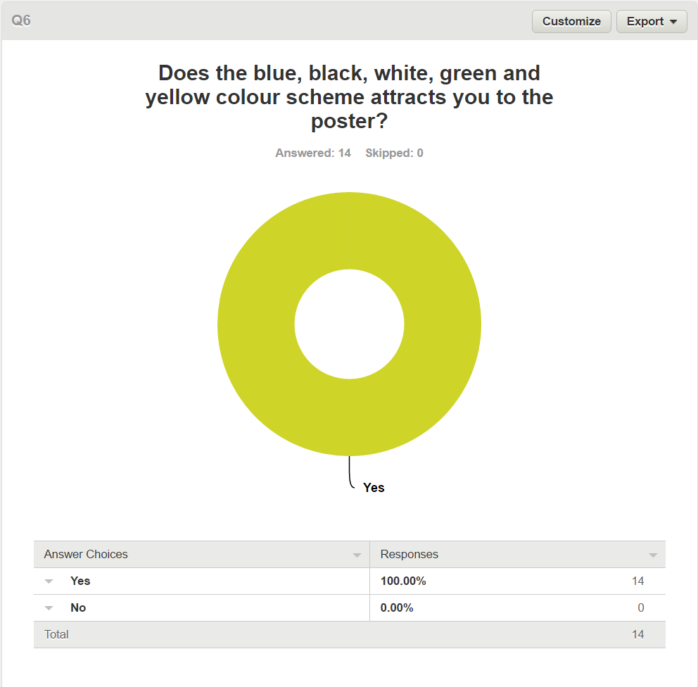
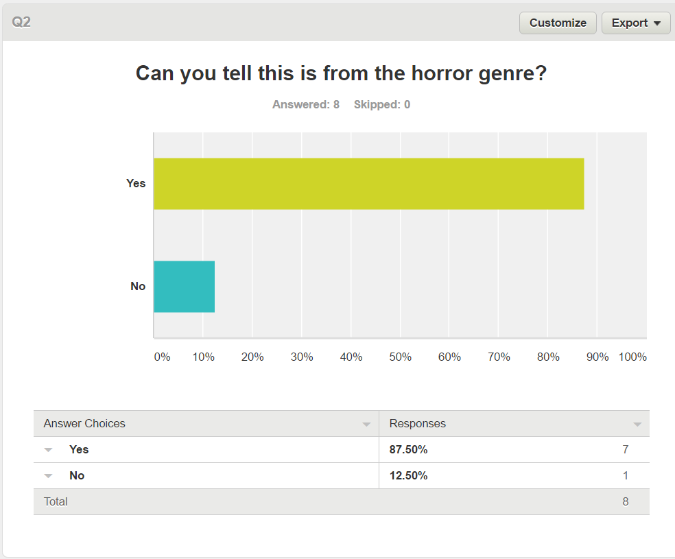
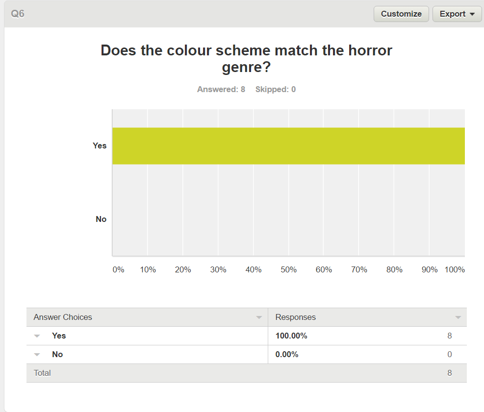
Film posters are an integral part of advertising a movie, they have been used since the earliest exhibition of films, including important information such as; the films name, actors names, directors and the release date. Poltergeist is an existing media text that we used the poster as an influence for the colour scheme by using the blue convention but putting a twist with the darker theme and the mystery behind the identity of the antagonist like the second poster Nightmare on Elm Street hiding the antagonists face.
|
|
|
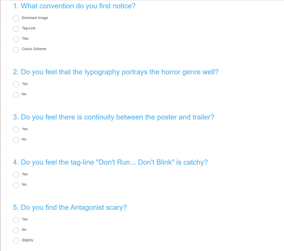
Poster Questions
|
|
Survey Monkey Responses
|
|
|

|
YouTube Responses
|
|
|
Evaluation
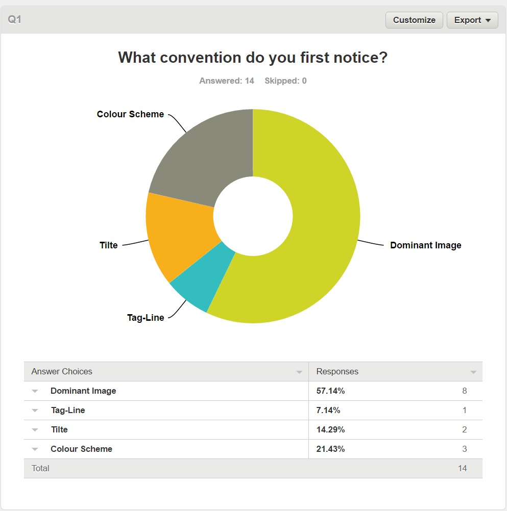
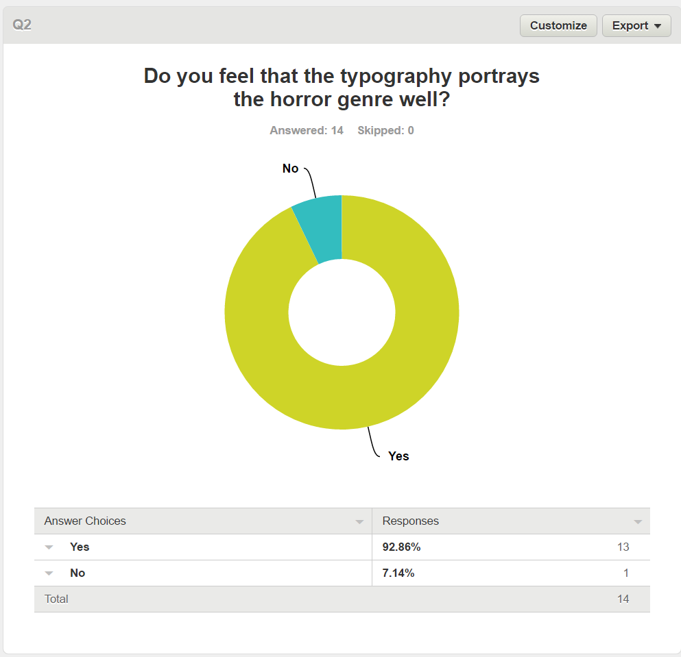
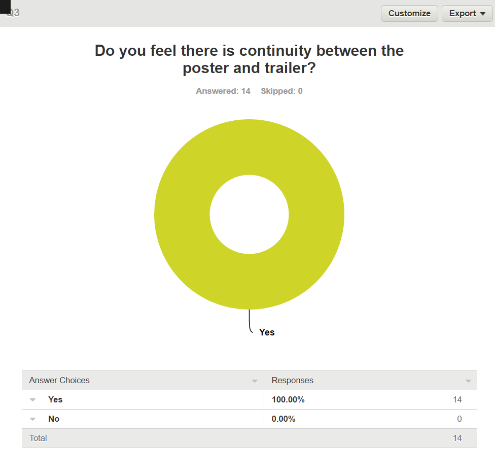
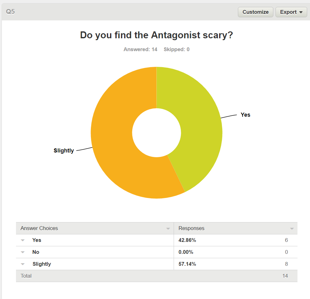
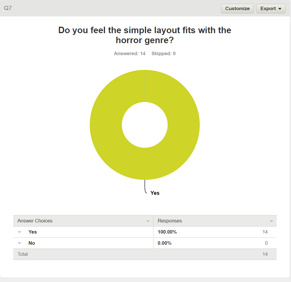
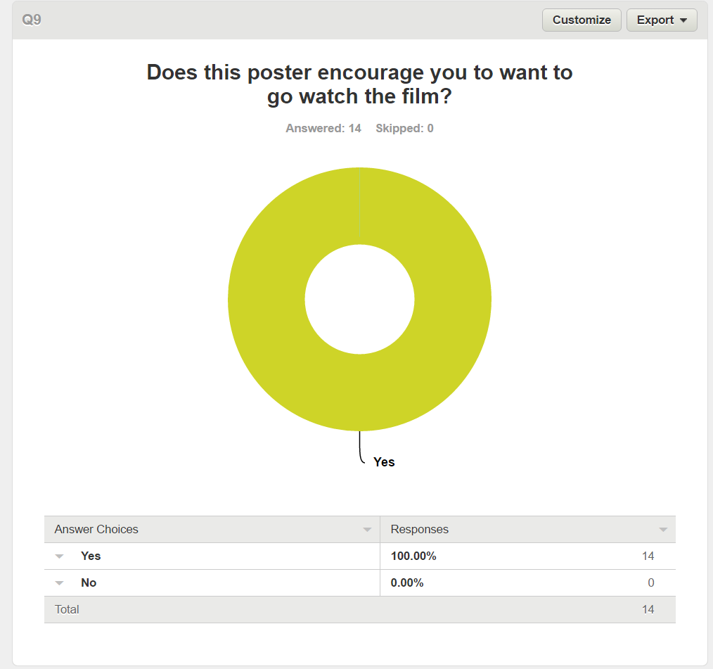
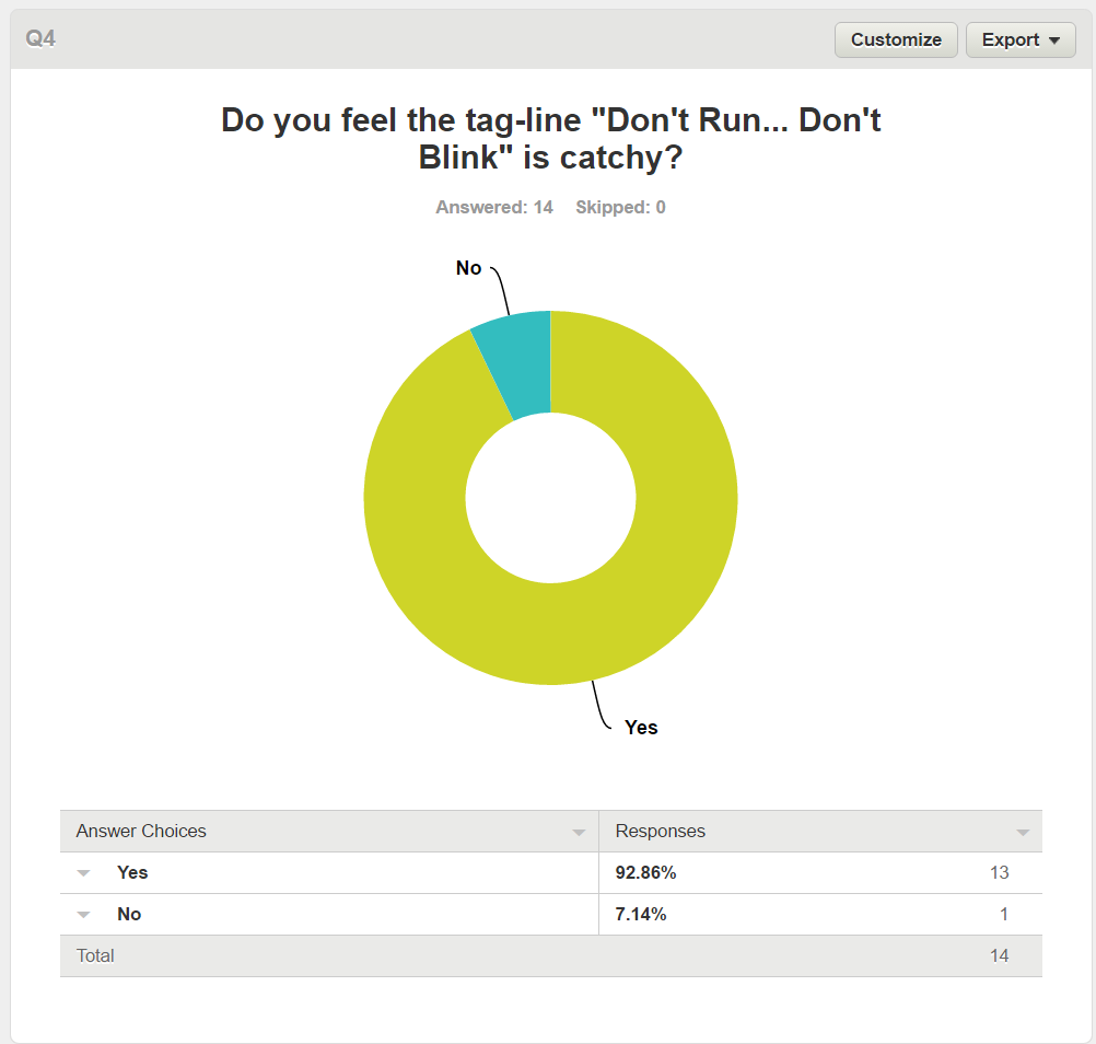
The audience research shows that overall for our poster the image played a huge role in attracting the audiences attention with 57% of people saying it was the first thing they noticed however when it came to if the antagonist was scary there was a split with 43% saying yes but 57% of people saying only slightly this shows that my target audience was more desensitised then first expected, But with the typography and tag-line having 93% of people in favour of them, overall it lead to the poster getting 100% of people saying that the poster made them want to see the movie in cinema.
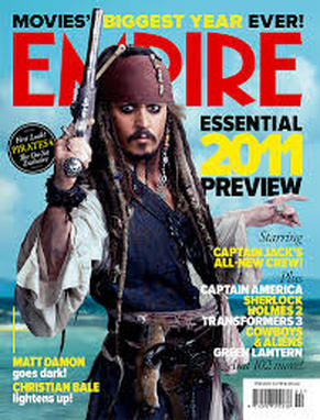
Magazine
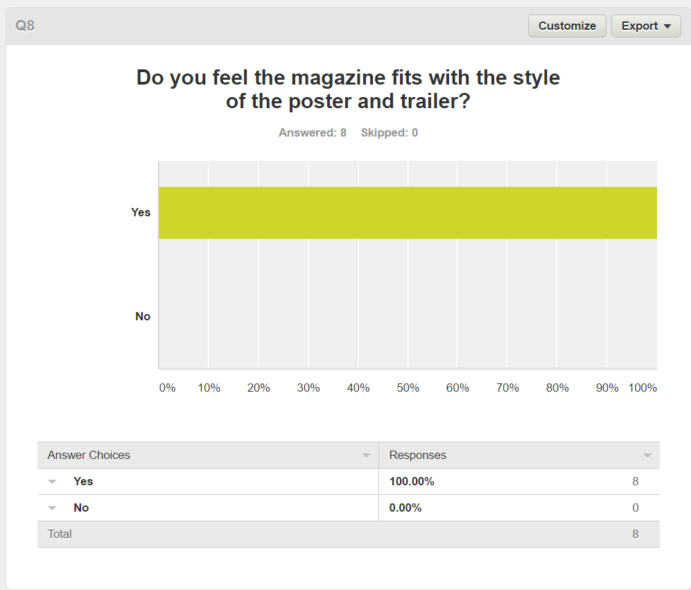
Horror magazine's publish horror fiction with the purpose of scaring the reader, and increase interest for horror movies. By including the words "NEW HORROR FILMS" in the magazine it clearly lets the audience know what the focus of the issue is, we felt that keeping the layout of a typical film magazine like that of EMPIRE, but making it into a horror edition would make it stand out among the other mainstream media texts. The colour scheme used is similar to that used on the poster and in the trailer to keep the house style.
|
|
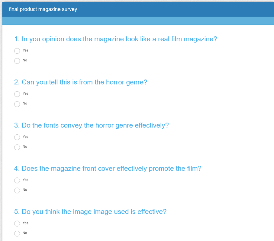
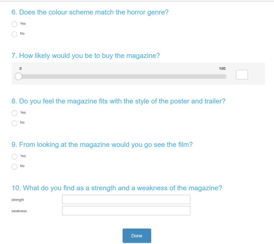
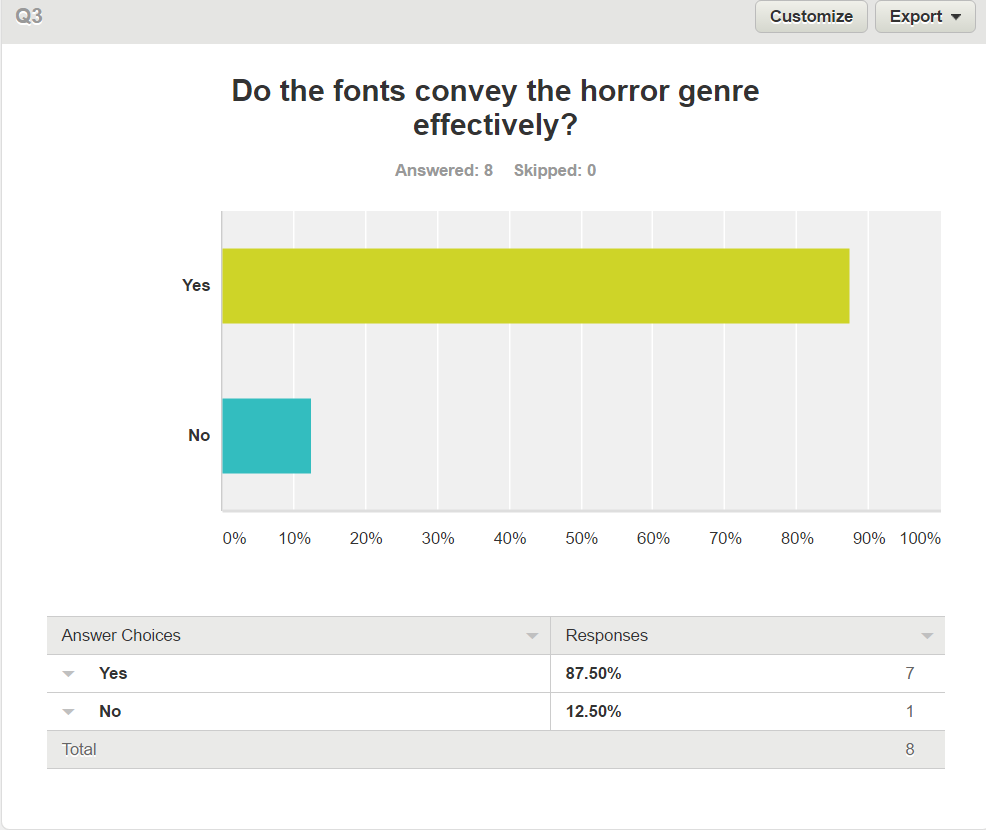
Magazine questions
|
|
Survey Monkey Responses
|

|
YouTube Responses
|
|
|
Evaluation
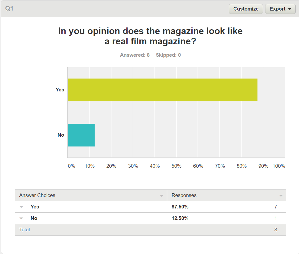
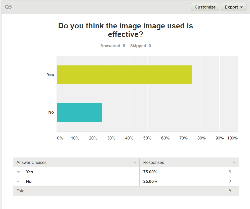
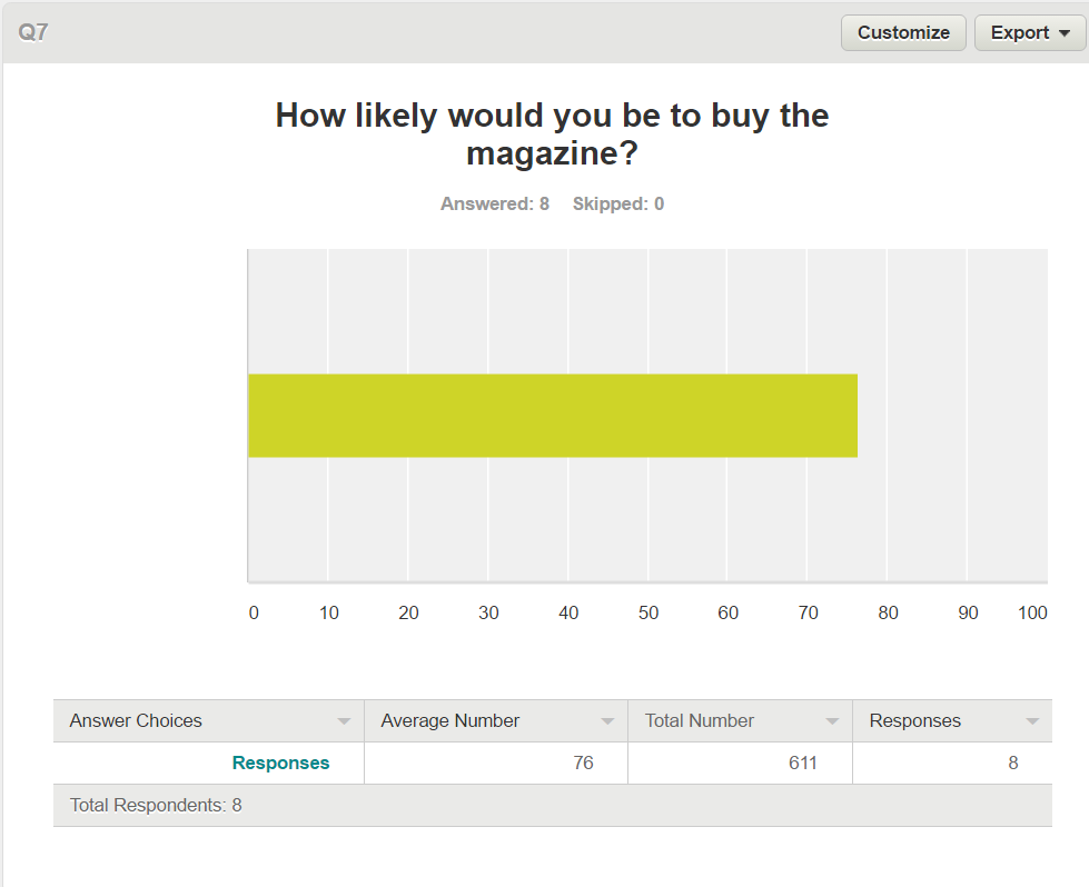
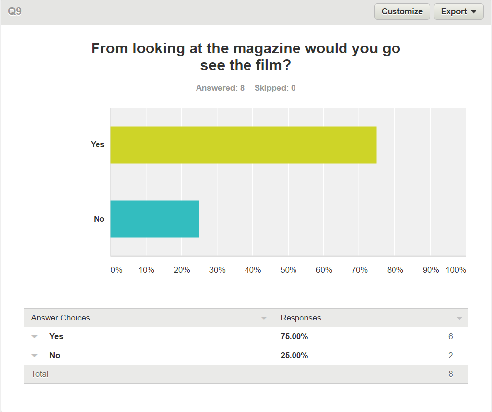
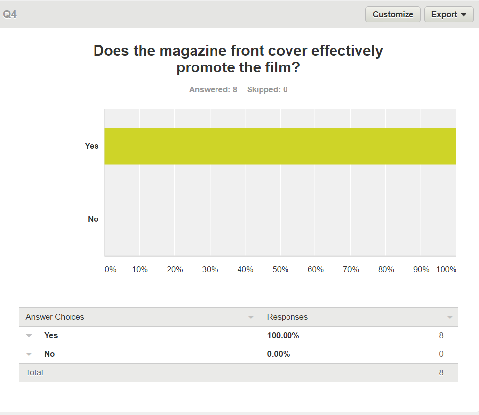
Our horror magazine got a mixed response from the audience research, 88% of people said the product looked like a real film magazine but there was a definite mixed feeling about the dominant image with 75% of people thinking the image was effective some of the written and vocal responses focused on the fact that the image could have been edited with less effects to allow the wounds to properly show on the image, this lead to 75% of people saying they would be interested in going to see the movie from the poster with one response stating that the lack of information made them interested to watch the trailer to see what the movie was about but not the movie itself.
Teaser Trailer
Our Synopsis:
Marry-Annie is coming to terms with er husbands death, struggling to sleep at night haunted by the thought of him and his death, turning to going out drinking and sleeping with men to try and forget her husband but nothing helps, she requiring the help of her friend Jane to give her sleeping pills to try and get through the nights. her dreams turns into nightmares haunted by a spirit that can only move when you don't look at it, now not just attacking her in her dreams but the real world.
In order for Marry-Annie to survive she must never turn her back, never sleep and most of all never ever blink or the Antagonist will get its victum and its chase will be over, she must enrol the help of the priest that helped to buired her husband in order to vanquish this demon haunting her.
Inspiration:
The inspiration when making the teaser trailer was to keep a similar structure to other, teaser trailers and for this The conjuring 2 was the inspiration, as it is a supernatural it fit with our sub-genre and was the inspiration for such shots as the tracking shot and helped us set the layout with jump scares at 20, 30 and 45 seconds in the trailer.
|
|
|
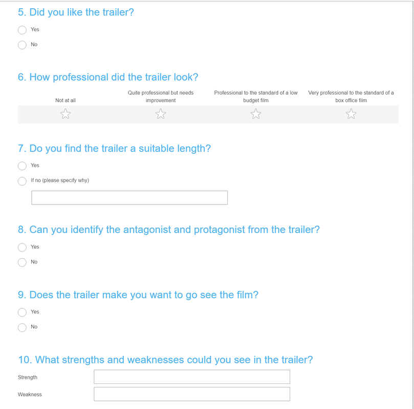
Teaser Trailer Questions
|
|
Teaser Trailer Responses
|

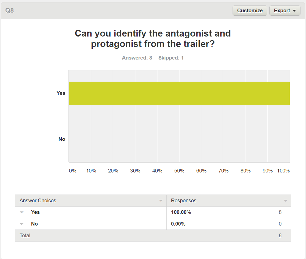
|
Teaser Trailer Information
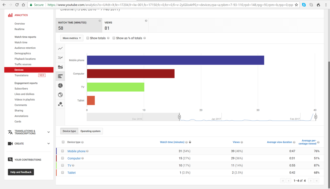
|
|
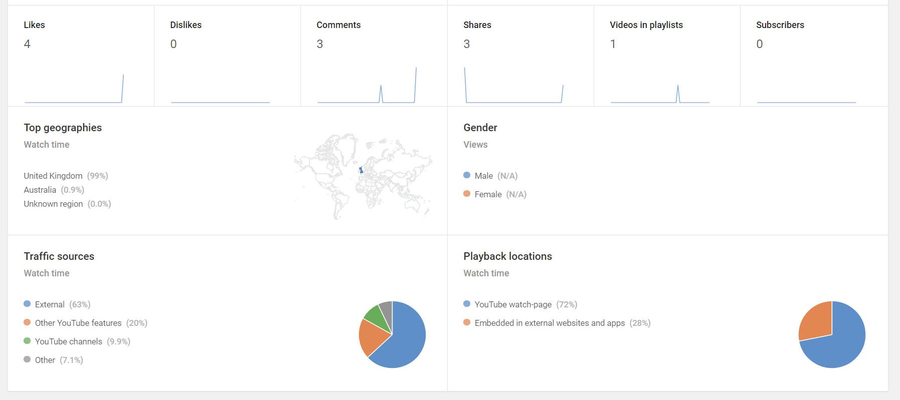
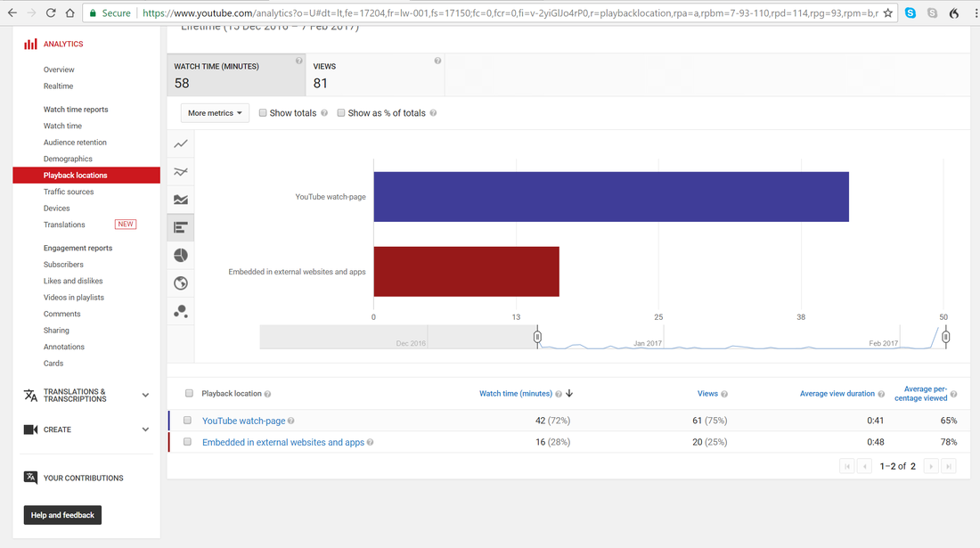
Teaser Trailer Reactions
|
|
|
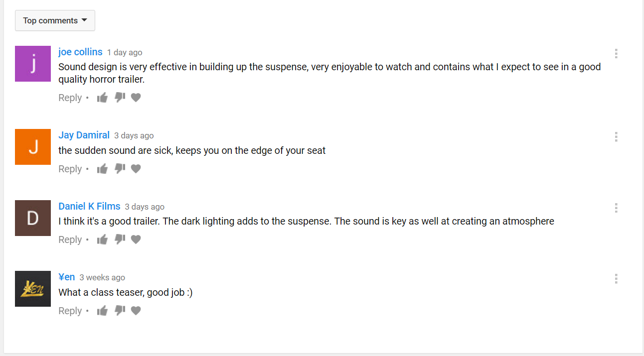
YouTube Responses
|
|
|
Evaluation
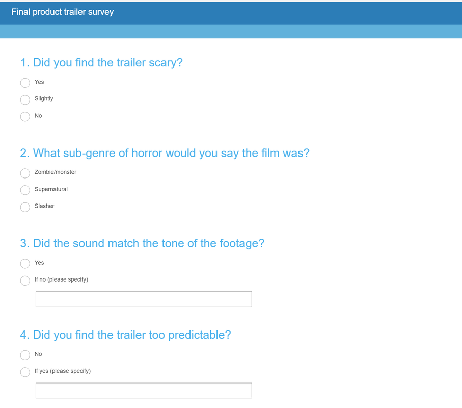
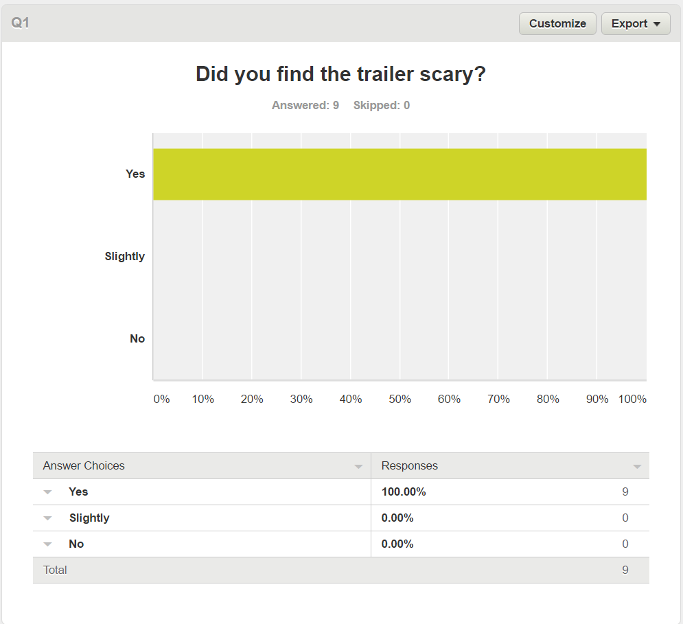
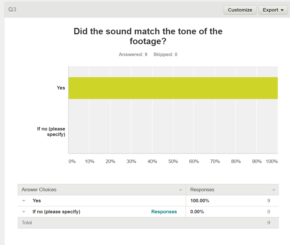
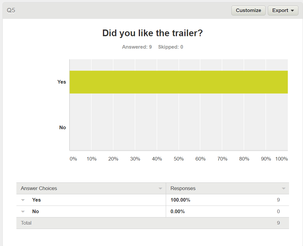
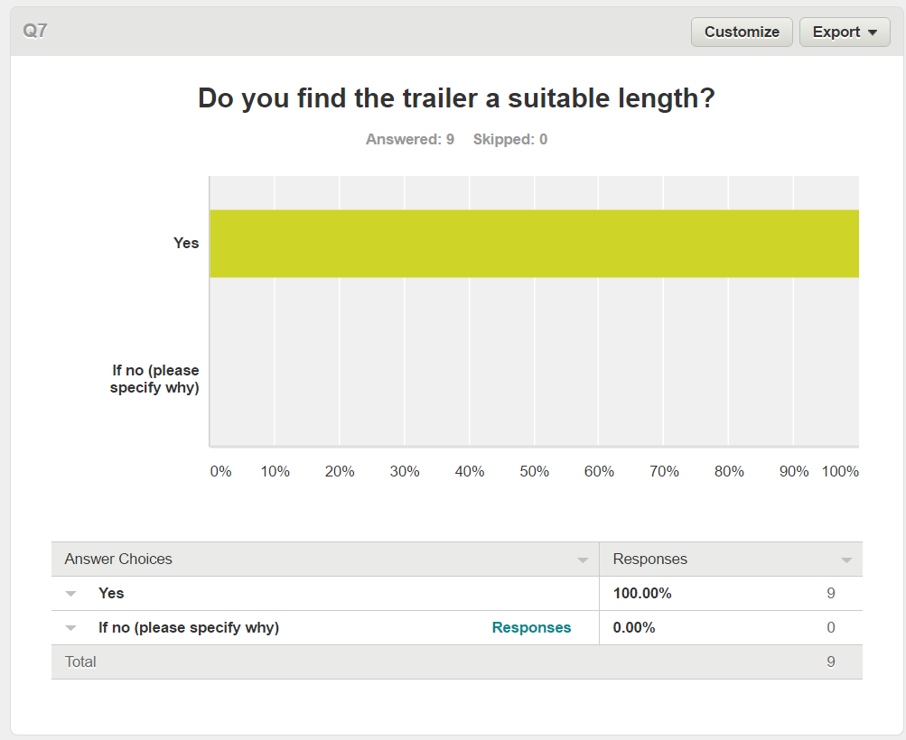
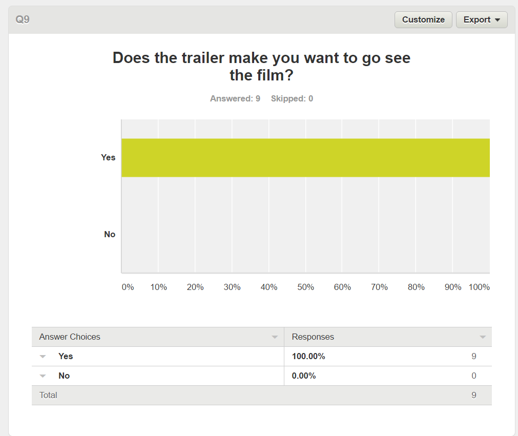
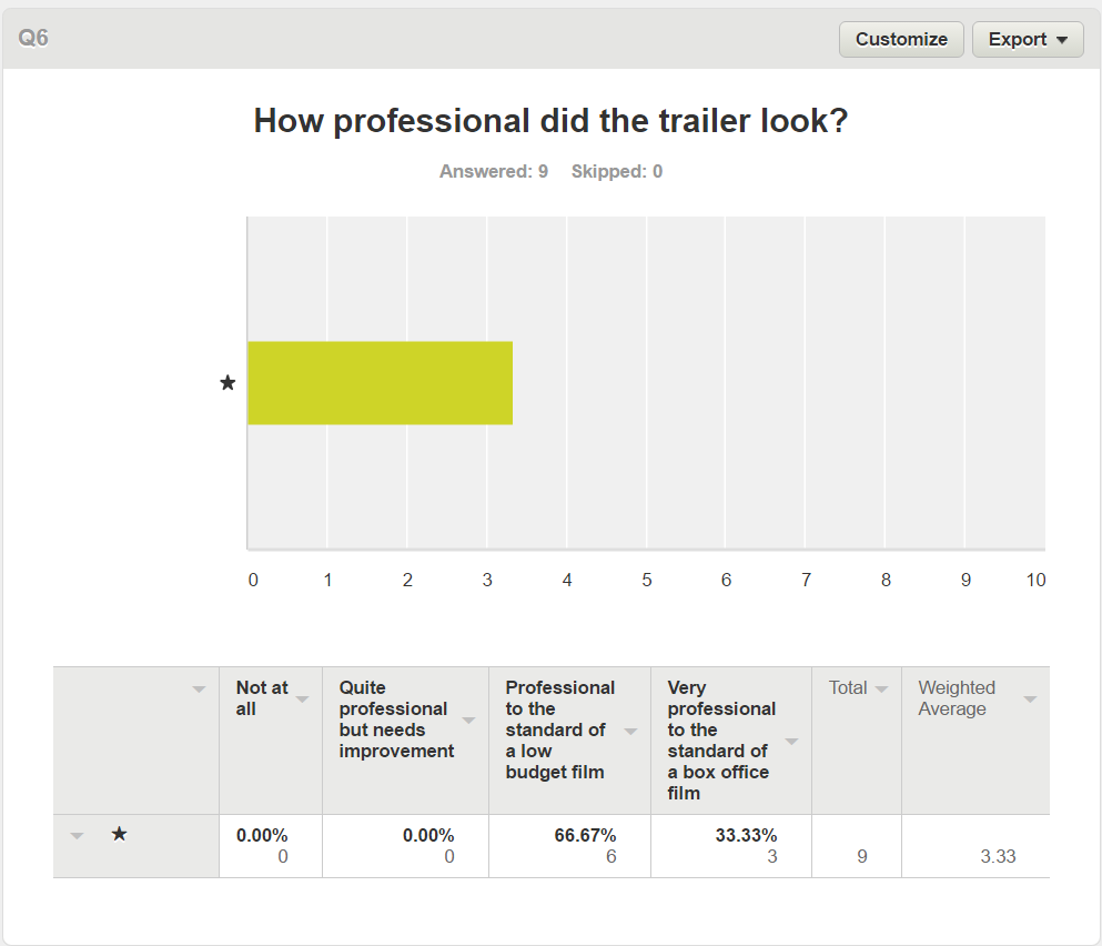
Overall the trailer received a positive response from the audience feedback, with 100% of people saying they found the trailer scary as well as the music being used effectively and 67% of people saying that the quality of the trailer was of the standard of a low budget film, however only 67% of people got that the sub-genre was a supernatural and 22% of people thinking it was a slasher, showing that there may be some mystery behind the antagonist and what they are exactly which is good as the teaser trailer is used to create mystery and comments stating that in places the music was a bit to loud and became a bit static in places and that the heavy breathing could be replaced with more of the non-diejetic sound at the start of the trailer, but overall there was a 100% of people wanting to go to see the film in cinema after watching the trailer.
Conclusion
Based on the audience feedback if we were to improve the three products it would be too:
For the poster we would need to alter the image or the background so that the antagonist doesnt blend into the background as much as well as increasing the size of the title so that it is more eye catching to the audience, but apart from that the poster would remain the same.
For the magazine we would look at re-editing the image to make it clearer allowing the colours in the wounds to come through, as well as cleaning up the layout to remove the unnecessary conventions and replace them with information focused on the movie itself so that the audience understand what the movie is about.
For the trailer the main point of improvement would be to add in one or two texture shots to really make it clear that the sub-genre is supernatural by including stock situations like an object flying off a shelve, another focus would be to look at the sound design to remove any crackly sound and to cut the duration of the heavy breathing and finally look at including a blind transition in between the jump cuts for suspense and tension.
